The network for creativity
Join 1.25M professional creatives like you
Connect with clients, get discovered, and run your business 100% commission-free
Creatives on Contra have earned over $150M and we are just getting started
Back to feedPost

Every card in this video is something most service websites already have, like results and reviews. Usually they’re scattered and nobody connects them. Press the button and they line up in the order people actually decide to hire you. That’s most of what I do for clients.


Great way to explain the concept.

That typography is bold as hell, love it. And yeah, connecting the dots between reviews and results is really where the conversion happens. Great work on this, Yousuf!

Lining up results and reviews in the order people actually decide to hire you is such a smart reframe, Yousuf. Most service sites just scatter that trust content and hope it lands.
The network for creativity
Join 1.25M professional creatives like you
Connect with clients, get discovered, and run your business 100% commission-free
Creatives on Contra have earned over $150M and we are just getting started







Related posts


Startfrom 2.0 is live. It's our template library: finished websites designed at Apollo Studio, available as a Framer project, an Astro theme or a Next.js app.
Each template page shows what you get and runs the live demo in the page. Some templates are free.


Keeping content separate from layout would make the Astro and Next.js versions easier to customise. Do they share a content schema, or does each template have its own setup?

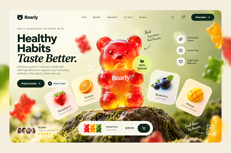
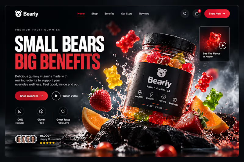
Which gummy brand would make you stop scrolling?
Two different directions for Bearly, a gummy candy brand concept.
One is bright, playful, and fruit-inspired. The other is bold, dark, and premium.
Same product, two completely different visual experiences.
Which one would you choose? Vote below! 👇
#BrandIdentity #WebDesign #UIUX #EcommerceDesign #Figma #DesignInspiration #ABTesting

9 voted
75%
3 voted
25%
12 votes
Closed

I will always love it playful cant lie

APPOINTLY — Built for barbershop growth.
A website built around the challenges barbershop owners face: empty chairs, missed calls, and clients who don’t return.
Bold editorial typography and direct messaging bring the offer into focus—from appointment handling and local visibility to review collection and client retention.
The design goal: make the value clear and give visitors a straightforward path to getting started.
Explore the website:
https://appointlyhq.com
#WebDesign #UIUX #WebsiteDesign

empty chairs, missed calls and clients who don't return is such a clear way to put it for barbers. are you going after shops in one us city first, or all over?