The network for creativity
Join 1.25M professional creatives like you
Connect with clients, get discovered, and run your business 100% commission-free
Creatives on Contra have earned over $150M and we are just getting started
Back to feedPost
Logomark for TX Staple Co. A strategic product-infrastructure lab with roots in a Houston fastening-supply business.
The mark is derived from from the geometry of a loading pallet with the initials built into the slats. Foundation and name in one shape.

Pallet slats forming the initials is a clever idea.

The mark stays readable as a single flat color on the navy hoodie and the ID badge, which tells me the pallet geometry is doing real work. Was the isometric angle the first thing you locked down, or did you test the mark head-on before settling on it?

I actually designed the logomark in a flat view first then projected it onto the isometric pallet grid

The network for creativity
Join 1.25M professional creatives like you
Connect with clients, get discovered, and run your business 100% commission-free
Creatives on Contra have earned over $150M and we are just getting started



Related posts


Great!!

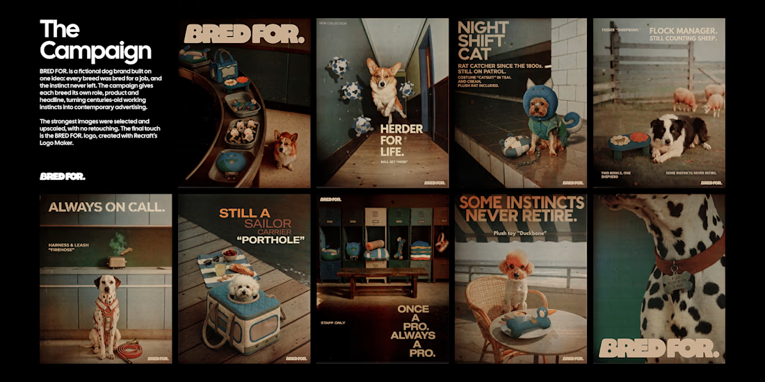
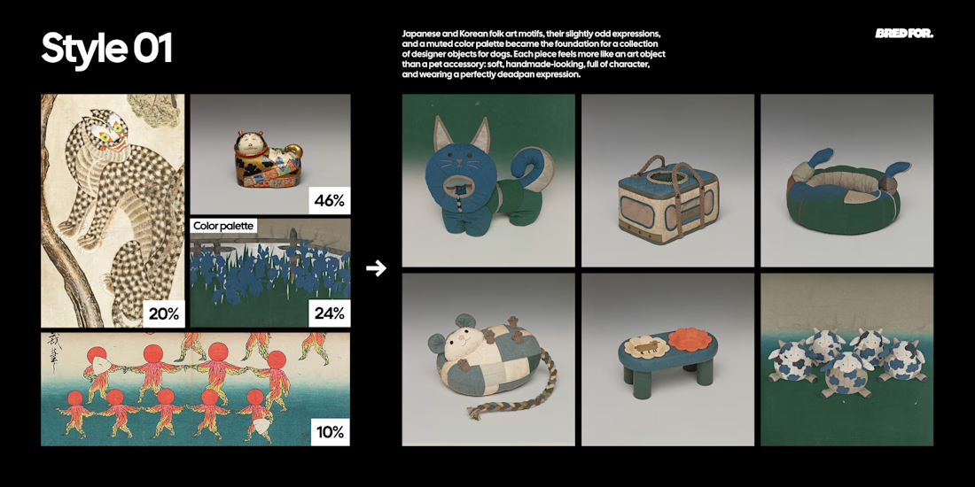
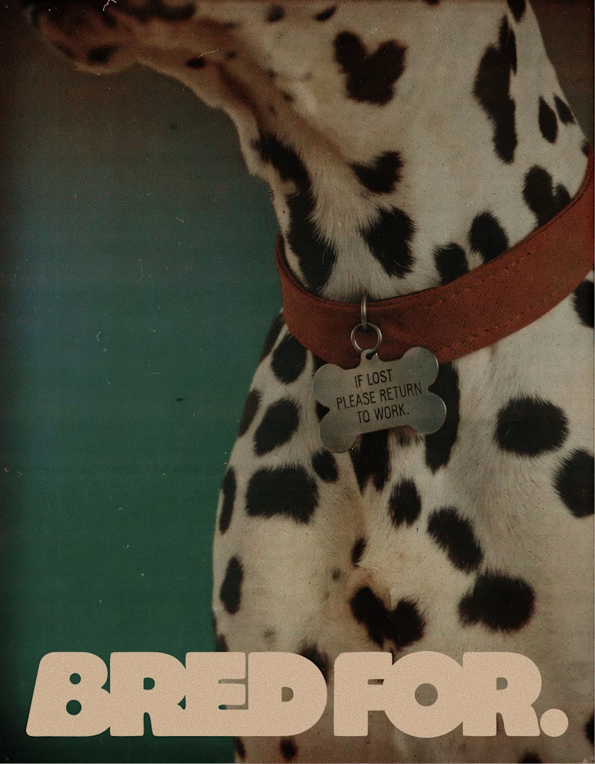
BRED FOR. is a fictional dog brand built on one idea: every breed was bred for a job, and the instinct never left. Collies herded sheep, poodles retrieved ducks, Yorkies hunted rats, Dalmatians ran beside fire carriages, so each product turns a breed's original work into an everyday object.
Style 01 is built from Japanese and Korean folk art found at the Cleveland Museum of Art, The Met, LACMA and the Rijksmuseum, and designs the products as soft, deadpan designer objects.
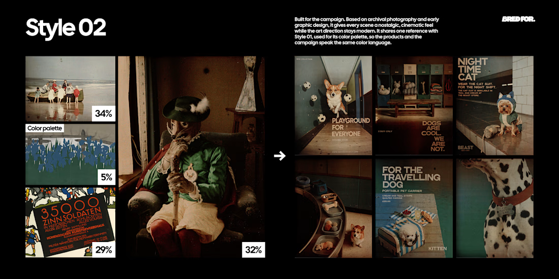
Style 02 is built from early colour autochromes and a 1914 lithographic poster from the Rijksmuseum and the Albertina, and turns every scene into a modern fashion campaign with an archival feel.
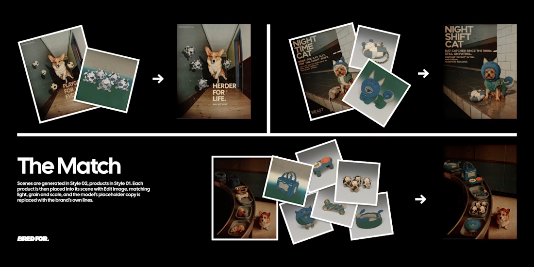
The two Styles were chained with Edit image: Style 01 products placed into Style 02 scenes, every headline rewritten in the brand's dry, deadpan voice. The strongest images were selected, upscaled and finished with a logo made in Recraft Logo Maker.
Style 01 (products): https://www.recraft.ai/styles/b8e1a6b6-ae61-49db-907d-74229530b596
Style 02 (campaign): https://www.recraft.ai/styles/7f2a89de-d69a-4fad-aa0d-ba6302c9a2f3


What makes a candy brand recognizable across every pack?
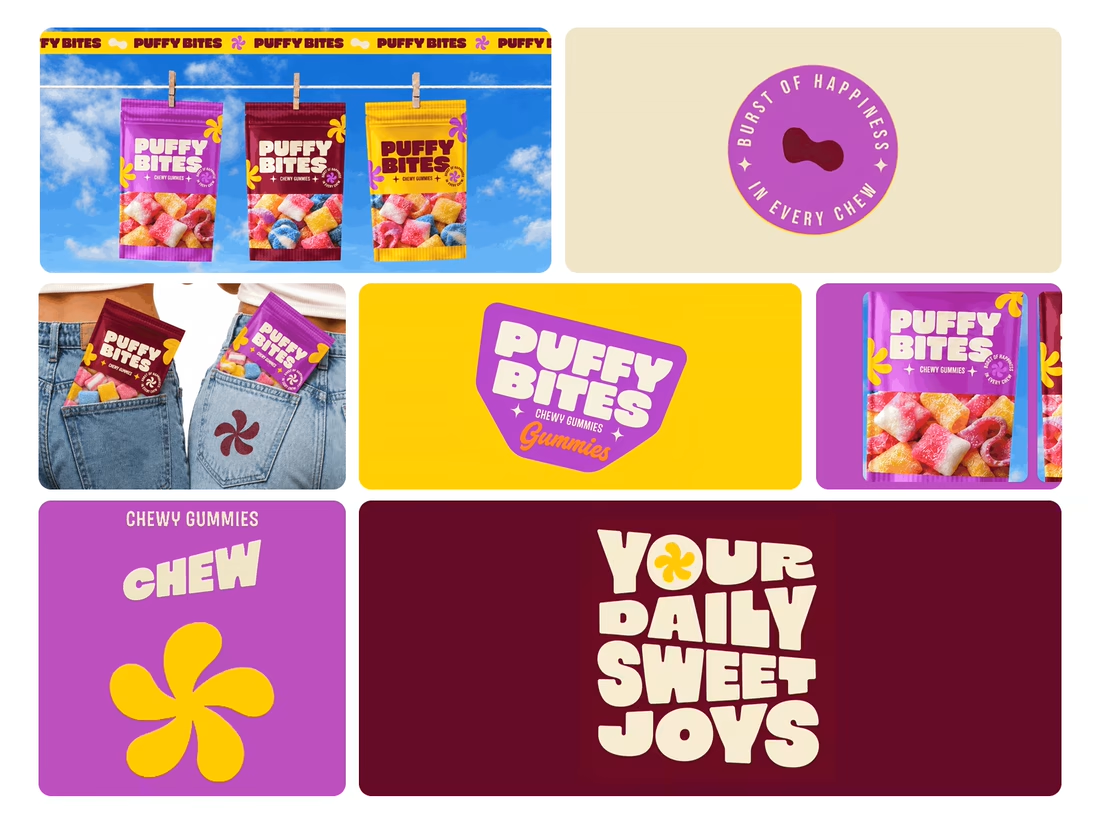
For Puffy Bites, I built the identity around rounded lettering, expressive symbols, and a palette of burgundy, purple, yellow, and cream.
The same visual language carries through pouch packaging, smaller wrappers, campaign imagery, and an animated brand showcase.
One design decision that ties it together: the packaging color changes, while the logo placement, product descriptor, and supporting graphics maintain a consistent structure.
I handled the full client project, from logo and visual identity to packaging and campaign applications.
Which colorway would catch your eye first—purple, burgundy, or yellow?
Explore the full Puffy Bites case study. If you’re developing a candy or snack brand, I’m available for branding and packaging projects.

Love it,
Great work