The network for creativity
Join 1.25M professional creatives like you
Connect with clients, get discovered, and run your business 100% commission-free
Creatives on Contra have earned over $150M and we are just getting started
Back to feedPost
I built a digital tool rooted in two real craft traditions. It's called Indikon.
The first: hand block printing centuries-old Indian craft where artisans carve wooden blocks, dip them in natural dye, and press them onto fabric.
The second: texture hunting , a practice where people press soft clay onto surfaces, lift the impression, and carry a pattern home with them. Like a rubbing, but tactile. Like collecting, but physical.
Indikon is the digital version of both.
Built entirely in @Figma Make, with the motif library generated in Figma Weave real carved Indian wooden block stamps translated into flat ink impressions using Flux Canny Pro. Every motif in the library came from a real object.
Here's how it works: press real block-print motifs onto a canvas. Scan your clay impressions or any real-world texture a cracked wall, a carved gate, a sari border ink it in natural dye colors, and stamp it alongside your carved motifs. Two craft traditions, one surface.
Your composition becomes a seamless tileable repeat the exact format a textile printer would need. Save it to your Indi-Journal, a living sketchbook canvas where print cards, field notes, and sketches accumulate the way a real sketchbook does.
The thing I kept asking while building: does this feel like block printing and clay impressions, or does it feel like software?
Indikon - from sketchbook to swatch.
Made for the @Contra x Figma Makeathon #ConfigMakeathon
TRY IT😊
https://www.figma.com/make/zZk3xstsOVJBnwmuM9vXOS/Indikon-by-Surbhi?t=VdkPEmZAPvDBMqJh-20&fullscreen=1


https://x.com/surbhi_nwskr03/status/2067861496500281762
Posted on X check it out!
Check out the full screen view below!!
https://www.figma.com/make/zZk3xstsOVJBnwmuM9vXOS/Indikon-by-Surbhi?p=f&t=FGFi1HGlwcPCS0DJ-0&fullscreen=1

figma.com
Figma
Created with Figma
Quick update on my Config Makeathon submission
My X (Twitter) account got automatically suspended right after I posted my submission thread for the Figma Config Makeathon .I've submitted an appeal and I'm hoping it resolves soon.
My project, Indikon, is still fully up on Figma...
figma.com
Figma
Created with Figma
The network for creativity
Join 1.25M professional creatives like you
Connect with clients, get discovered, and run your business 100% commission-free
Creatives on Contra have earned over $150M and we are just getting started







Related posts


Another set of mockups for Bakedwell


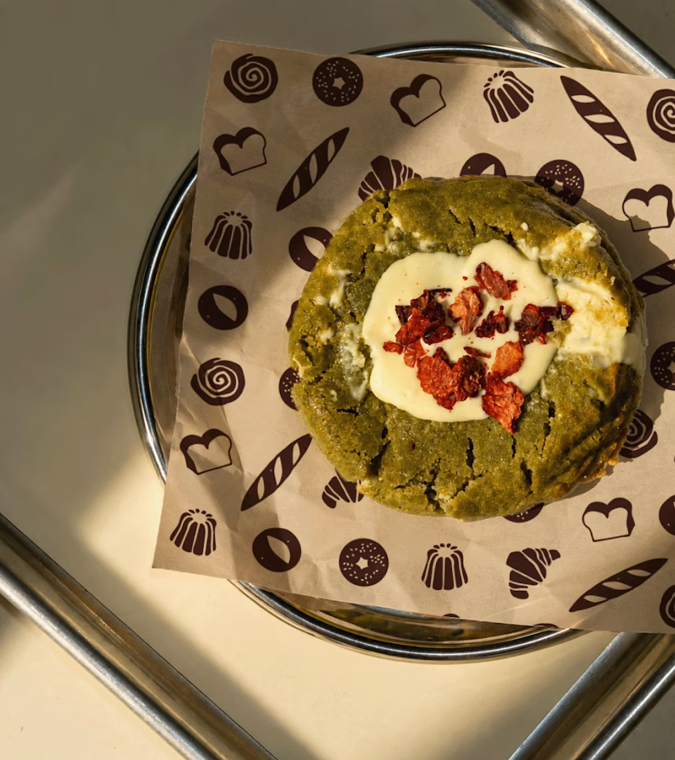
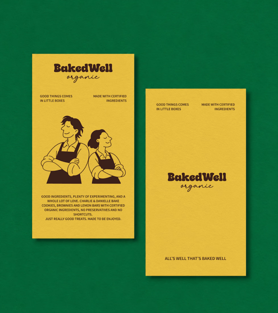
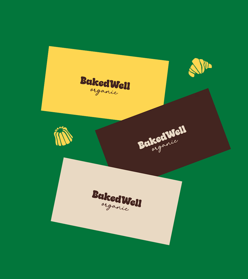
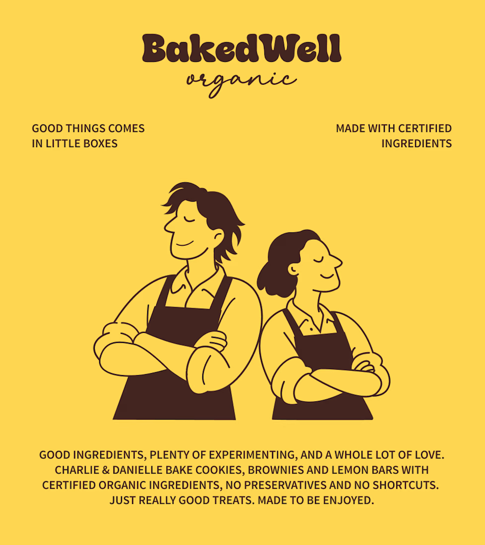

Forest green and mustard with the two bakers in flat illustration is a warm, confident pairing, and the cards read clearly. Contrarian take: the illustrated pair is the strongest asset here, stronger than the wordmark. If I owned BakedWell, I would put those two on the bag and the window and let the logo go smaller.

A luxury property deserves a presentation that does it justice.
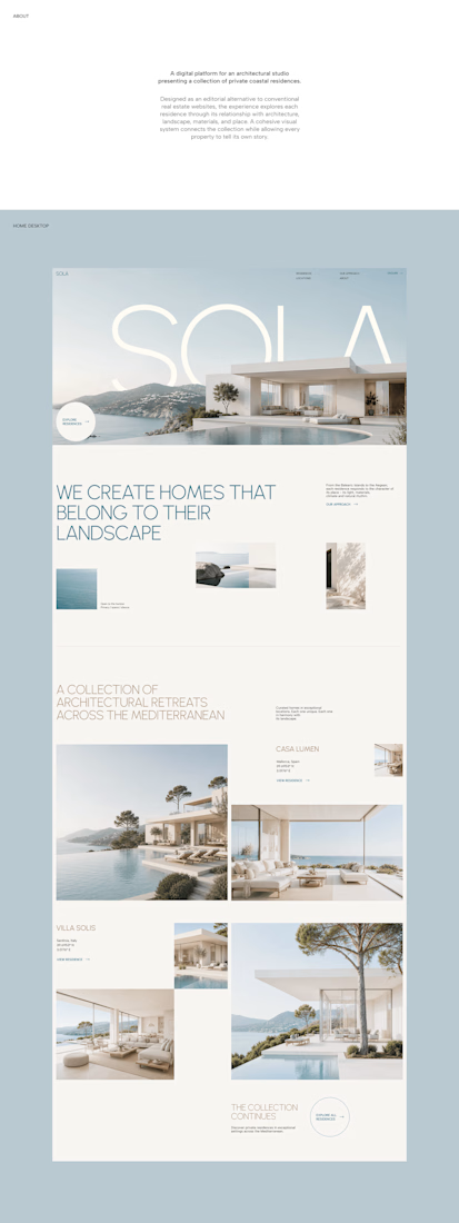
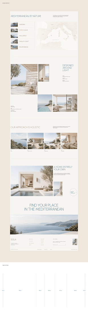
With SOLA – Architecture Studio & Luxury Real Estate, I wanted to bring the beauty of modern coastal architecture into the website itself.
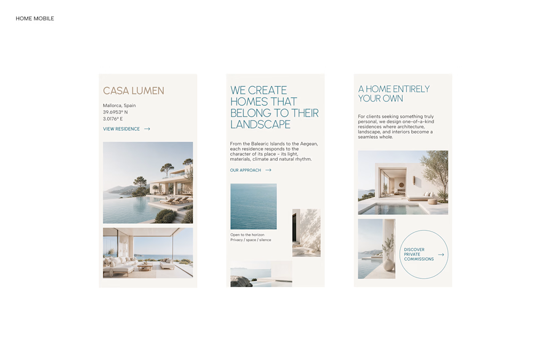

From the large property images and soft blue tones to the clean layout across desktop and mobile, every part of the design helps create a calm, premium feel while making the homes the centre of attention.
I like how the website brings architecture and digital design together, giving visitors a chance to explore the properties before making an enquiry.
If you were looking for a luxury home, would a website like this make you more interested in the property?
#WebDesign #Architecture #LuxuryRealEstate

Incredible work, you transformed SOLA into a premium property brand.


Every element feels perfectly placed! 👏