The network for creativity
Join 1.25M professional creatives like you
Connect with clients, get discovered, and run your business 100% commission-free
Creatives on Contra have earned over $150M and we are just getting started
Back to feedPost

Creative Partnership. Thoughtful Design. Meaningful Impact.
Welcome to Katelynn Sears Creative Services!
I'm Katelynn, a graphic designer with over seven years of experience helping businesses, nonprofits, churches, and organizations bring their ideas to life through thoughtful, strategic design.
Throughout my career, I've worked on everything from complete brand refreshes and corporate marketing campaigns to illustrations, digital content, and everyday creative communications.
What I enjoy most about design is the opportunity to build relationships, understand an organization's mission, and create work that makes a meaningful difference.
Here's how I can support your organization:
Brand Identity & Brand Refreshes
Marketing & Promotional Materials
Corporate Communications
Social Media & Digital Graphics
Custom Illustrations
Ongoing Creative Design Support
I believe great design starts with collaboration. My goal is to become a trusted creative partner who understands your vision, supports your team, and helps your organization communicate with confidence.
I'll be sharing portfolio projects, behind-the-scenes creative processes, and new work here on Contra.
I'm currently welcoming freelance projects, contract opportunities, and ongoing creative partnerships.
If you're looking for a dependable creative partner who brings both strategy and creativity to the table, I'd love to connect!
Explore my portfolio or send me a message to discuss your next project.


The network for creativity
Join 1.25M professional creatives like you
Connect with clients, get discovered, and run your business 100% commission-free
Creatives on Contra have earned over $150M and we are just getting started
Related posts

A little more about the inspiration behind Tindara.
I wanted the identity to have a connection to Tindari, Sicily. The Madonna di Tindari statue was the starting point for the symbol, while Sicilian decorative patterns inspired the graphics around it.
For the colors, I chose mustard yellow, deep green, and burgundy, balanced with cream. I wanted to bring some of that warmth and richness into the packaging, while keeping the different elements comfortable together.
For me, these references are what give the project its character and sense of place.



Most websites open with “Welcome.”
This one opens with “Boots required.”
Little Fen’s site is a field guide: locals with Latin names and a heron soundtrack.
Go meet the vole.
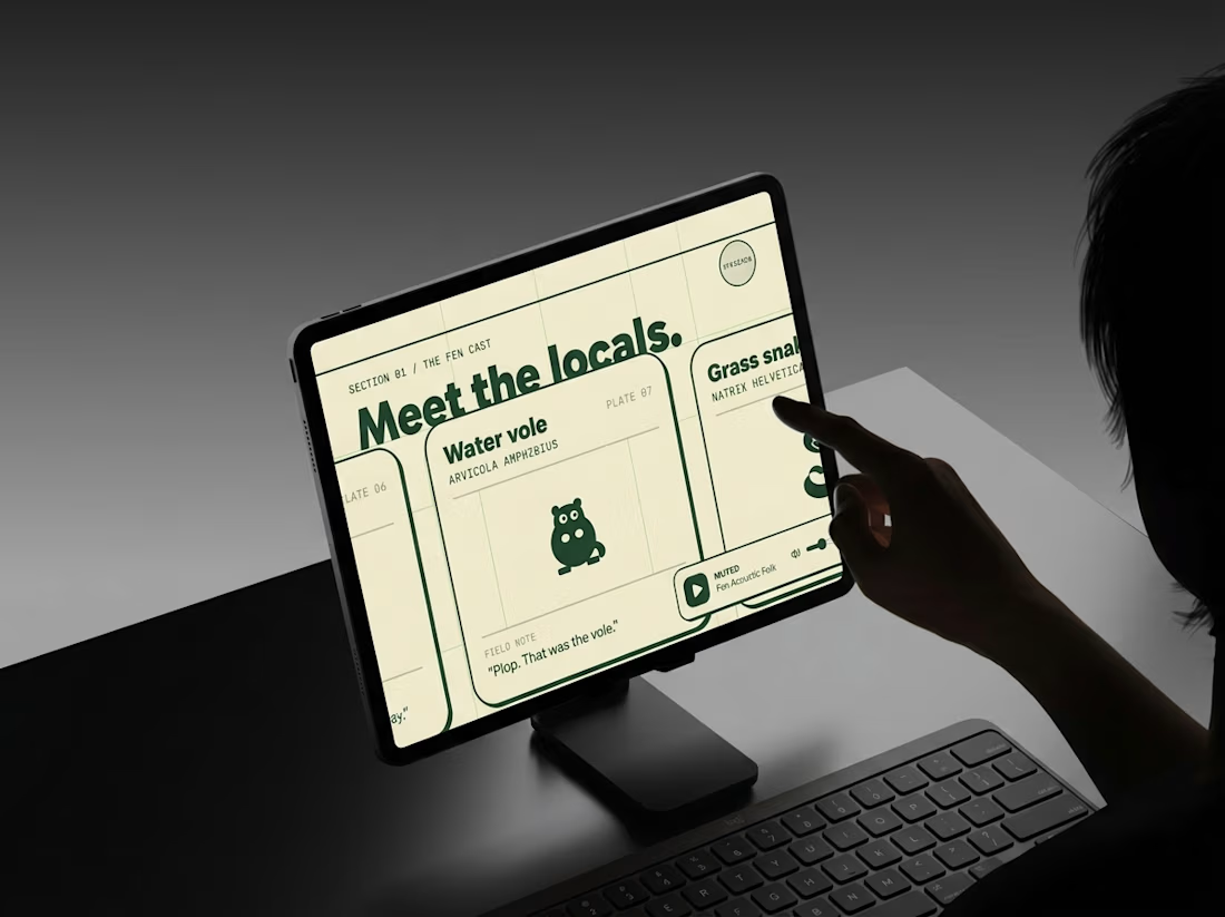
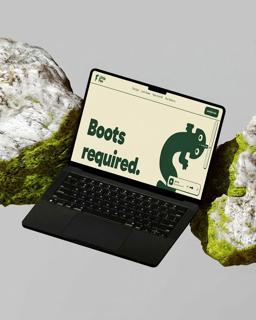
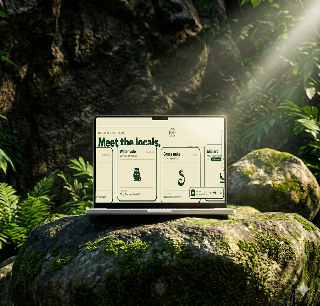

A brand identity inspired by the Florida Keys.
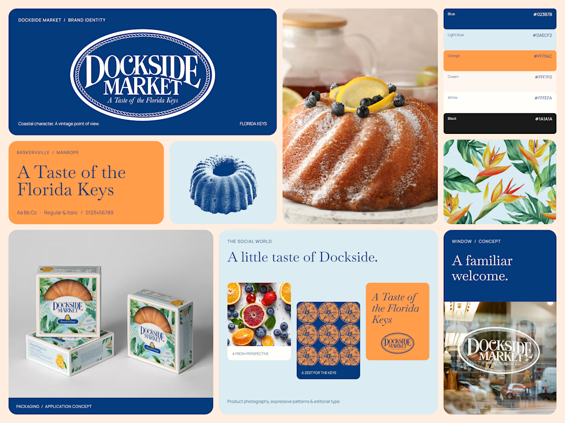
Dockside Market brings together vintage character and contemporary design, creating a visual identity that feels distinctive, warm, and full of personality.
From the iconic circular logo and editorial typography to the color palette, vintage-inspired illustrations, patterns, and packaging, every element works together to build a cohesive brand world.
This Bento brings the identity system together, showcasing how the brand translates across visual assets and real-world applications.
Brand identity, art direction & visual design.



Tremendous