The network for creativity
Join 1.25M professional creatives like you
Connect with clients, get discovered, and run your business 100% commission-free
Creatives on Contra have earned over $150M and we are just getting started
Back to feedPost
I rebranded Fish Point into a premium dining spot with a gold monogram and deep pine palette. A visual lift turning local tilapia into upscale mall cuisine.


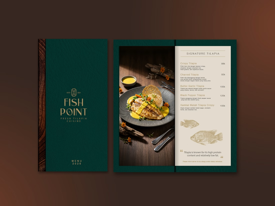
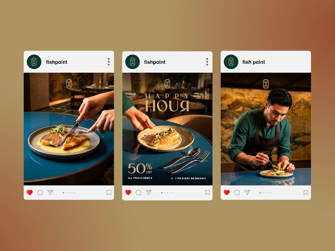
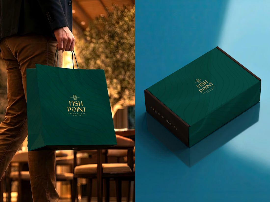

Deep pine and gold is the safe route to "premium", and it works here - but the harder part with tilapia is that the price jump has to feel earned before anyone reads the menu. The delivery-app tiles are doing more of that job than the packaging is, which is an odd but interesting inversion.

I agree. The deep pine and gold gives us the premium foundation, but I think the bigger challenge is making the tilapia itself feel valuable enough to justify that positioning.
The point about the delivery-app tiles is interesting too. It suggests that the visual identity needs...
The network for creativity
Join 1.25M professional creatives like you
Connect with clients, get discovered, and run your business 100% commission-free
Creatives on Contra have earned over $150M and we are just getting started
Trending
retrofuturism
Share your favorite designs from the past exploring the distant future. Or your own take on the aesthetic 🚀
halftone
Dots. Texture. Grain. Let's see your designs using the halftone technique.

Midjourney
Creatives are showing off what they're making with Midjourney.
colorgrade
Video editors sound off: How do you enhance the mood of your video in color grading?





Related posts

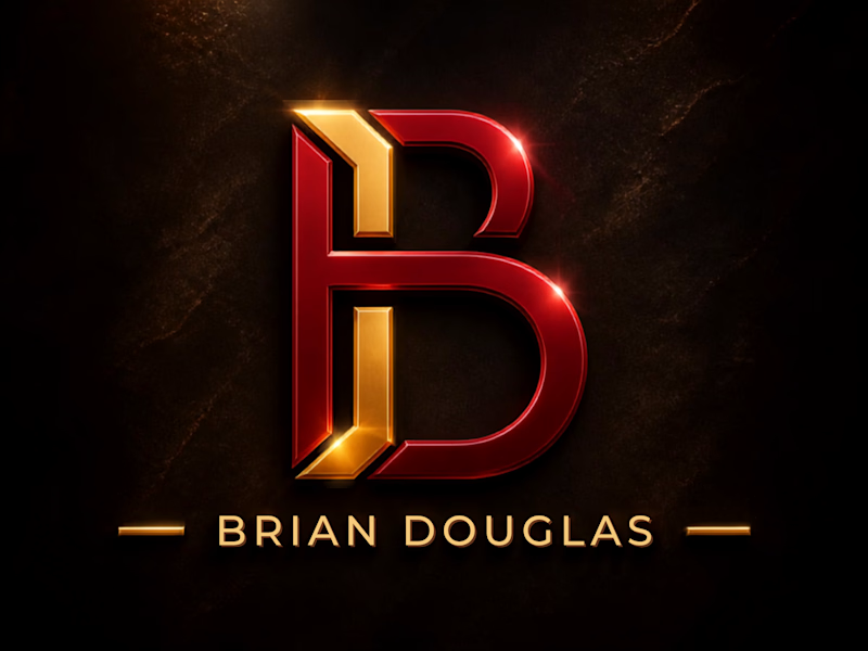
Choosing between these two brand identity concepts is genuinely tough! Option 1 brings a bold, 3D metallic presence, while Option 2 offers a refined, luxury monogram feel.
If you appreciate the work, please give this post a like/upvote and vote for your favorite option below!
SPECIAL OFFER:
I am offering a 100% FREE custom logo design for anyone who needs a visual identity for their brand in exchange for an honest review on my profile!
How to get yours:
Upvote and vote for your favorite design above.
Send me a direct message with your brand name and vision.
Let's collaborate and bring your brand to life!


3 voted
38%
5 voted
62%
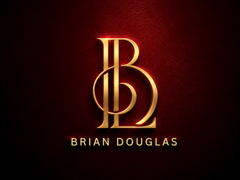
8 votes
Closed

Luxury gold is so good tbh

I worked on this passion project for monica, showing the problem and giving the solution through a well represented motion design


This looks good welldone!

I create unique, professional, and memorable logos that represent a brand’s identity and vision. I focus on clean design, creative concepts, strong typography, and visual balance to create logos that are simple, impactful, and easily recognizable.


very nice i like it