The network for creativity
Join 1.25M professional creatives like you
Connect with clients, get discovered, and run your business 100% commission-free
Creatives on Contra have earned over $150M and we are just getting started
Back to feedPost

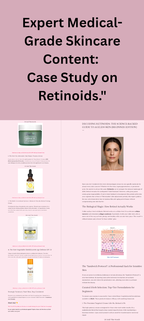
:Expert Medical Garde Skincare content Case Study on Retinoids.


The network for creativity
Join 1.25M professional creatives like you
Connect with clients, get discovered, and run your business 100% commission-free
Creatives on Contra have earned over $150M and we are just getting started

Challenges
View all


Related posts

Leal Beauty — Modern Multi-Brand E-commerce
A modern beauty e-commerce concept designed to bring multiple beauty brands into one clean, editorial shopping experience.
I designed the homepage for Leal, a multi-brand beauty store featuring brands such as Rare Beauty, rhode, Huda Beauty, KIKO Milano and essence.
The design focuses on a minimal aesthetic, strong visual hierarchy and an effortless shopping experience, combining product discovery, curated categories, skincare, lip edits, brand discovery and editorial content.
Role: UI/UX Design


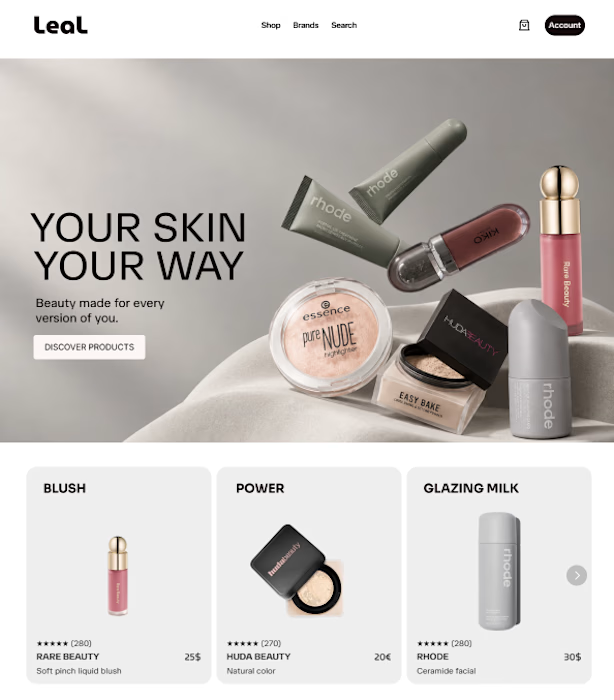

The editorial structure makes the multi-brand idea feel premium without losing the shopping flow. The separate brand cues and tight product cards are a smart way to support discovery while keeping the page calm.


What does “simple skincare” look like as a brand?
For Clairfair, I explored a soft, youthful visual identity built around a simple idea: care should feel gentle, approachable, and personal.
I developed the direction across the logo, typography, color palette, messaging, and facial-cream packaging keeping the system clean and minimal while adding subtle playful details through the soft pink palette, hearts, and expressive typography.
The goal wasn't to make skincare feel clinical or overly luxurious. It was to create something that feels friendly, confident, gentle, and easy to connect with.
I also explored how the identity could translate into a broader brand system rather than stopping at the logo.
Does this feel more like a skincare brand for teens, young adults, or both?


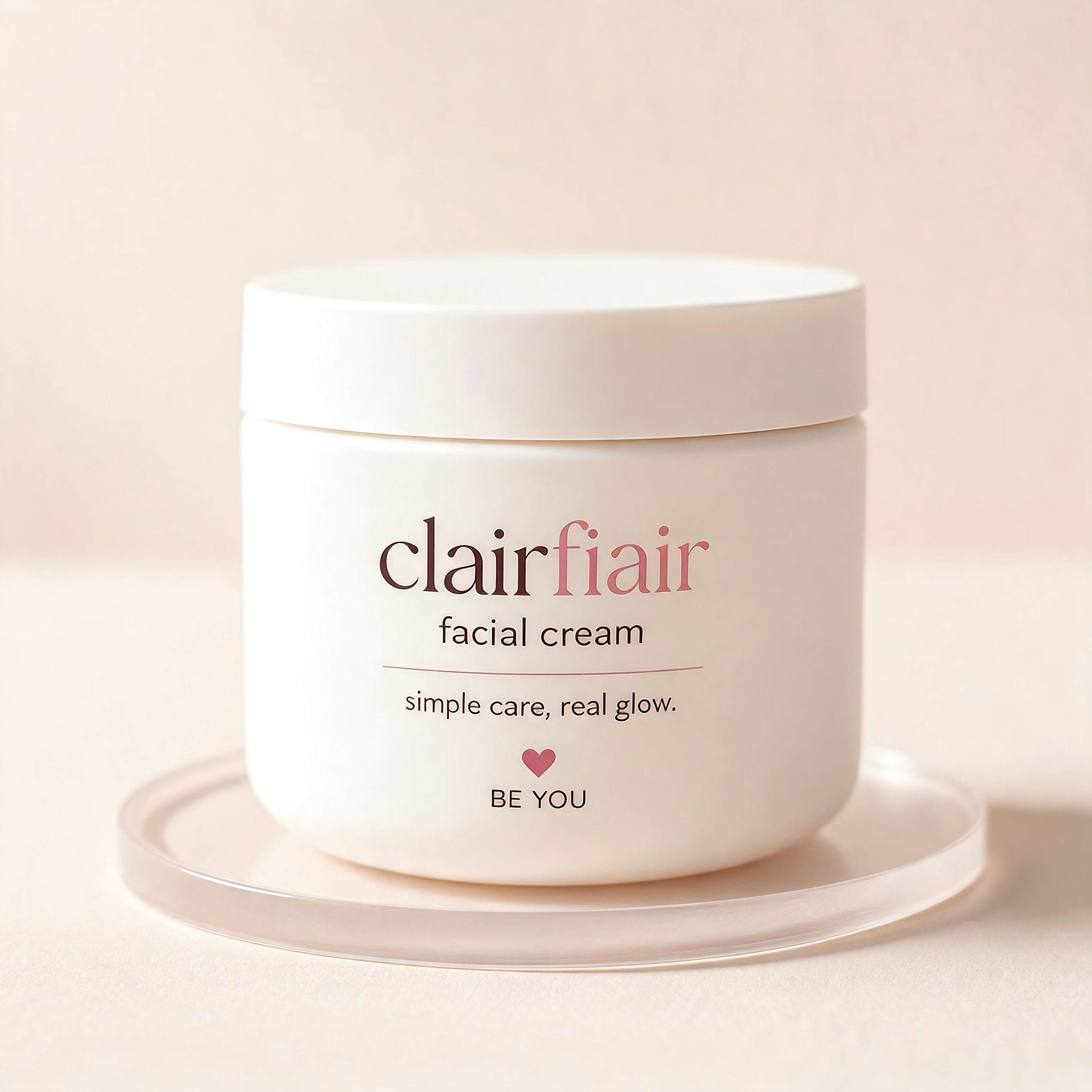
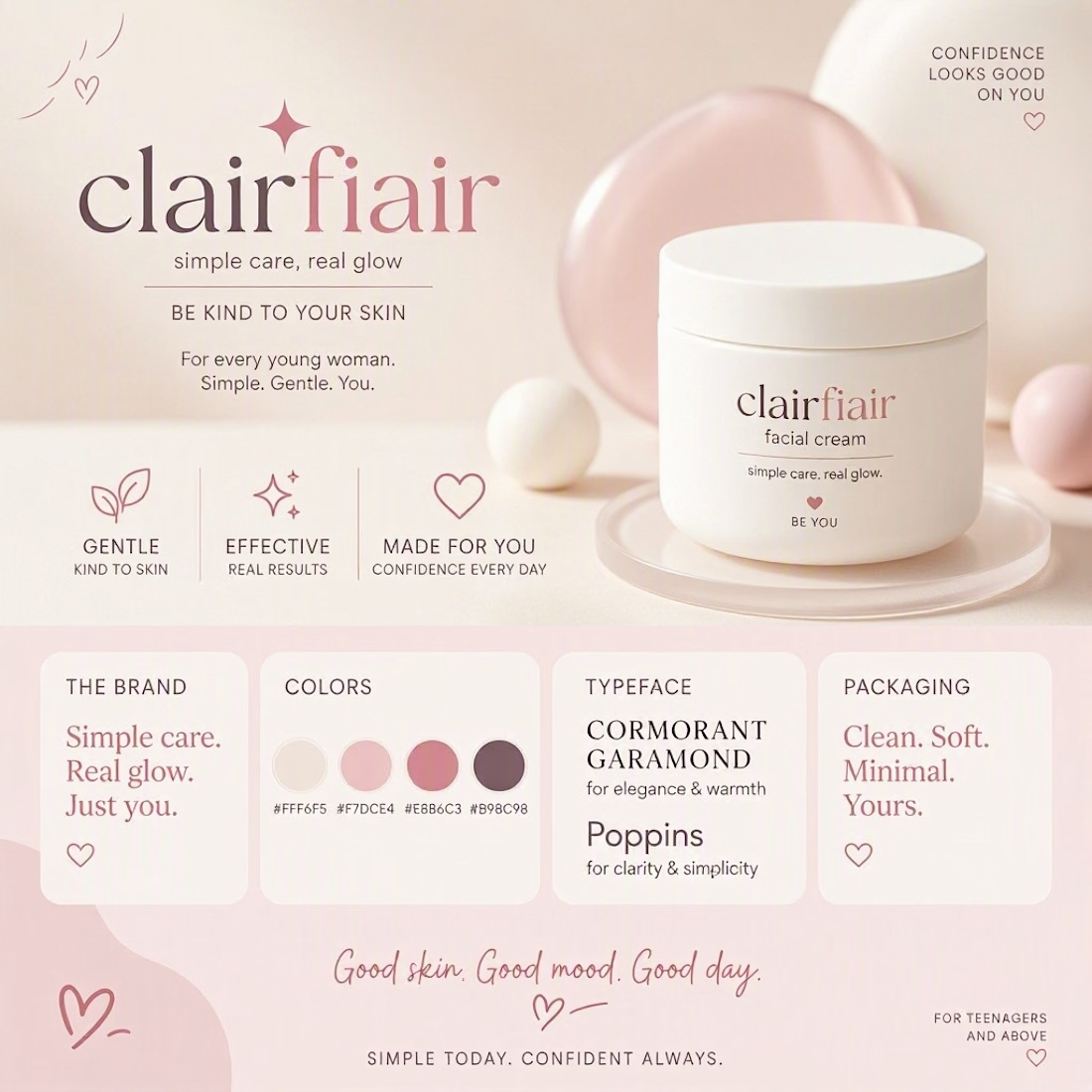

Teen-leaning to me, and the hearts are what tip it — they're the one element an older buyer would read as aimed at someone younger. The script wordmark and that muted rose palette on their own would sit fine in early-twenties territory. If you want it to stretch to both, the...

Dr. Emily Wheeler needed a fresh, elevated personal brand for her future functional medicine business without losing the warmth, trust and subtle familiarity of her legacy identity. The system had to carry her expertise across website direction, educational content, templates and future practice growth without becoming another generic wellness brand.
I blur some parts of the branding, I always protect some IP-sensitive parts.
Read the full case study
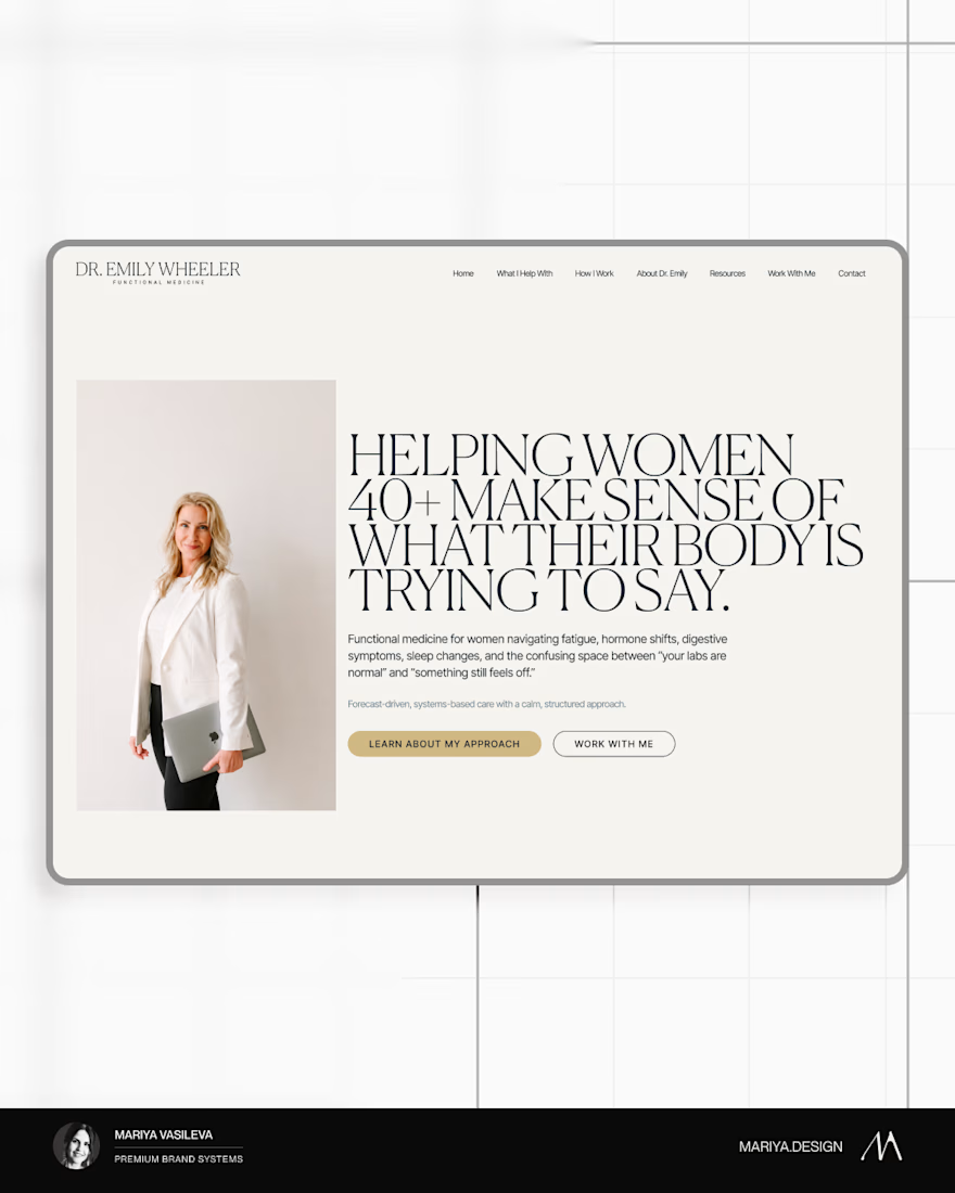
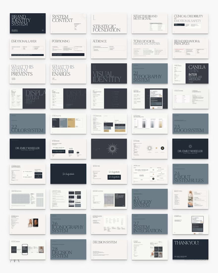
The restrained palette and editorial type hierarchy make the warmth feel intentional—especially alongside the structured system context. Great example of turning a personal brand into a flexible web direction.