The network for creativity
Join 1.25M professional creatives like you
Connect with clients, get discovered, and run your business 100% commission-free
Creatives on Contra have earned over $150M and we are just getting started
Back to feedPost
Leal Beauty — Modern Multi-Brand E-commerce
A modern beauty e-commerce concept designed to bring multiple beauty brands into one clean, editorial shopping experience.
I designed the homepage for Leal, a multi-brand beauty store featuring brands such as Rare Beauty, rhode, Huda Beauty, KIKO Milano and essence.
The design focuses on a minimal aesthetic, strong visual hierarchy and an effortless shopping experience, combining product discovery, curated categories, skincare, lip edits, brand discovery and editorial content.
Role: UI/UX Design


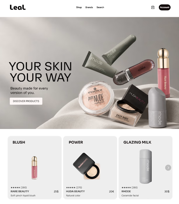

Keeping the brand name on its own line under each product name, rather than folding it into the title, is what lets Rare Beauty and Rhode still read as distinct shops inside one storefront.

The editorial structure makes the multi-brand idea feel premium without losing the shopping flow. The separate brand cues and tight product cards are a smart way to support discovery while keeping the page calm.

Thanks ☺️
The network for creativity
Join 1.25M professional creatives like you
Connect with clients, get discovered, and run your business 100% commission-free
Creatives on Contra have earned over $150M and we are just getting started











Related posts


Hiring: UX / Product Designer (remote, ongoing)
I run Novatur Design, a product design studio based in Malta. We work with startups through to enterprise clients such as The Daily Mail, across a range of industries from EV to Crypto, Fintech to IoT.
I’m looking for an all-round UX / product designer who can take a problem from user flows through to polished hi-fi UI. Figma, auto layout and design systems should be second nature.
This is ongoing contractor work on a monthly basis, not a one-off project. If it works well on both sides, there’s potential for it to go full time.
Remote, so you don’t need to be in Malta. Individual designers only, no agencies please.
If you’re interested, the application takes about 6 minutes:
https://tally.so/r/yXZ2dB
Ralph

Love the variety of industries you work with. Sounds like an amazing opportunity for the right designer.
I created a brand identity concept for Velora, an AI productivity platform. I explored the logo, colors, typography, and how the brand could look across a website, mobile app, and everyday products. I wanted everything to feel consistent, modern, and easy to recognize.


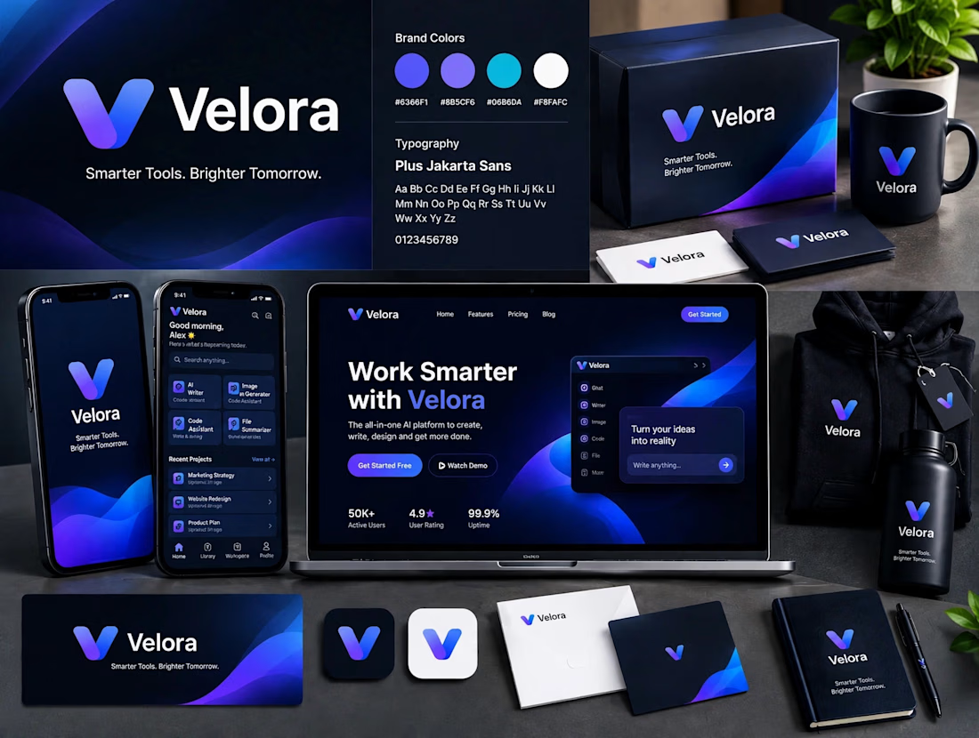

The blue is perfect for this. I’ve seen so many AI brands do boring black/white but this gradient gives it energy. And Plus Jakarta Sans was a great choice, keeps it friendly.

Every AI product apologizes for the wait. I designed the wait instead.
Latency: identity, interactive site and campaign built on Ma, the space that gives a thing its shape. The headline breathes in weight until the answer lands.
Design the pause.


Man, you’re superhuman; your consistency and quality are out of this world... congratulations on your work.