The network for creativity
Join 1.25M professional creatives like you
Connect with clients, get discovered, and run your business 100% commission-free
Creatives on Contra have earned over $150M and we are just getting started
Back to feedPost
🔸🔸 TRY IT 🔸🔸
https://heirloom.figma.site
I’ve been building Heirloom: a quiet, private space to hold onto people we’ve lost.
If you’re seeing this for the first time:
Heirloom is not a social app.
Not a feed.
Not a memorial journal.
It’s a private space where you can:
Create a place for someone you’ve lost
Add memories, photos, voice notes, messages
Revisit them slowly, one at a time
ALL IN ONE PLACE
Not everything at once.
Not scattered across your phone or your mind.
Just… gentle access to what you still have.
🔸🔸 FEEDBACK, please. 🔸🔸
Now I need something different from you.
Not just “this is nice”
I want real feedback. Honest, even uncomfortable.
Did anything feel confusing?
Did anything feel unnecessary?
Did it feel meaningful… or just like another app?
Would you actually come back to it? Why or why not?
I’m very open to critique right now -
this is the stage where it can still change a lot.
So if you spend even 2-3 minutes on it,
that feedback genuinely shapes what this becomes next.
🔸 I’m listening 🔸


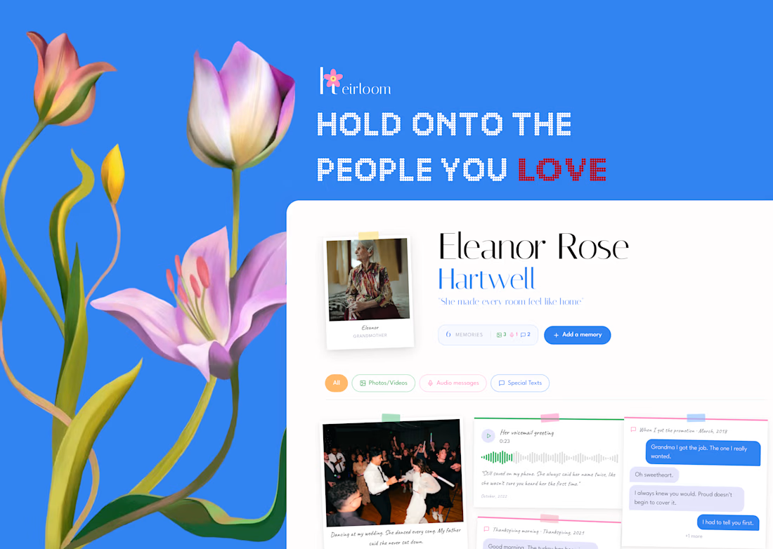


this is such a nice concept! make sure you record a walkthrough too and share it here to qualify for a prize :)

Thank you so much @Isabel Feuerstein , I am really glad you liked the concept.
I am working on the walkthrough video, and will post shortly.
The network for creativity
Join 1.25M professional creatives like you
Connect with clients, get discovered, and run your business 100% commission-free
Creatives on Contra have earned over $150M and we are just getting started







Related posts

What if your watch collection had a dashboard this luxurious?
Meet Chronova. Built for collectors who care about every detail.
Would you use this?


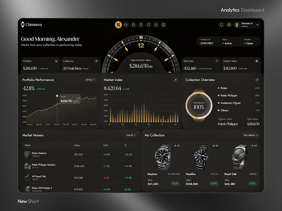



a dark dashboard makes sense here, the watches get to be the brightest thing on screen. how do you show a collection's value changing without it feeling like a trading app?


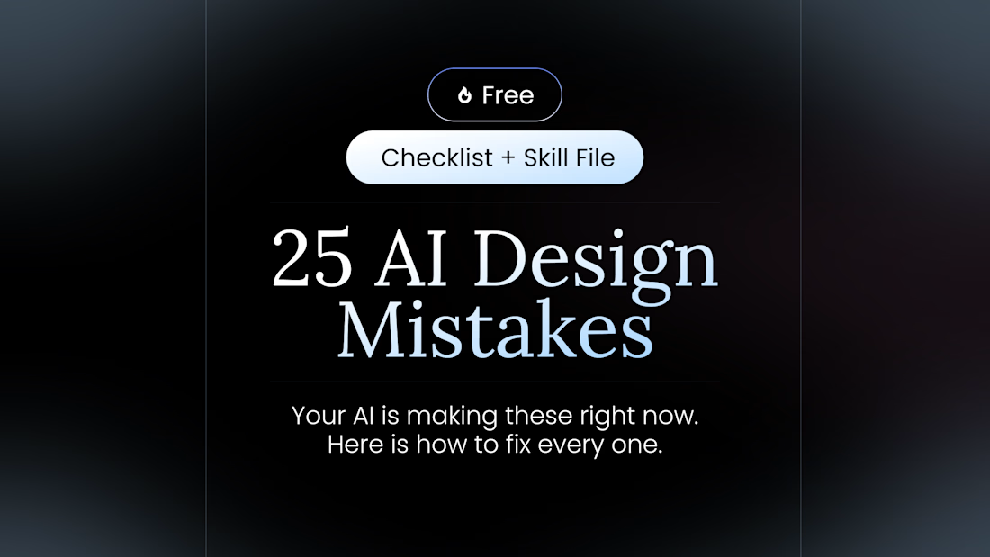
100+ people already use my free skill file to stop their AI from making the same 25 design mistakes.
Drop it into your project and your agent gets better at typography, spacing, color, and dark mode. Link in the comments.

Recent work on MAE - Visual identity

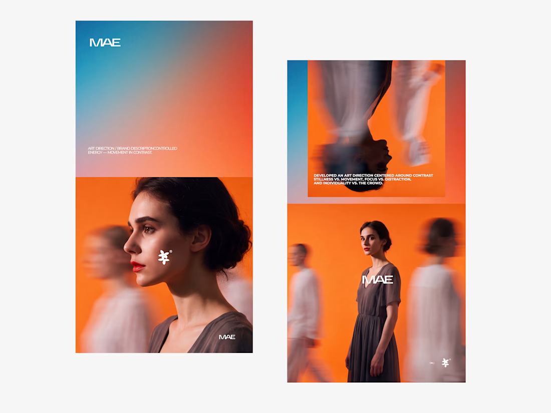

The motion blur on the figures gives the orange-to-blue gradient a reason to be there, and the small star mark stays readable on both the cheek and the shirt. Did the star come first as a standalone mark, or did it grow out of the photography direction?