The network for creativity
Join 1.25M professional creatives like you
Connect with clients, get discovered, and run your business 100% commission-free
Creatives on Contra have earned over $150M and we are just getting started
Back to feedPost
Taste Test
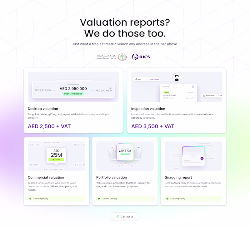
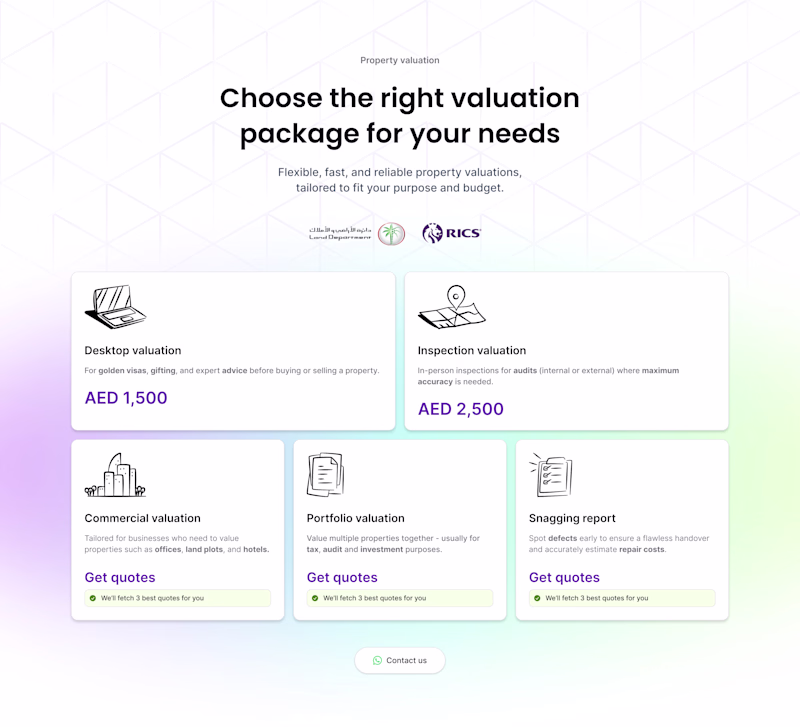
Both look great, but Section B is a winner if you're going for a more minimal, classic SaaS vibe. The line icons keep the focus purely on the pricing.
Option B looks cleaner!
The network for creativity
Join 1.25M professional creatives like you
Connect with clients, get discovered, and run your business 100% commission-free
Creatives on Contra have earned over $150M and we are just getting started
Related posts
This deserve more than just liking it, nice job brr
One last small update to my submission for the Config Makeathon!
The idea: ask real people for recommendations in the city they know best. 🌍
Beyond the recommendations from others that land on your Canvas, you can now add your own ideas and build a custom board too.
And from all the messy ideas that have made it onto your canvas, both yours and the ones recommended by others, you can now plan day trips. 🗺️
Just hold Shift to select the items you want to do in one day, then figure out how long it takes to get from one spot to the next and which mode of transport gets you there. 🚃
The app runs on Supabase in the backend. Summer's just around the corner and it's time to discover new places, so give it a try. ☀️
Link to Incola: https://vary-mac-30681003.figma.site
Here's the link to my main post: https://on.contra.com/qk9nLk
this is the perfect addition to a project like this, nice work!
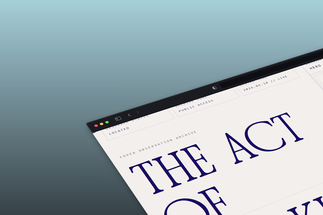
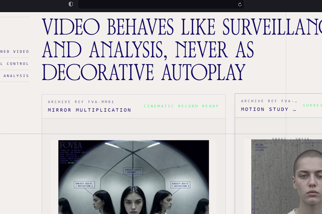
Built the FOVEA website.
Not a lookbook. Not a portfolio page.
An observation archive.
Every image has a reference number.
Every section has a field note.
The copy doesn't sell. It documents.
OBSERVER STATUS: LOCATED
ARCHIVE MODE: PUBLIC ACCESS
SYSTEM TIME: 2026.06.10 // LIVE
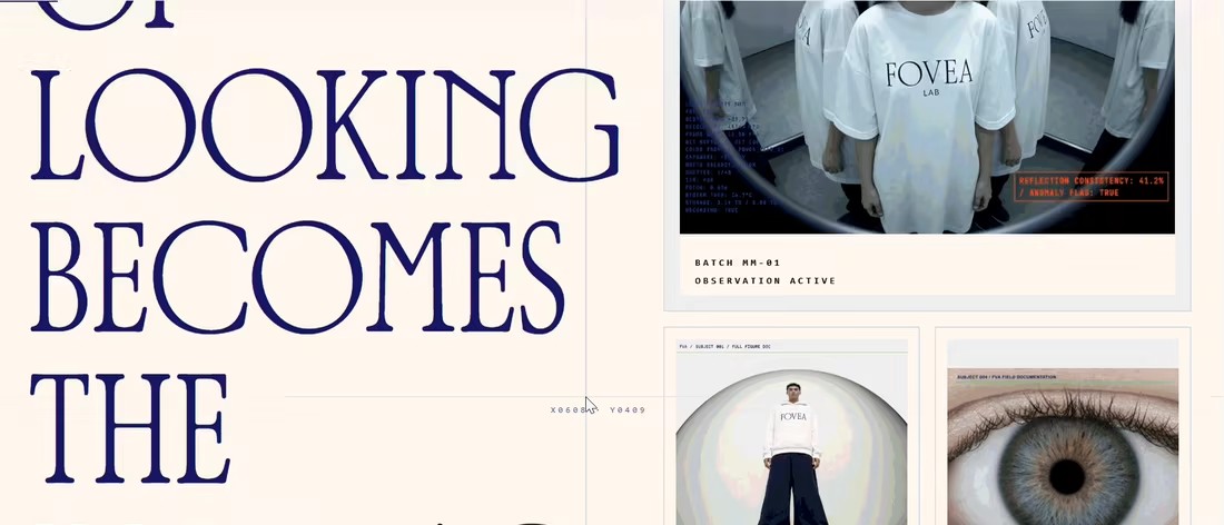
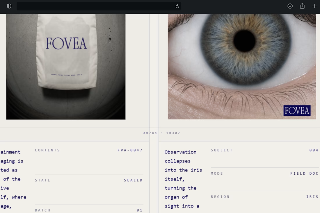
Just wanted to add as an optometrist, Fovea means the focus point of the eye. Great work!
Trending
Claude
Claude has entered the design space. How are you using Claude Design?
Contra University
Learn from expert creatives how to earn more using next-gen AI tools.
MagicPath
The canvas is infinite, and exploration is becoming the workflow. How are you using MagicPath?
creativeaiflow
Creative AI workflows are evolving. What tools do you use, and what are their strengths and weaknesses?
freelancerlife
Freelancer life is wins, pivots, and everything in between. What’s yours right now?