The network for creativity
Join 1.25M professional creatives like you
Connect with clients, get discovered, and run your business 100% commission-free
Creatives on Contra have earned over $150M and we are just getting started
Back to feedPost



The network for creativity
Join 1.25M professional creatives like you
Connect with clients, get discovered, and run your business 100% commission-free
Creatives on Contra have earned over $150M and we are just getting started







Related posts




I really like how the visual identity carries from the artwork into the website. The landscape makes the whole page feel distinctive without overwhelming the message.

Luxora Skincare Serum Packaging


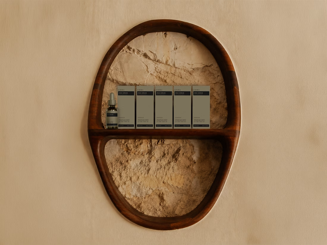
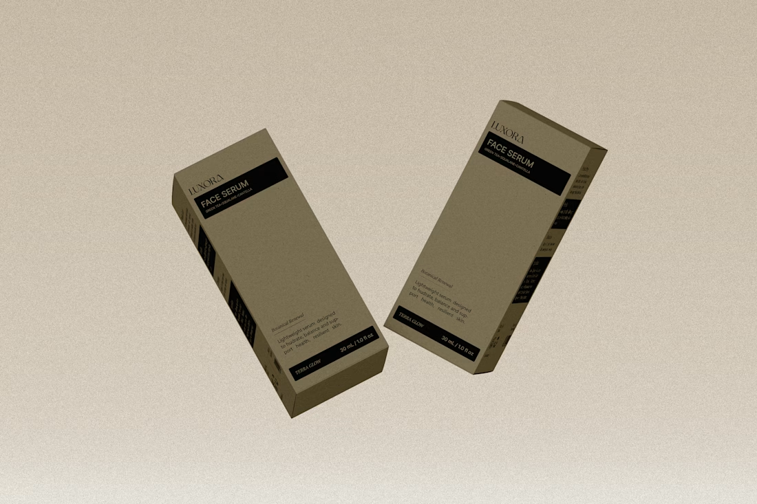
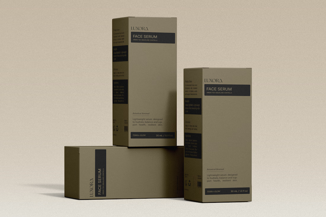
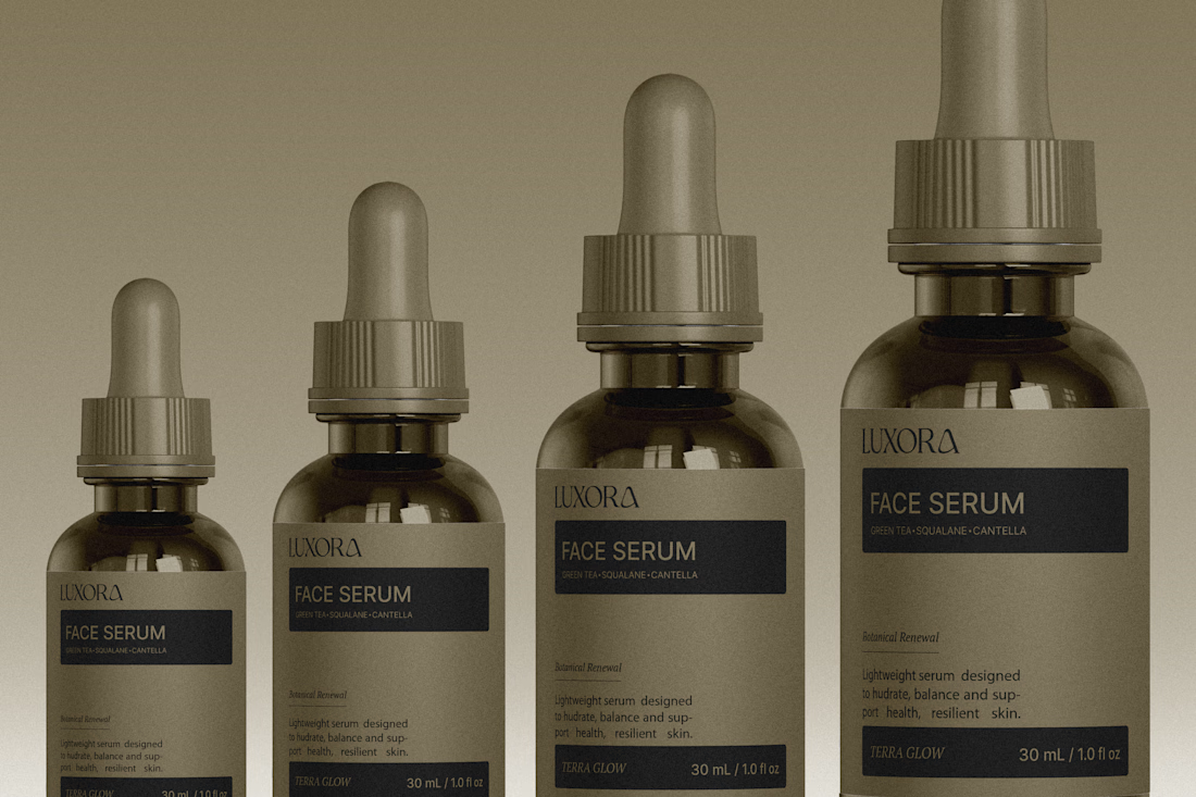

The olive droppers and FACE SERUM label stay in one calm palette, which is what makes the set feel expensive. The powder backdrop keeps it tactile instead of glossy-ad.