The network for creativity
Join 1.25M professional creatives like you
Connect with clients, get discovered, and run your business 100% commission-free
Creatives on Contra have earned over $150M and we are just getting started
Back to feedPost
MA Studio — What I Built
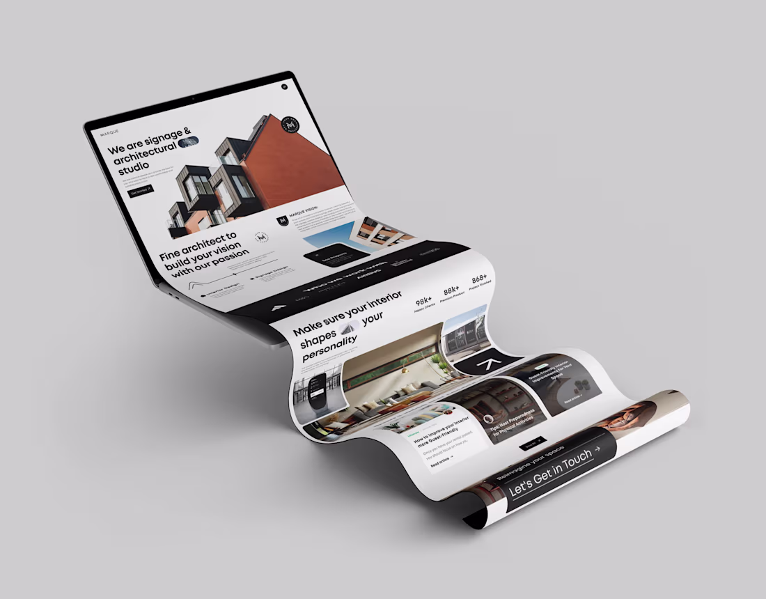
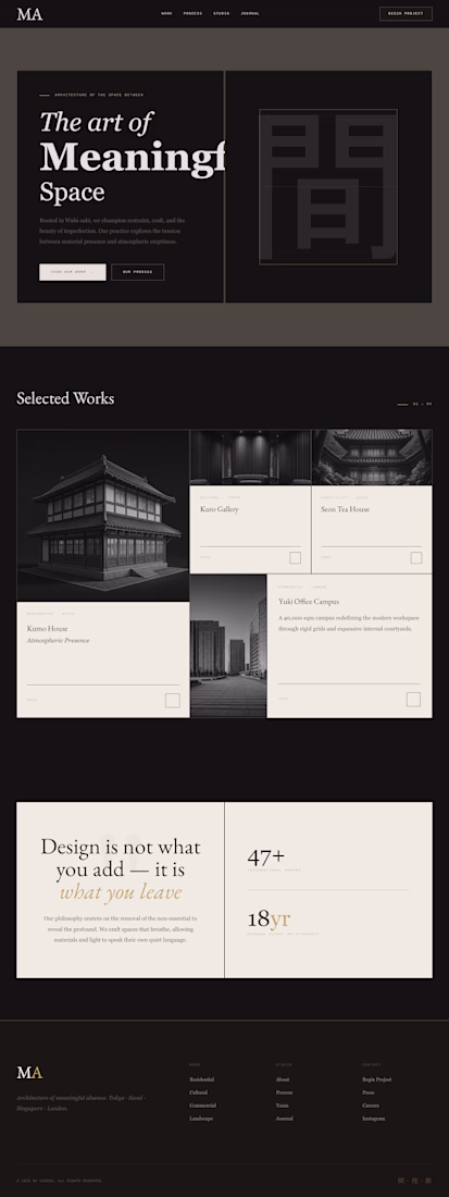
MA Studio is a luxury architecture studio website built around the Japanese philosophy of ma (間) — the idea that meaningful space lives not in what you add, but in what you leave out.
The design rejects every default web aesthetic: no gradients, no shadows, no rounded corners, no saturated color. Instead it uses a warm cream and charcoal palette with gold as a single restrained accent — the visual equivalent of a tea ceremony.
The homepage opens with a split-screen hero: editorial headline on the left, a slowly rotating geometric circle with a faint kanji watermark on the right. Below it, an asymmetric card grid presents the studio's work — one tall featured project anchoring the left, two compact cards and one wide horizontal card filling the right — each separated by 2px gaps, not margins, so the layout reads as one unified surface rather than a collection of boxes.
A full-width philosophy panel follows, dark ink on the left with the studio's manifesto, warm paper on the right with two oversized stat numbers. Then three service cards that invert completely to dark on hover. A centered testimonial. A four-column footer in deep charcoal.
Every detail is considered: the fonts stay light at weight 300, the body text breathes at 1.9 line-height, the labels are always monospace uppercase at 9px with wide tracking. The grain overlay at 3% opacity makes the screen feel like paper.
The result is a website that doesn't compete for attention — it earns it through stillness.
Brief Explanation : I started by writing a DESIGN.md file — a locked design system defining every color, font, spacing rule, and layout constraint before generating anything. I then used a 5-prompt zoom-out-to-zoom-in framework: the first prompt established the full page context, user, and layout hierarchy; each subsequent prompt refined one component at a time. To prevent Stitch from restructuring the layout during iteration, every refinement prompt began with "Keep all layout structure and DESIGN.md rules. Only change:" followed by a single targeted edit. The reference design was also uploaded as a visual anchor at each new session. The result is a fully resolved homepage — asymmetric card grid, philosophy panel, and service section — produced through disciplined prompting rather than lucky generation.
Feedback : 😍 Stitch is impressive at executing structured, well-defined layouts when given precise prompts — but it requires a different mindset than most AI tools. The biggest learning was that Stitch rewards preparation over improvisation: writing a DESIGN.md before generating anything was the single most effective technique for maintaining consistency across iterations. Without it, each refinement prompt risked destabilizing the layout structure entirely.
The zoom-out-to-zoom-in prompting framework worked well — starting broad with context and user intent, then narrowing to one component per iteration. Stitch responded significantly better to targeted single-edit prompts than to multi-instruction prompts, which often caused unintended structural changes.
The main limitation I encountered was with unconventional aesthetics. Stitch excels at clean, structured layouts but struggles when the design intent is deliberately ambiguous or anti-pattern. Switching to Experimental Mode (Gemini 2.5 Pro) produced noticeably more refined outputs for complex typography and spacing decisions.
Overall, Stitch feels like a junior designer who executes instructions literally and precisely — the quality of the output is almost entirely determined by the quality of the brief you give it.
Love the discipline behind this process. The DESIGN.md + zoom-in refinement approach really shows in the final result. The aesthetic feels incredibly intentional and refined.
View my entry for this challenge:
https://on.contra.com/pnfJBQ
Would love to hear your thoughts.
Thank you very much
The network for creativity
Join 1.25M professional creatives like you
Connect with clients, get discovered, and run your business 100% commission-free
Creatives on Contra have earned over $150M and we are just getting started
Trending
Claude
Claude has entered the design space. How are you using Claude Design?
Contra University
Learn from expert creatives how to earn more using next-gen AI tools.
creativeaiflow
Creative AI workflows are evolving. What tools do you use, and what are their strengths and weaknesses?
freelancerlife
Freelancer life is wins, pivots, and everything in between. What’s yours right now?
Related posts
Fayes Faerie Stories has been a true labour of love for myself and the client. As both illustrator of the children's book and designer of the website, it has been a pleasure to implement the beautiful and whimsical graphics into the website to continue the magical story online. It was also such a treat to use Squarespace's flexible system to craft a website that works with the magical and colourful illustrations and the characters within the books.
View the website here: https://fayesfaeriestories.com
• Finish Layer was used to animate the little fairies, having them appear and / or float in the viewing space, bringing a sense of whimsy and also drawing the eye to important areas of the website. It was also used sparingly on other areas to drop the book into the viewing space and feature key notifications about the launch of the book.
this is beautiful!
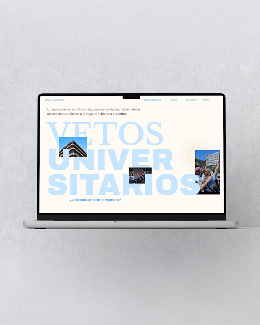
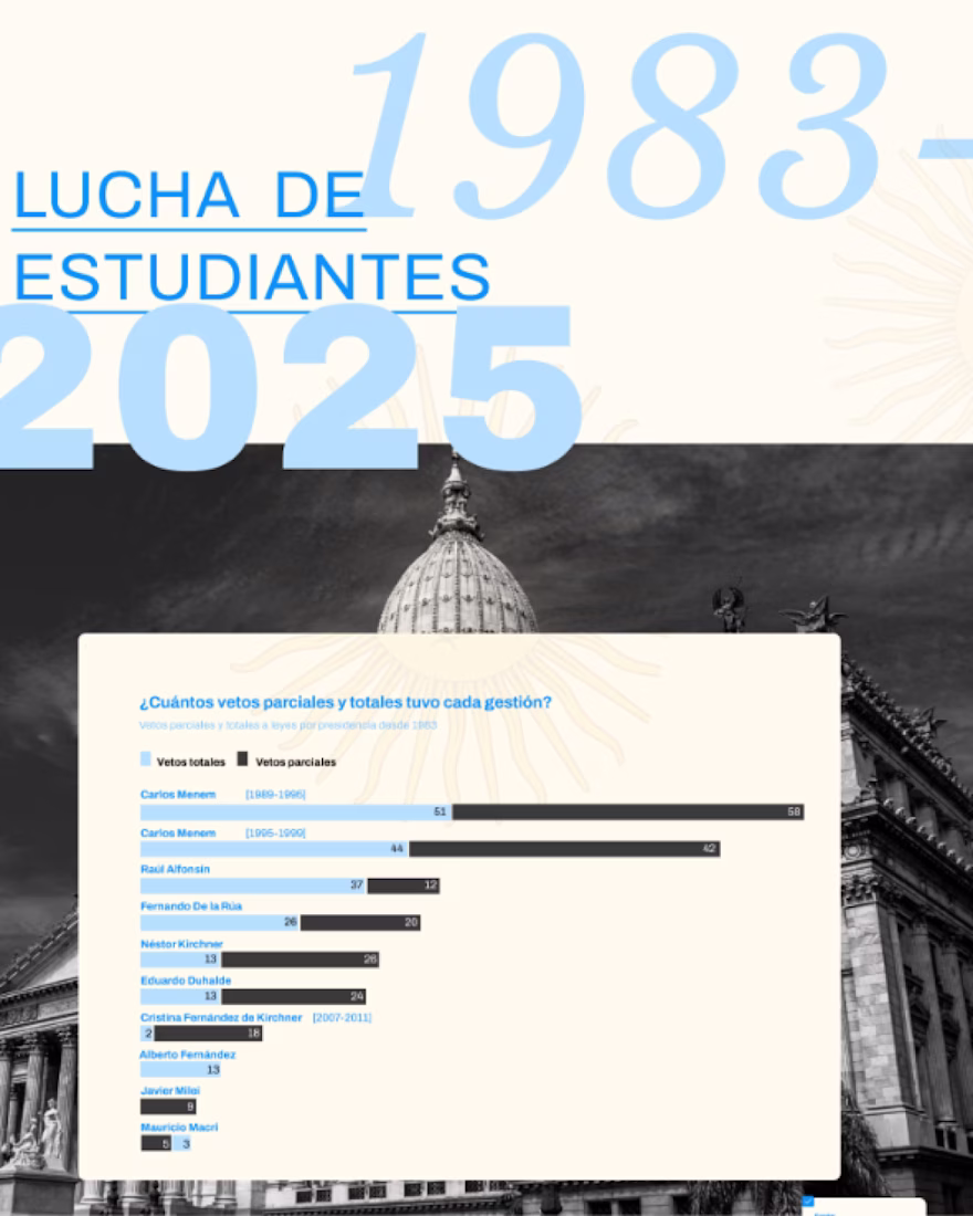
This web design explores the university vetoes that have taken place throughout Argentina’s history.
Education in Argentina is a fundamental right that must be protected. It represents the fight for equal opportunities, social progress, and the growth of society.
this is beautiful design! the color selections & how you highlight both bold & light blues makes for a really lovely presentation of important information, which serves it super well & is likely to lead to more people diving in.
Very creative presentation and nice designing!