The network for creativity
Join 1.25M professional creatives like you
Connect with clients, get discovered, and run your business 100% commission-free
Creatives on Contra have earned over $150M and we are just getting started
Back to feedPost
What Should Your Kajabi Homepage Look Like?
Your homepage does not need to say everything about your business.
It needs to help the right visitor understand your offer and take the next step.
Here is a simple structure I like:
1. Hero section
Tell visitors who you help and what result you provide.
2. The problem
Show that you understand what your audience is struggling with.
3. Your solution
Explain how your program, course, or service can help.
4. Your offer
Make it clear what people can buy or join.
5. Social proof
Use testimonials, results, or other trust signals.
6. About you
Help visitors understand why they should trust you.
7. Clear CTA
Tell them exactly what to do next.
The goal is not to add more sections.
The goal is to create a simple journey from:
“I found you.”
to
“I understand what you offer.”
to
“I want to take the next step.”
That is how I approach Kajabi website design.
Need help improving your Kajabi homepage?
Send me a message and let’s turn your homepage into a clearer experience for your visitors.
#KajabiExpert #KajabiWebsite #KajabiDesigner #CourseCreator #OnlineBusiness #WebDesign #SalesPage #Kajabi

The network for creativity
Join 1.25M professional creatives like you
Connect with clients, get discovered, and run your business 100% commission-free
Creatives on Contra have earned over $150M and we are just getting started

Challenges
View all


Related posts

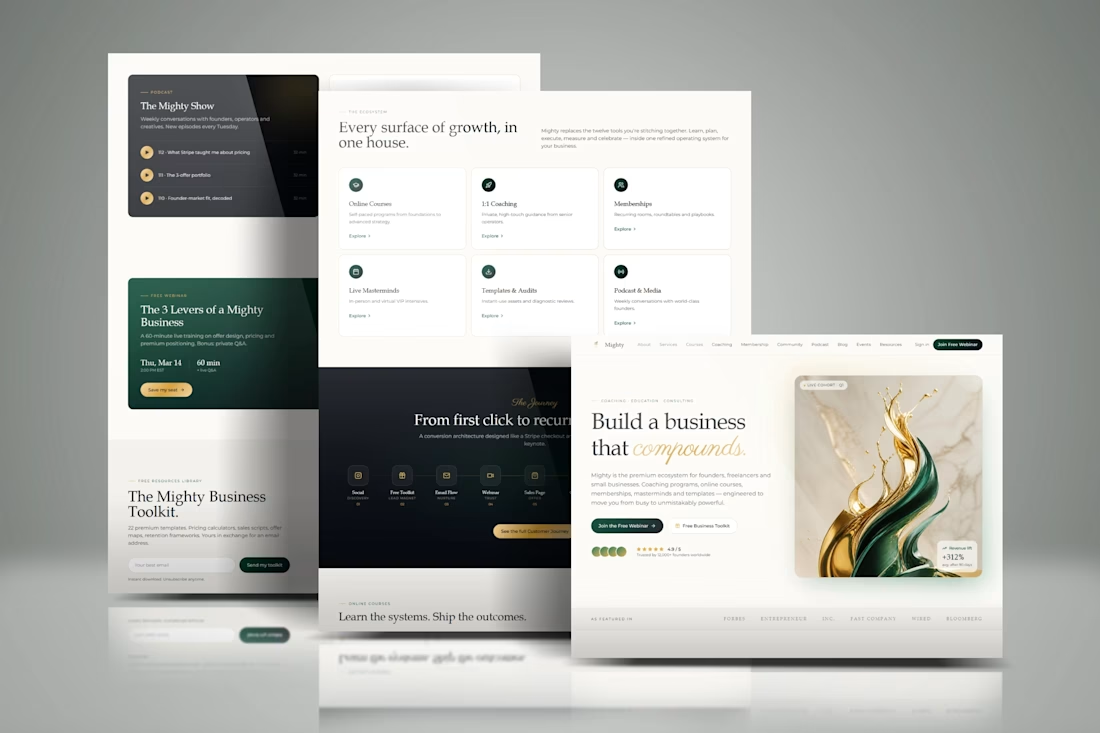
Another Kajabi build I am proud of.
The focus was to create a website that feels clean, professional, and easy to navigate while keeping the client’s brand at the center.
I worked on the page design, structure, user flow, and Kajabi setup to make the whole experience feel simple from start to finish.
No unnecessary sections.
No confusing navigation.
Just a clear experience built around the offer.
Got a Kajabi project you want to build? Let’s talk.
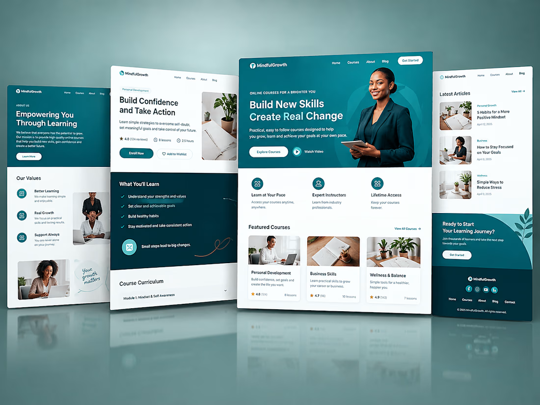


Kajabi isn’t just for hosting courses.
You can use it to build the entire customer journey , from the first landing page to the offer, checkout, email follow-ups, and even the client experience after purchase.
That’s what makes Kajabi powerful when it’s set up strategically.
A beautiful website is great, but the real value comes from having the pages, offers, automations, and customer journey working together.
I’ve been working with Kajabi to build and optimize websites, funnels, courses, and customer journeys for online businesses.
If you’re already using Kajabi but feel like you’re not getting the most out of it, there may be a lot of opportunities to improve what you already have.
#Kajabi #SalesFunnels #FunnelDesign #WebsiteDesign #OnlineBusiness

Kajabi Business Coach Website Design
The client needed a professional website that could clearly communicate their business coaching services, establish credibility, and give potential clients a simple path to learn more about their coaching programs.
The result was a polished Kajabi website with a clearer user journey, stronger presentation of the coaching services, and a professional online presence built around the client’s brand.
#responsivedesign