The network for creativity
Join 1.25M professional creatives like you
Connect with clients, get discovered, and run your business 100% commission-free
Creatives on Contra have earned over $150M and we are just getting started
Back to feedPost

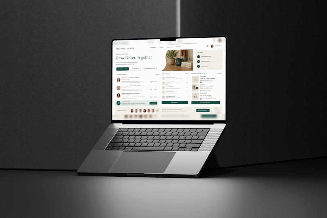
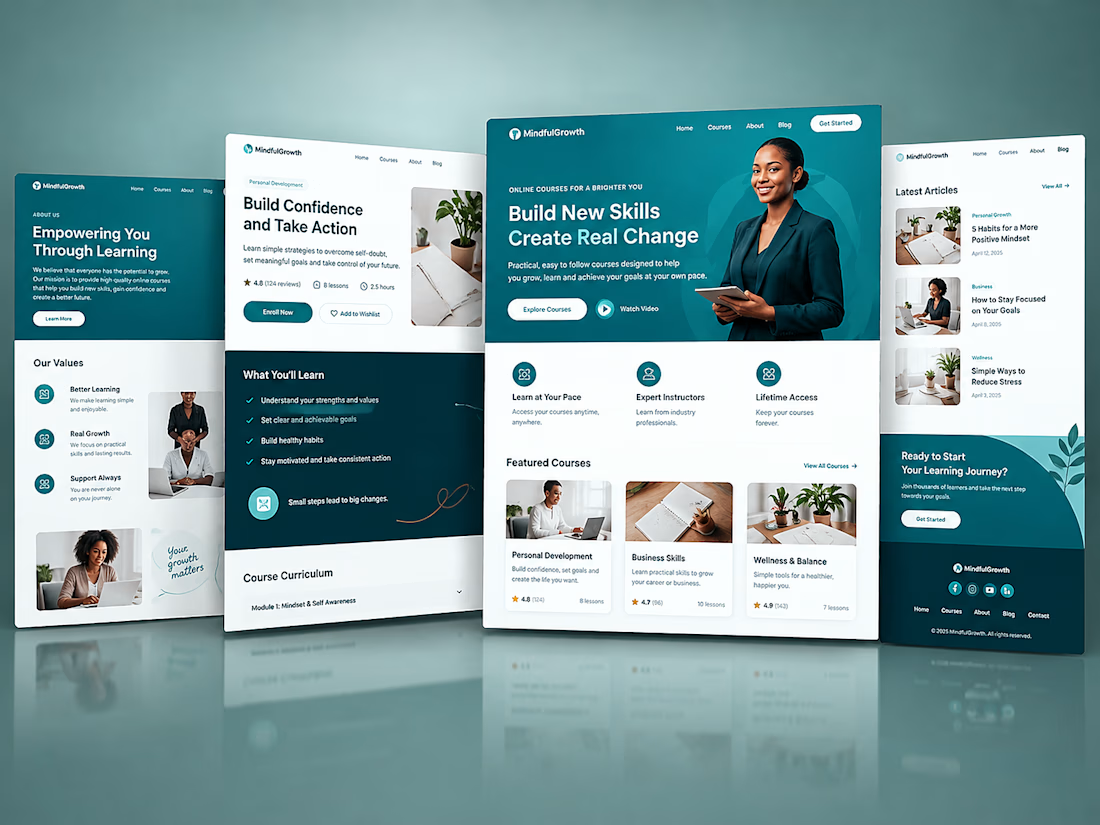
Another Kajabi build I am proud of.
The focus was to create a website that feels clean, professional, and easy to navigate while keeping the client’s brand at the center.
I worked on the page design, structure, user flow, and Kajabi setup to make the whole experience feel simple from start to finish.
No unnecessary sections.
No confusing navigation.
Just a clear experience built around the offer.
Got a Kajabi project you want to build? Let’s talk.

The network for creativity
Join 1.25M professional creatives like you
Connect with clients, get discovered, and run your business 100% commission-free
Creatives on Contra have earned over $150M and we are just getting started











Related posts


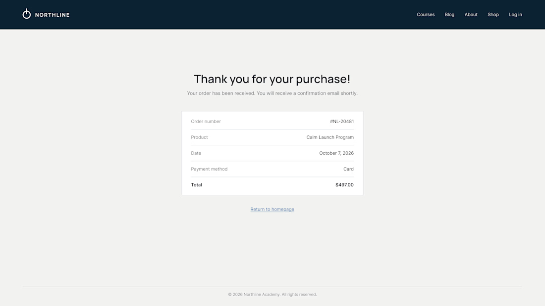
What does your customer see 3 seconds after paying?
On most Kajabi sites it's a plain "Thank you for your purchase" and a receipt. It's the moment of highest trust, and the page offers nowhere to go.
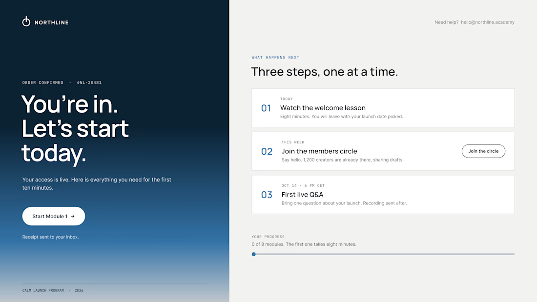
So we design the thank-you page as the first page of the course:
01 – One clear first step. "Start Module 1" sits above everything else. Momentum beats confirmation.
02 – A visible "what happens next". Today, this week, the first live call, with a calendar button. Clear dates calm the doubts that come right after paying.
03 – Proof they're in the right place. A link to the community, a human email they can reply to, progress at 0 of 8.
The receipt still lives in the inbox. It just isn't the headline.
Same brand, same colors. The only difference is where the page leads.
What did the last thank-you page you saw actually ask you to do?

Love the focus on making the experience feel simple for users.


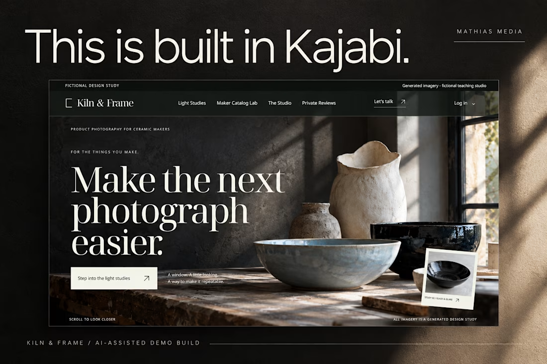
This is built in Kajabi.
Meet Kiln & Frame, a demo brand created to explore what a custom Kajabi website can look and feel like.
Editorial layouts. Rich imagery. Interactive details. And content that remains editable inside Kajabi.
Built through the AI-assisted process I’ve been developing and testing.
Pretty excited about this one.

love the editorial approach for kiln & frame. curious - how did you handle the image grids inside kajabi? i've struggled to make kajabi feel this custom without breaking the cms