The network for creativity
Join 1.25M professional creatives like you
Connect with clients, get discovered, and run your business 100% commission-free
Creatives on Contra have earned over $150M and we are just getting started
Back to feedPost

Depth: A Slow-Social Experiment
The Problem: Social feeds prioritize "clout" over nuance, creating a "Reaction Economy" where we respond before we understand.
The Solution: The Context Gate
Using Figma Make, I created a feed that rewards presence over mindless scrolling:
The Gate: Articles are blurred by default. Users must "Hold to Reveal," creating a physical commitment to the content.
Active Focus: As you hold, the text clarifies and a progress ring fills, simulating a mind focusing.
Mandatory Nuance: Unlocking reveals a "Perspective Shift", a mandatory counter-argument to break echo chambers.
New Metrics: Replaced likes with "Understanding Time" and a generative "Focus Heatmap."
Experience it here.
The network for creativity
Join 1.25M professional creatives like you
Connect with clients, get discovered, and run your business 100% commission-free
Creatives on Contra have earned over $150M and we are just getting started





Related posts

One problem. Two design directions. Which would you choose?
For AEGIS / 001.05 . Traffic Operations, we explored two approaches to the same challenge: helping city operators understand congestion, incidents and network-wide disruptions without overwhelming them with information.
Both solve the same operational problem. Different approaches to hierarchy and interaction.
If you were behind the control desk . Option A or Option B?
#smartcities #enterpriseux #productdesign #digitaltransformation #jemirae


1 voted
33%
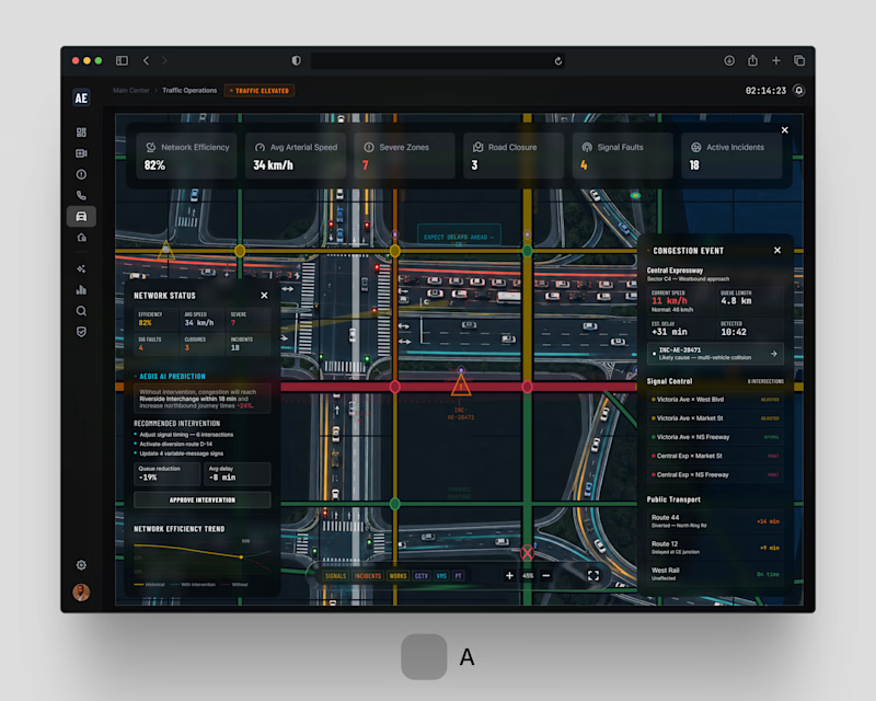
2 voted
67%
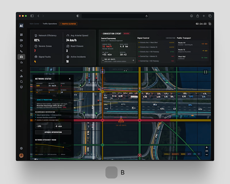
3 votes
Closed


Let me be your trusted Social Media Manager!
Send me a DM and let's grow together!!!


I’ve been working on a concept called Respira, focused on making breathing and recovery data feel easier to understand and less clinical.
The main challenge was not the visuals. It was deciding what the user should understand first. So I structured the experience around three things: current recovery, supporting health signals, and the next action. Recovery stays central, secondary metrics remain easy to scan, and the guided breathing session is always close enough to act on.
The interface and motion were created in Figma, with a lot of attention on hierarchy, data visualisation, component behaviour and micro-interactions. The goal was to make the product feel calm, responsive and useful, not just visually polished.
I’m sharing a short video of the interaction here. Would be interested to know which part of the experience stands out to you most.
#UXDesign #UIDesign #ProductDesign #Figma #InteractionDesign #HealthTech #DashboardDesign #UXUI
