The network for creativity
Join 1.25M professional creatives like you
Connect with clients, get discovered, and run your business 100% commission-free
Creatives on Contra have earned over $150M and we are just getting started
Back to feedPost
Best way to tank conversions that were coming your way?
👇

An unoptimized landing page with
>3 sec load times.
Unclear CTA.
Solution before the problem.
The network for creativity
Join 1.25M professional creatives like you
Connect with clients, get discovered, and run your business 100% commission-free
Creatives on Contra have earned over $150M and we are just getting started





Related posts

My standard process of creating products:
- Research, planning and strategy
- Foundation and flows
- Sketches or wireframes (optional)
- High fidelity designs
- Build (if needed) 🚀


After making my first $1K on @contra, I just hit the top 1% of creatives.
Want a higher visibility score?
• Complete your profile
• Add 3+ strong projects
• Add 2+ services
• Get client recommendations
• Stay active and responsive
• Keep your work fresh
Don’t just create a profile and wait for clients.
Build it. Stay active. Get seen.




more wins bro I dey with you🫵😎

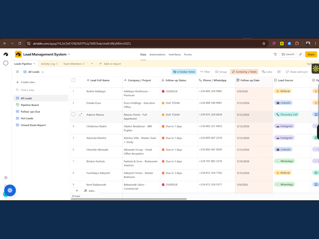
A growing business was losing sales opportunities because leads were scattered across multiple channels with inconsistent follow-ups and no pipeline visibility.
I designed a centralized Airtable Lead Management System to organize leads, track follow-up status, prioritize opportunities, manage pipeline stages, and improve team visibility.
The result was a structured sales workflow, faster follow-ups, improved lead accountability, and a scalable CRM system that reduced operational confusion and supported higher conversion rates.