The network for creativity
Join 1.25M professional creatives like you
Connect with clients, get discovered, and run your business 100% commission-free
Creatives on Contra have earned over $150M and we are just getting started
Back to feedPost

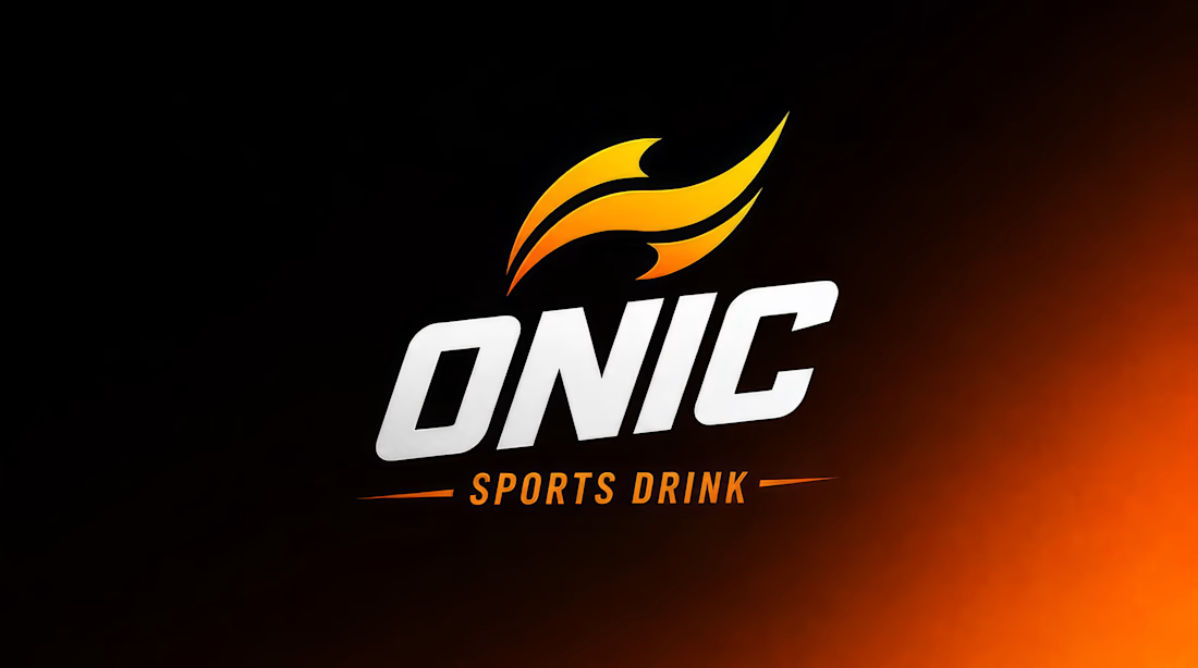
ONIC, Building Confidence You Can Actually Taste
For this project, I built ONIC, a sports energy drink brand centered on a single belief: confidence isn't handed to you, it's fueled from within.
I noticed most energy drink brands sell the same promise — hype, adrenaline, extreme stunts — but rarely the quiet moment of doubt that comes right before someone actually takes the leap. I wanted to build a brand that lived in that in-between moment, where hesitation turns into action.
Creative Direction
I started with the mark itself: a flame motif reduced to its simplest form, two curved streaks instead of anything overly literal like a lightning bolt or a muscle icon. Every choice after that — the can design, the ad sequence, the tagline — got measured against one question: does this still feel like quiet resolve, or is it sliding into generic "extreme sports" noise?
Using Envato
Envato powered the entire build.
・GraphicsGen for the flame mark and can label exploration
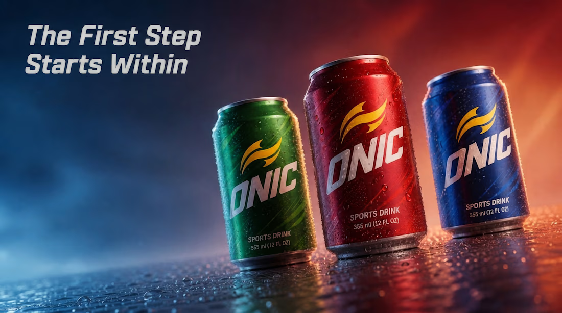
・ImageGen for the product renders — the three-can lineup, studio shots, background concepts
・VideoGen for the ad sequence across the three athletes
・Figma to assemble the final system and refine what AI left rough
Human by Design
The can design took the most rounds. Early AI concepts looked sharp but generic, indistinguishable from any other sports drink on a shelf. I kept refining the prompts and rejecting outputs until the flame mark felt calm instead of loud, confident instead of aggressive.
That same instinct carried through the ad. My first video drafts kept drifting toward the same clichés this category always leans on: energy drink as the reason someone becomes brave, instead of something that simply stands beside them while they find their own courage. I kept steering it back — reworking the beats where the athletes receive the can, softening the framing so the drink never claims to cause the bravery, only to accompany it.
None of these decisions came from a single prompt. They came from knowing exactly what ONIC was supposed to feel like, and rejecting anything — however polished — that missed that feeling.
Created using Envato. Tools used: GraphicsGen, ImageGen, VideoGen.
I didn't want a drink brand that told you it makes you fearless. I wanted one that simply stood there when you found the courage yourself.



Impressive 👏


Great

What stands out to me is the restraint. Instead of following the typical "more energy, more intensity" direction, you built a brand around a genuine human emotion. That level of creative discipline is what gives a brand a distinct identity. Really well thought out.
The network for creativity
Join 1.25M professional creatives like you
Connect with clients, get discovered, and run your business 100% commission-free
Creatives on Contra have earned over $150M and we are just getting started







Related posts


Marigold was a one-day concept for a design challenge. I set the direction in real photography before generating anything.
That order matters more than people think. If you generate first, you're negotiating with whatever the model offers. If you shoot or choose real references first, you've set a standard the rest of the work has to meet.
The tool didn't set the taste. It matched a bar that already existed.

Great work!, love the colors
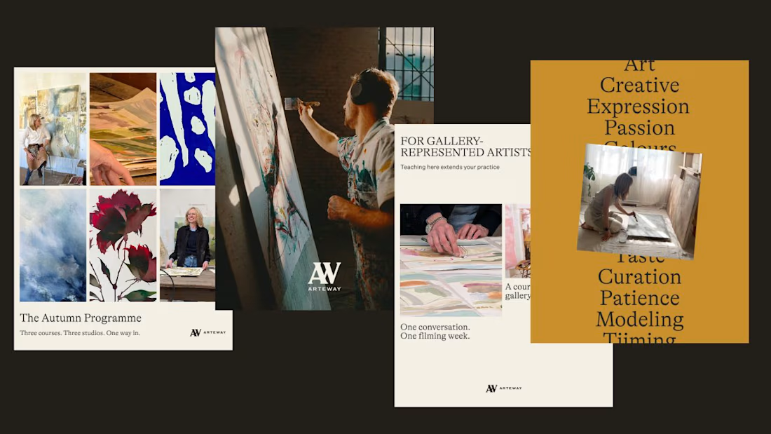
Arteway sells access to how working artists actually think. That's a hard thing to hold onto once you're at 15,000 students across 50-plus countries.
The risk with education platforms at that size is that the intimacy gets designed out. Everything gets standardized until it reads like a textbook with better photography.
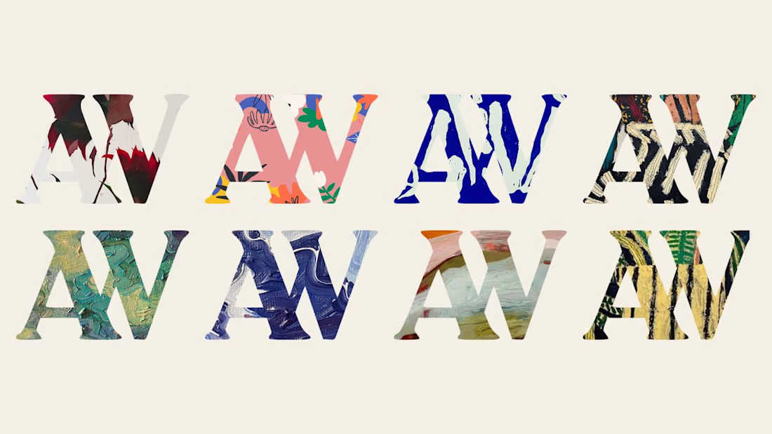
So the identity leans on the work itself. High-contrast type, a frame that behaves like a studio window, and enough restraint to let a canvas stay a canvas.
Scale doesn't have to flatten a brand. It just makes the original intention harder to protect.
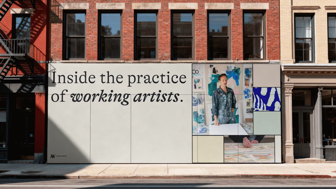
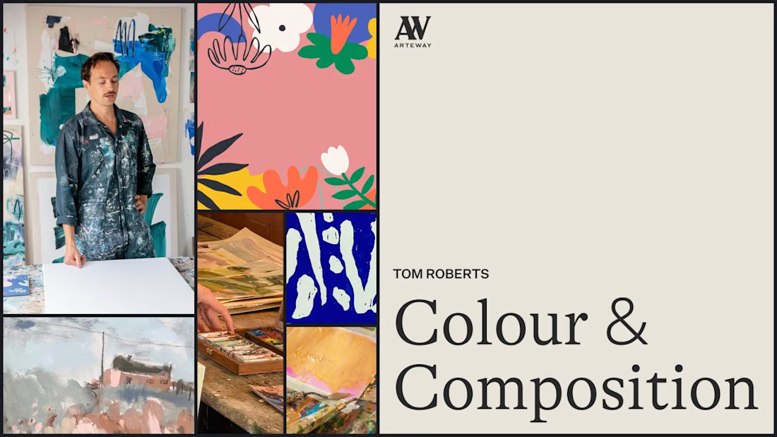

The intimacy usually dies in the product layer before it dies in the identity. At 15k students you are not writing copy anymore, you are deciding how many people share a cohort, how often the platform speaks to them, and whether the feedback loop runs through a human or a...

A new visual identity for Reroll.
We turned the O in the name into a die and built the wider brand language around that simple idea.
The project includes:
• Logo design
• Social media identity
• Logo animation
• Custom playing card back
• 3D visual assets
Creative direction: Dmitry Lepisov
Identity design + motion: Arthur Skripnik
Created by Lepisov Branding
Some of the 3D visuals and animation were made in Spline.


