The network for creativity
Join 1.25M professional creatives like you
Connect with clients, get discovered, and run your business 100% commission-free
Creatives on Contra have earned over $150M and we are just getting started
Back to feedPost


The network for creativity
Join 1.25M professional creatives like you
Connect with clients, get discovered, and run your business 100% commission-free
Creatives on Contra have earned over $150M and we are just getting started



Related posts

A few months ago I got to work with Coderhouse, one of the leading education brands in Argentina, and the place where I took several courses myself.
So this one feels like a full circle. A brand that shaped my career and helped me grow as a designer, and now I got to design for it.
The funny part is Chris had no idea I was a former student when he reached out. I was really happy when that message came in.
I built a visual system for their 60+ course covers, made so their team can keep producing them on their own. Today it lives across their app, website and Meta ads.
Thanks Chris for trusting my work and for the opportunity 🧡 And thanks @Contra HQ for making connections like this one possible.


Felicitaciones Jere! muy bueno el proceso y el resultado final

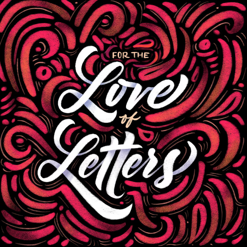
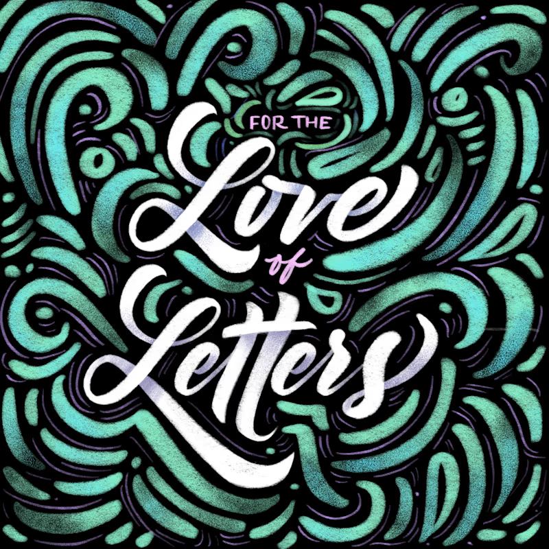
Same lettering, two color directions. Which one would you pick?
I got nostalgic this week looking at this lettering design. About 8 years ago I was deep into it and drew every day. Little by little I lost that rhythm, and now I only do it once in a while for gifts and small things.
Back then I could spend a lot of time choosing colors and comparing options. A taste test like this would have saved me so much time. 😅 I keep wondering how much I would have improved if I had never stopped practicing.
Is there something you used to practice a lot and would love to get back to? I had my lettering, illustration AND tufting phase.
17 votes
Ends in 1d