The network for creativity
Join 1.25M professional creatives like you
Connect with clients, get discovered, and run your business 100% commission-free
Creatives on Contra have earned over $150M and we are just getting started
Back to feedPost

Vestris — from ratified contract to closing-ready, on autopilot
Just wrapped one-week sprint designing the landing page for Vestris, a YC S26 startup automating mortgage title & closing work. Sharing the process because a few things about it were genuinely different from a typical SaaS landing page project.
The brief
Vestris automates the unglamorous middle of a real estate closing — chasing documents, prorating taxes, drafting closing disclosures, coordinating between lender/agents/title company. The founder wanted the site to feel "homey," not like enterprise software — because the buyers here are mom-and-pop title companies, not enterprise IT departments.
Process
2 hero concepts tested in parallel (a quieter parenthetical headline vs. a bold full-width one), each with copy variants, sent as a single comparison sheet rather than one "final" direction — let the founder react to real trade-offs instead of guessing what I meant.
Redesigned the site's core interactive block — an 11-step "how it works" breakdown — three separate times based on live feedback: first a desktop accordion, then a mobile-specific pass (accordions don't compress well under ~380px), then a full restructure into a 2×2 grid after the client flagged the original zig-zag layout for being "repetitive and too long to scroll."
The illustrated hero background (watercolor countryside, cottage) needed to dissolve into the brand's cream background at the edges — but a standard blur/gradient looked flat next to the painterly art style. Built a small custom tool (canvas + JS) that applies ordered Bayer dithering to fade the illustration into the background color pixel-by-pixel instead of blending — it reads as grain, not gradient, and matches the hand-painted texture instead of fighting it. Turned it into a reusable tool with adjustable fade area, blur radius, dot size, and a transparent-overlay export, so it's not a one-off script.
Figma for design, Framer for the build, custom canvas/JS tooling for the image-edge treatment, Midjourney for the base illustrations.
vestris.ai — live now.


I honestly clicked because I saw your name. The process was just as interesting as the final result.
Thank you!


Looks amazing

Love the process breakdown. That Bayer dithering tool you built to fade the watercolor edges into the cream background is so clever Since you turned it into a reusable script are you thinking about releasing it publicly?
The network for creativity
Join 1.25M professional creatives like you
Connect with clients, get discovered, and run your business 100% commission-free
Creatives on Contra have earned over $150M and we are just getting started
Trending

Claude
Claude has entered the design space. How are you using it?

Contra University
Learn from expert creatives how to earn more using next-gen AI tools.
Brand Design
The best brand designers are on Contra. Scroll to see what's trending in brand design. What are you building?
creativeaiflow
Creative AI workflows are evolving. What tools do you use, and what are their strengths and weaknesses?
freelancerlife
Freelancer life is wins, pivots, and everything in between. What’s yours right now?





Related posts
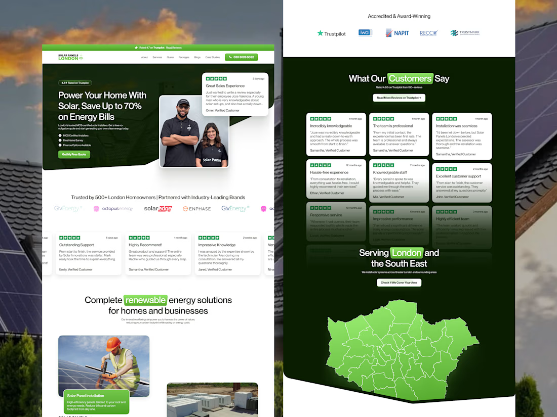
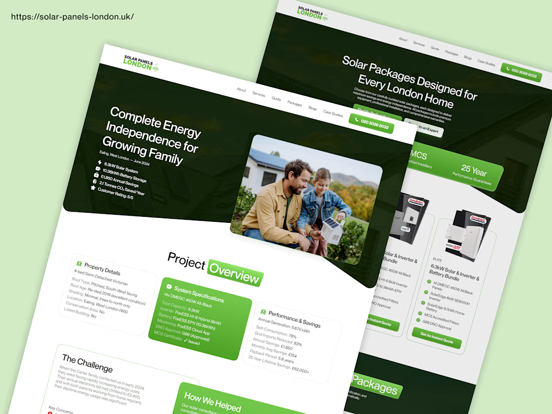
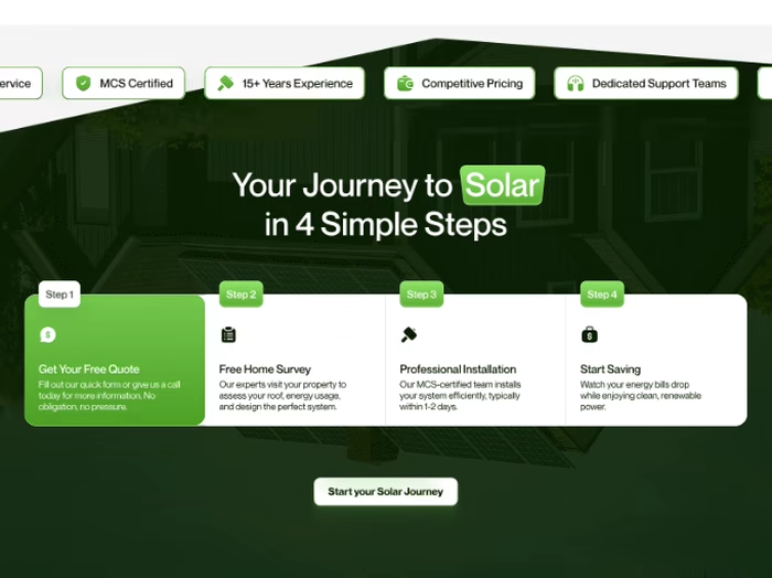
Check out this website redesign I did for Solar Panels London.
I started with Figma to plan the design. Then I built the website in Framer. After that, I did full SEO so the website can rank better on Google and get more solar customers.
This is how I help solar companies get more leads online through good design and SEO.


Amazing Design


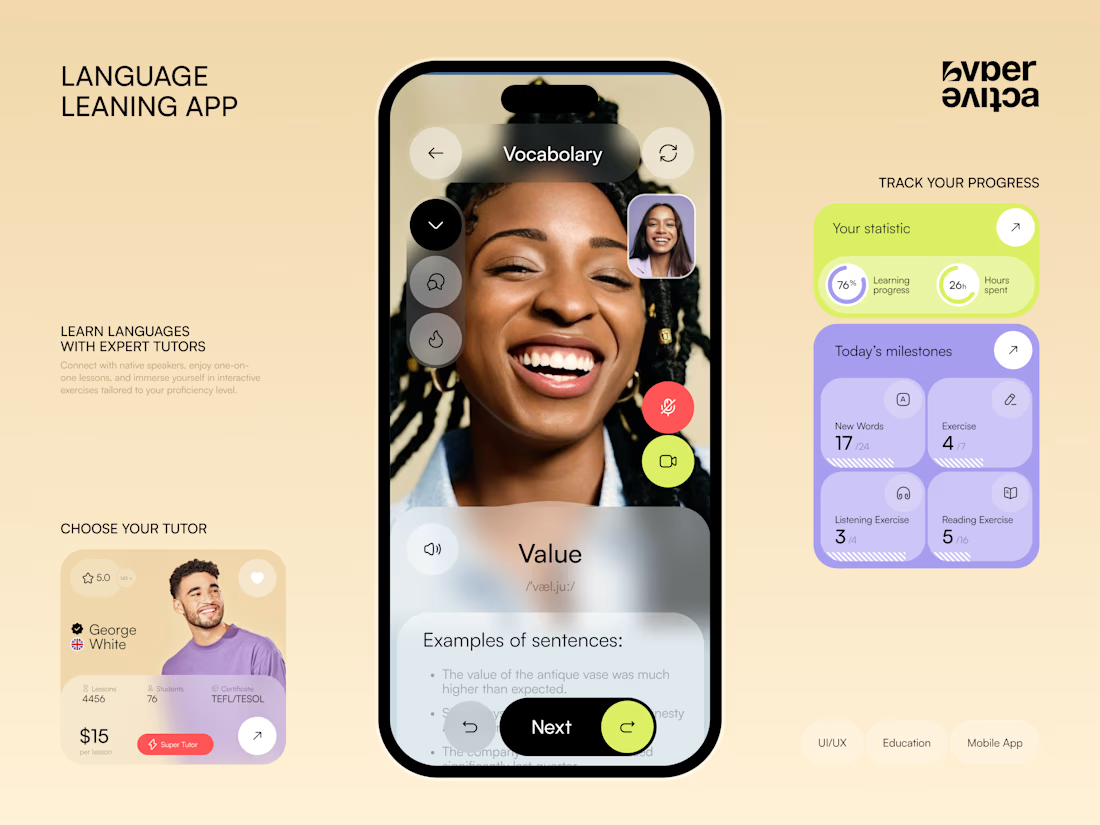
Just posted a new concept for language learning platform 📚 Share your feedback 😊


Looks super clean and sets apart from them other apps, nice work.


Can the same prompt start feeling like you? 🥸
I'm not a fan of long, super-specific prompts, and much more interested in building systems where my vision lives naturally in every single image. So I'm pretty picky about creating personal styles for each of my projects
Sometimes one sref is enough, sometimes it takes a combination of a few, and sometimes I need a whole moodboard
Personalization used to feel like the most inconvenient option because I had to go through hundreds of image pairs, which took me daaaays. But apparently the whole thing has been redesigned in 8.2 and now all the images are shown in one even grid, and you need to choose waaaay fewer to get a really good result!
So in case you've been avoiding Midjourney personalization too, you can probably stop now 🎉
✦
In the video: my style for aftrglo compared to the default generations
Love it sooo much, my current favorite❤️🔥
Drop a prompt in the comments (even one word hehe) and I'll send you the image it creates🙌

The 8.2 grid change sounds like a genuine quality of life fix, hundreds of pairs down to one grid. Curious what tips you off that a single sref isn't going to cut it and you need the whole moodboard instead, is that decided project by project or do certain aesthetics just always need more scaffolding?