The network for creativity
Join 1.25M professional creatives like you
Connect with clients, get discovered, and run your business 100% commission-free
Creatives on Contra have earned over $150M and we are just getting started
Back to feedPost

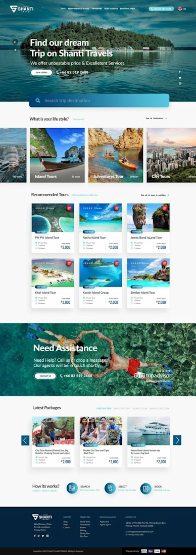
Travel Website Design – Inspiring Adventures & Easy Bookings
This travel website was designed to help travelers discover destinations, explore tour packages, and book their next adventure with confidence. The focus was on creating a visually engaging and user-friendly experience that makes trip planning simple and enjoyable.
With modern layouts, clear navigation, and conversion-focused booking sections, the website helps the brand attract more visitors and turn travel inspiration into real bookings.
The result is a responsive, professional travel website that combines stunning visuals with a seamless user experience.
#TravelWebsite #WebDesign #TourismDesign #UIUXDesign #WordPress #TravelAgencyWebsite #ResponsiveDesign #WebsiteDesigner #ModernWebDesign #PortfolioProject #ContraCreator


The network for creativity
Join 1.25M professional creatives like you
Connect with clients, get discovered, and run your business 100% commission-free
Creatives on Contra have earned over $150M and we are just getting started





Related posts

Same prompt. Two builders.
One site made with Lovable, one with Google AI Studio. A Flemish still-life snack brand, gilt frames, GSAP scroll, the works.
Which one is better?
33 voted
67%

16 voted
33%

49 votes
Closed

A few things we’ve been working on this month.
Different industries, different problems, but the same goal: making complex products feel simple, clear, and trustworthy.
Fintech → Investment Banking → Geospatial AI
More projects are still in progress.
Full case studies coming soon.






This is the kind of work I enjoy seeing — simple, focused, and actually thought through.

Hi Contra 👋 I'm Victoria, a website designer and architecture student in Buenos Aires.
Architecture taught me to think about light, material and how people move through a space. I bring the same thinking to websites.
To practise, I designed four concept sites for brands that don't exist (yet):
✦ Maison Ardent, a Parisian perfume house
✦ Oxblood Records, an indie record label
✦ Fuego Lento, a parrilla in Palermo
✦ Kōra Atelier, a ceramics studio in Kyoto
Each one started from a full brief, as if the client were real.
Now I'm taking my first commissions: custom landing pages in Figma, desktop and mobile, from $30.
Portfolio: https://victoriadiaz-studio.netlify.app
Which of the four would you want to see in detail next?
