The network for creativity
Join 1.25M professional creatives like you
Connect with clients, get discovered, and run your business 100% commission-free
Creatives on Contra have earned over $150M and we are just getting started
Back to feedPost

Exploring hero image directions for our EEG research lab.
Calm subject.
Neutral environment.
Signal-focused composition.

The network for creativity
Join 1.25M professional creatives like you
Connect with clients, get discovered, and run your business 100% commission-free
Creatives on Contra have earned over $150M and we are just getting started



Related posts

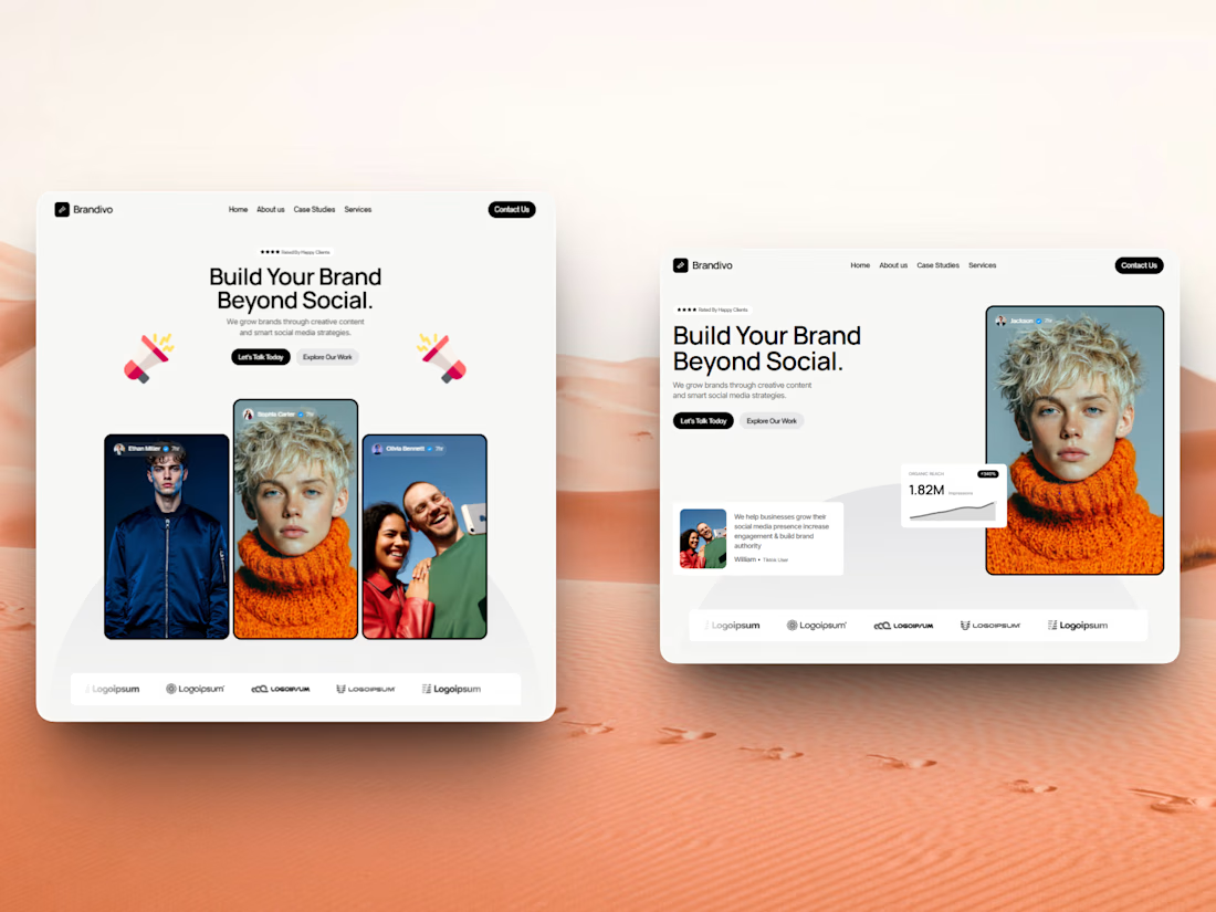

I'd pick the right one. The headline and image split is cleaner and the stats card gives proof right away, the left feels busier with three portraits. Is this template for Webflow?

Designed a hero section for NorthLine, an AI revenue intelligence platform 🚀
The challenge: make a complex, data-heavy product understandable in seconds.
What I did:
• One clear promise in the headline: “Stop guessing your revenue. Start seeing it.”
• Put the real dashboard front and center, so visitors see the product, not just read about it
• Dark UI with a vibrant green accent to signal trust and precision
• One focused CTA to drive demo requests
#WebDesign #SaaSDesign #LandingPageDesign #UIUX #Figma #WebDesigner #Contra


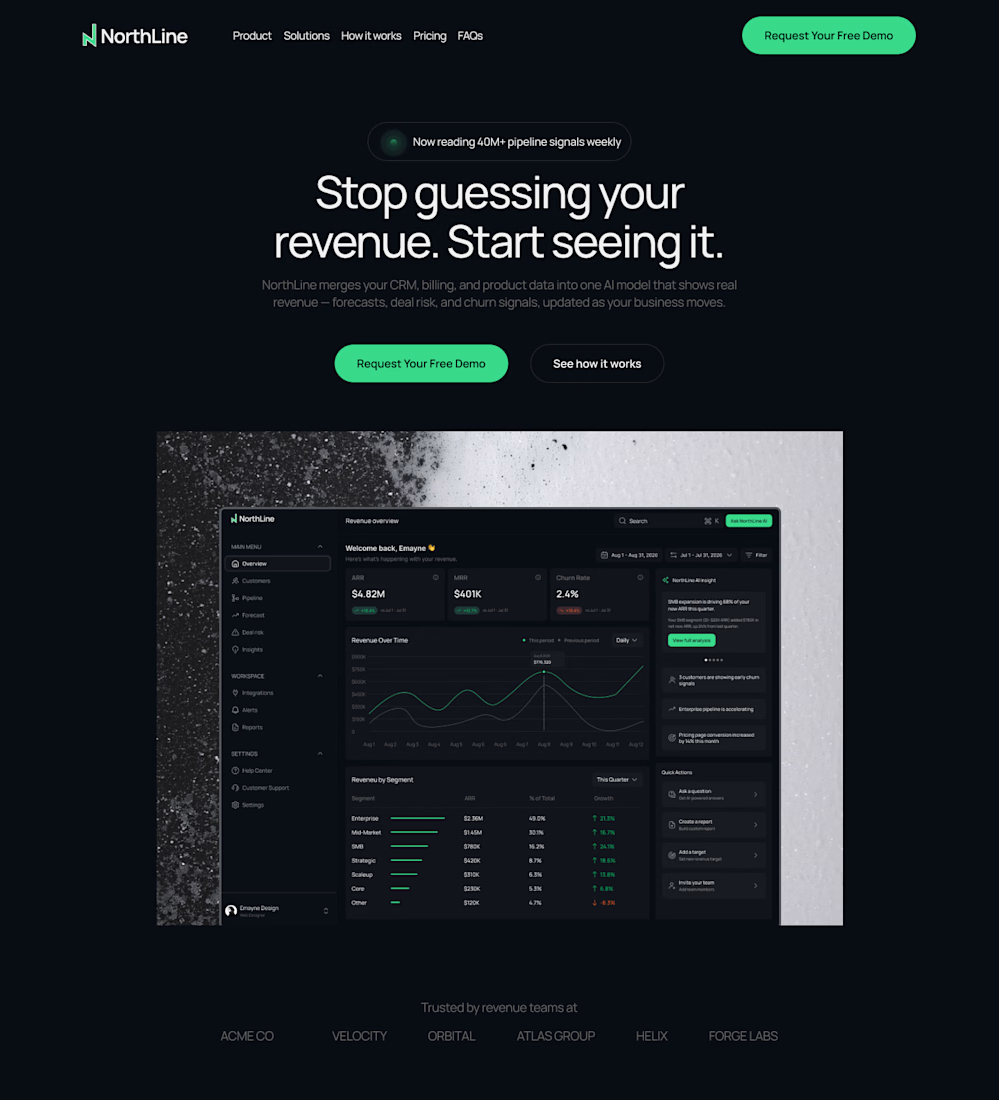

Dark UI with green accent looks striking

Project Title: Five in sync
Description:
An experimental 10 second motion loop examining light dispersion, translucent textures, and continuous gallop mechanics. Designed to showcase how organic, high-energy movement interacts with prism-like illumination and digital glow.


