The network for creativity
Join 1.25M professional creatives like you
Connect with clients, get discovered, and run your business 100% commission-free
Creatives on Contra have earned over $150M and we are just getting started
Back to feedPost
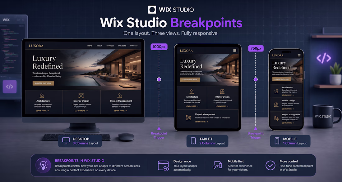
Headline: Mastering Fluid Responsiveness: How I Build Luxury Layouts in Wix Studio 💻✨
When building premium web experiences, responsiveness isn't just about resizing—it's about intentional layout adaptation.
In this guide/infographic (image_326300.jpg), I break down exactly how I structure breakpoints in Wix Studio to ensure custom, high-end designs remain flawless across all viewports:
Desktop Layout (>1000px): Utilizing an expansive 3-column grid system to maximize visual impact and showcase premium branding elements.
Tablet Layout (768px - 1000px): Seamlessly shifting the grid structure into a balanced 2-column layout to maintain clear readability and UI balance.
Mobile Layout (<768px): Stacking components vertically into a single-column layout optimized for tap targets and smooth thumb-scrolling.
The network for creativity
Join 1.25M professional creatives like you
Connect with clients, get discovered, and run your business 100% commission-free
Creatives on Contra have earned over $150M and we are just getting started
Related posts
Title:
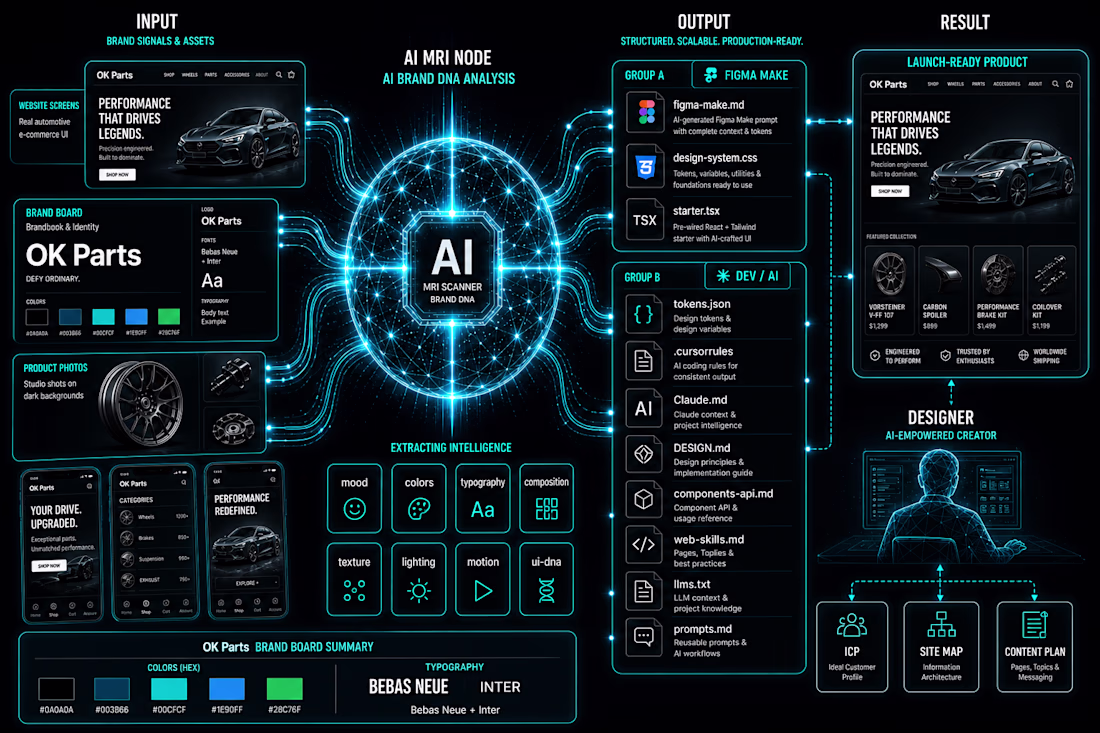
I built a design system generator inside Figma Make. Here's the workflow.
The problem I kept running into: every new client project meant re-explaining the brand to every AI tool from scratch. Figma Make didn't know the colors. Cursor didn't know the tokens. Claude didn't know the rules. I was the shared memory — and I kept losing things.
So I built Design System Gen. Entirely inside Figma Make. Powered by Claude API.
The workflow:
Upload brand references → Claude API analyzes them across 8 dimensions (palette, mood, typography, composition, lighting, texture, motion, UI DNA) → structured data, not vibes → generates 11 files, each formatted for a specific tool in your stack.
figma-make.md → paste once, Figma Make knows your entire design system
design-system.css → all tokens as CSS custom properties
tokens.json → W3C format, imports directly into Figma Variables
starter.tsx → React starter with tokens already bound
.cursorrules → Cursor knows your system from root
Claude.md → Claude reads it automatically every session
+ 5 more for docs, LLMs, prompts, components
Every tool gets its own context file. All consistent with each other.
The part I'm most proud of: I'm a designer. I don't write code. The entire tool — UI, API integration, file generation logic — was built and shipped inside Figma Make. No external hosting. No separate codebase.
Live at: vibecodingdsgen.figma.site
Add your Claude API key and try it with your own moodboard.
#FigmaMake #DesignSystem #VibeCoding #AI #Claude #UXUI #DesignSystems #ConfigMakeathon
As someone who constantly jumps between Figma, Claude, ChatGPT, Cursor, Lovable, and other AI tools, this problem feels very familiar 😅
The tools are getting smarter, but keeping context consistent is still surprisingly manual. Love seeing people tackle that gap.
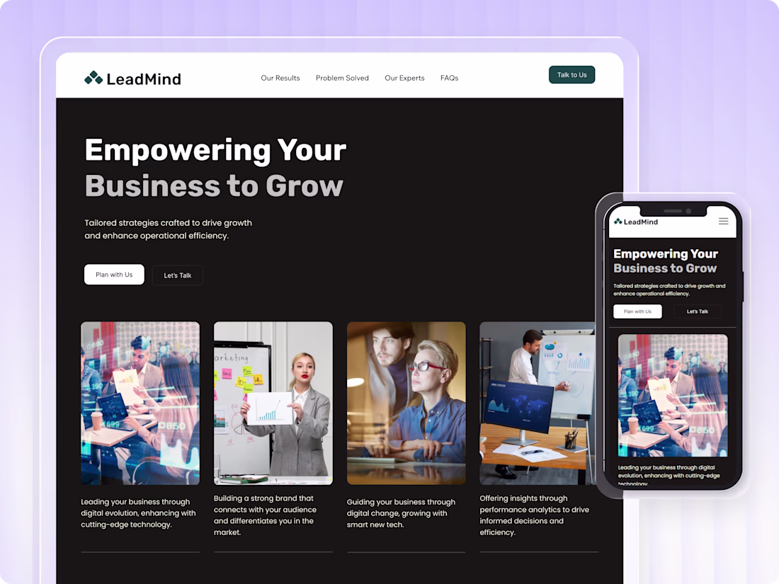
LeadMind is a custom, clean, and professional business consulting Landing Page template built on Wix Studio. Perfect for consulting firms, business coaches, and strategy agencies.
It has everything you need to build trust and get more clients. A bold hero section, services overview, results and stats, meet the experts, client testimonials, FAQ, and a contact form. Just swap in your own content, photos, and brand colors, and you're ready to go. Looks great on all devices.
Sections included: Hero · Why Choose Us · Our Results · Services · Meet the Experts · Testimonials · FAQ · Contact Form
Services: Vision Driven Strategy · Corporate Identity · Creative Solutions · Operational Strategy · Business Evolution · Digital Innovation
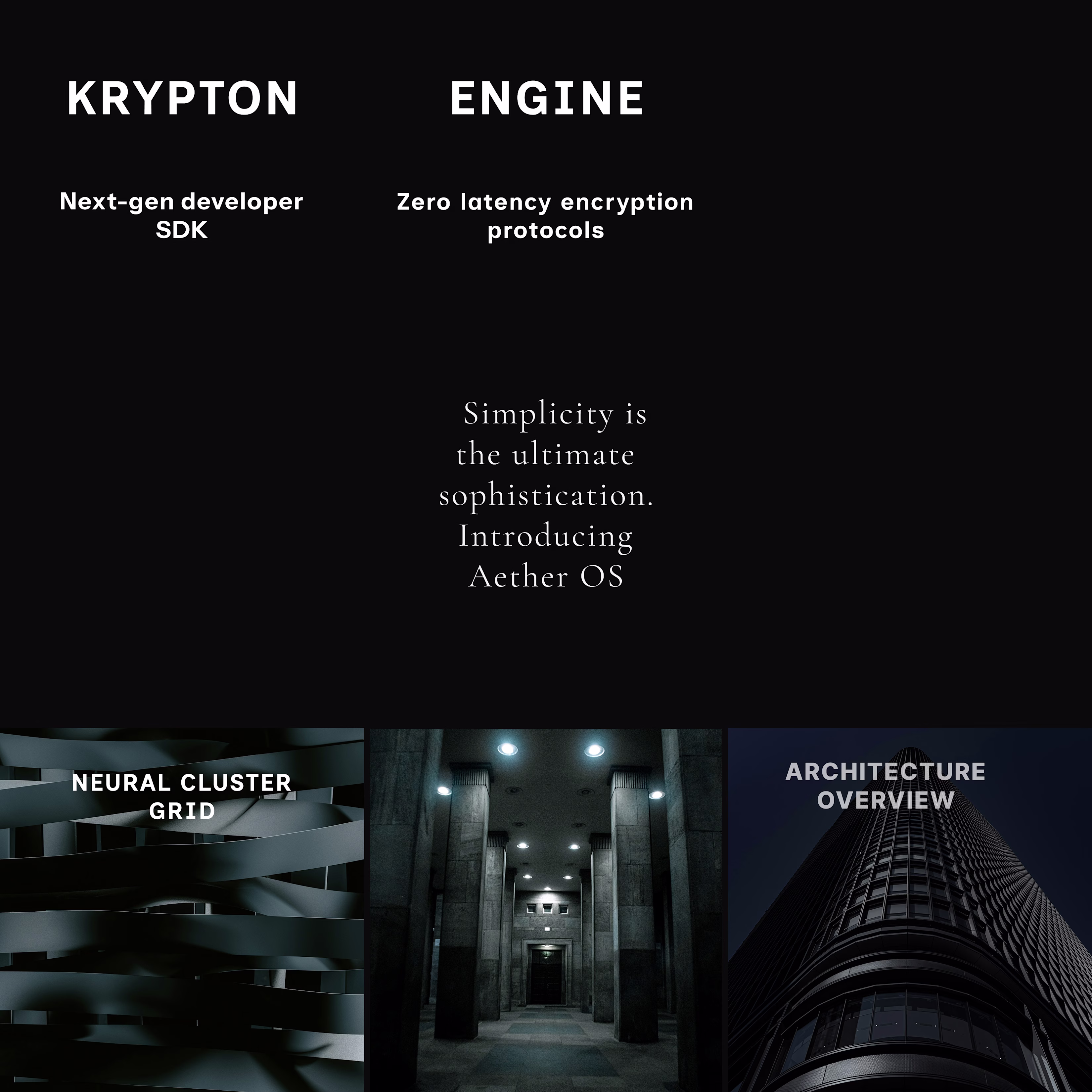
In a saturated digital marketing landscape, standard product screenshots fail to capture high-value enterprise leads. This project outlines a premium social media management blueprint designed for Interruptive Studios, elevating complex software into coveted digital assets by merging ultra-luxury branding with cutting-edge tech.
Core Deliverables & Content Strategy
Using Figma, I engineered a seamless 9-grid Instagram layout mockup using a dark, high-contrast palette across three targeted content pillars:
Monolith AI (Hardware Authority): Uses macro architectural imagery and minimal tech label overlays for strong creative direction and a premium dark mode aesthetic.
Aether OS (Software Minimalism): A typography forward center post using a elegant serif font on a black canvas to prove whitespace is luxury.
Krypton SDK (Developer Engagement): Bold, split-headline layouts that segment copy across posts to disrupt scrolling patterns and increase profile click-through rates.
Trending
Claude
Claude has entered the design space. How are you using Claude Design?
Contra University
Learn from expert creatives how to earn more using next-gen AI tools.
MagicPath
The canvas is infinite, and exploration is becoming the workflow. How are you using MagicPath?
creativeaiflow
Creative AI workflows are evolving. What tools do you use, and what are their strengths and weaknesses?
freelancerlife
Freelancer life is wins, pivots, and everything in between. What’s yours right now?