The network for creativity
Join 1.25M professional creatives like you
Connect with clients, get discovered, and run your business 100% commission-free
Creatives on Contra have earned over $150M and we are just getting started
Back to feedPost

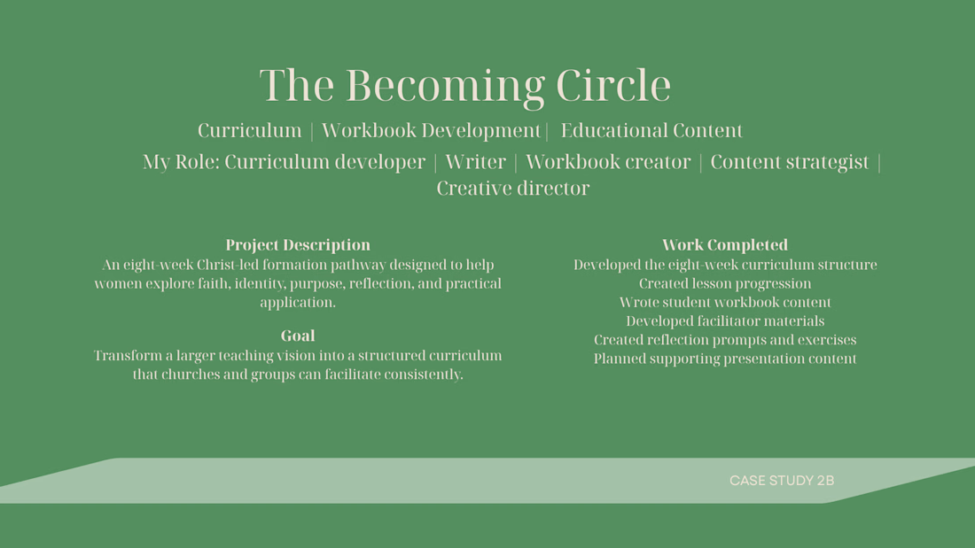
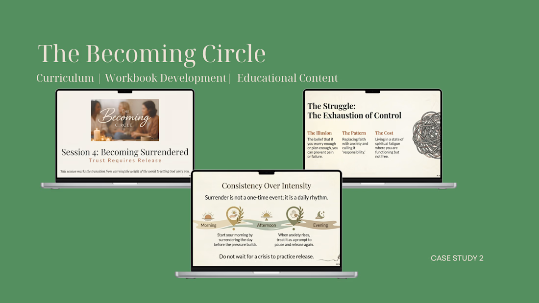
Developed the eight-week curriculum structure. Created lesson progression. Wrote student workbook content. Developed facilitator materials. Created reflection prompts and exercises. Planned supporting presentation content.


The network for creativity
Join 1.25M professional creatives like you
Connect with clients, get discovered, and run your business 100% commission-free
Creatives on Contra have earned over $150M and we are just getting started



Related posts

A beautiful website isn't necessarily a website that converts.
I've seen websites that look visually impressive but make it difficult for visitors to understand what the business offers, find important information, or take the next step.
Good website design should do more than look good.
It should:
- Communicate your business clearly.
- Build trust within seconds.
- Make navigation effortless.
- Work smoothly on mobile devices.
- Guide visitors towards taking action.
Whether it's a new website or a redesign, every design decision should have a purpose.
Your website is often your first impression. Make it count.
What is the first thing you look for when visiting a business website ?



honestly the phone number. if i cant tap to call on the first screen im gone. who are you building for mostly, local businesses?


Web screen stand out


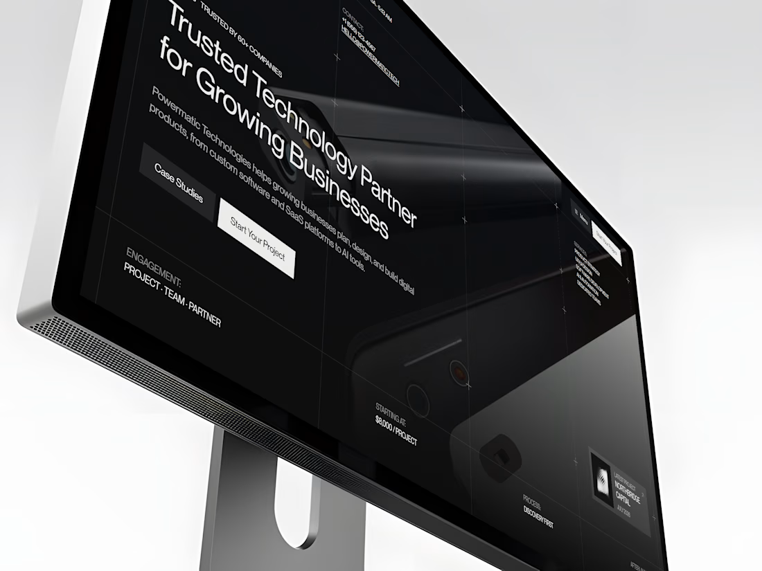
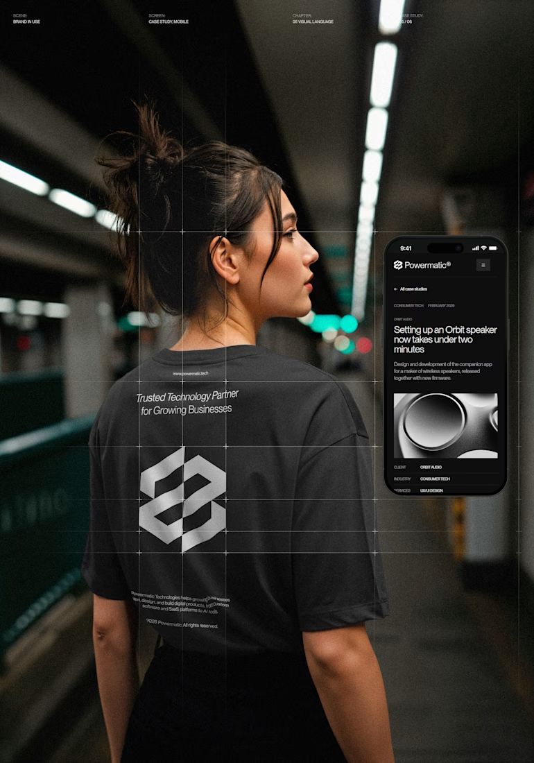
I've just put a new case study live.
Powermatic Technologies helps growing companies with strategy, design and software. I did the whole project on my own: the logo and identity, the design in Figma, the code and the copy on the site.
The site sits on a four-column grid, and you can see its lines on the screen. Graphite palette with no pure black or white, PP Neue Montreal, and a bit of ASCII art.
The page I'm happiest with is Careers. My first idea was to repeat the home page layout. I dropped it. Now the page opens with the open roles set in 72 px type, with a filter by team. A candidate sees the role, the city and the pay before they scroll.
The menu turns like a drum. You can drag it or use the arrow keys, and it opens on the section you're reading.
It's all hand-written HTML, CSS and JS, no framework. It holds up from a phone to an ultrawide monitor.
The live site is open, so you can click through it yourself.



Nice!