The network for creativity
Join 1.25M professional creatives like you
Connect with clients, get discovered, and run your business 100% commission-free
Creatives on Contra have earned over $150M and we are just getting started
Back to feedPost

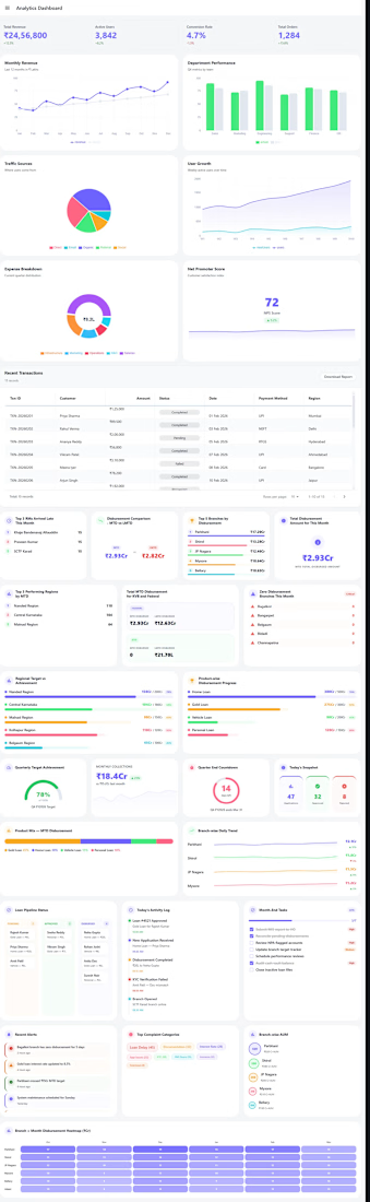
This project presents a comprehensive analytics dashboard UI designed with modular components and responsive layouts. It features rich data visualizations, stat cards, tables, and interactive sections crafted purely for front-end presentation. Emphasizing clarity, hierarchy, and scalability, the interface delivers a modern, enterprise-grade user experience without backend integration.This is a example project to showcase a different types of dashboards


The network for creativity
Join 1.25M professional creatives like you
Connect with clients, get discovered, and run your business 100% commission-free
Creatives on Contra have earned over $150M and we are just getting started

Challenges
View all


Related posts

I usually don't stop at 3 breakpoints when building a website.
Most people think about: Mobile, Tablet, Laptop
I like adding one more: Desktop
Because what looks great at 1440px can feel completely different at 1920px...
- The layout gets too wide.
- Spacing starts feeling off.
- Content loses its balance.
So I like testing the system across: Mobile → Tablet → Laptop → Desktop
Not because every website needs exactly 4 breakpoints. But because responsive design isn't about making a few screen sizes work.
It's about making the whole system work.
Follow Rushabh for more website fundamentals, experiments, and things I learn while building for the web.

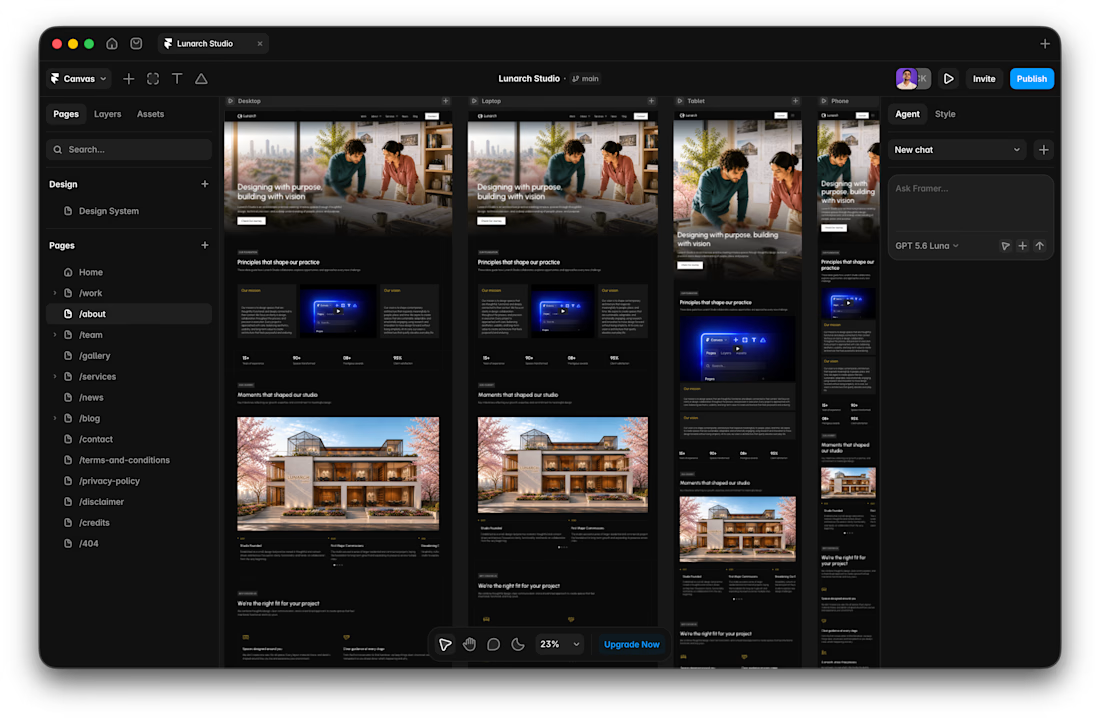

Wide screens expose spacing issues that laptop previews can hide.

Designed a clean, premium website concept for Arave — a modern digital watch brand. Focused on strong visuals, product storytelling, and a minimal, technical feel.
Would love to hear your thoughts — what do you think I could improve in this project?


"Built to be taken apart" reframes repairability as the premium feature, not a compromise - most watch sites hide the mechanism, this one leads with it.


I’ve been razzmatazzing and flibbertigibbeting with Claude Code and somehow ended up with a new yels.dev.
It finally feels like me: simple on the surface, slightly complicated underneath, and very much alive.
You can see who I am, what I do, the work behind Herodot, RaptorLabs, CyberLink Security and Solmint, plus a selection of projects I’ve built across AI, cybersecurity, Web3, product systems, education, archives, and experimental digital spaces.
Built to be explored


The simple-on-the-surface, layered-underneath idea comes through so clearly in the presentation. I especially like how the project archive turns the site into something to explore rather than just a résumé of links.