The network for creativity
Join 1.25M professional creatives like you
Connect with clients, get discovered, and run your business 100% commission-free
Creatives on Contra have earned over $150M and we are just getting started
Back to feedPost
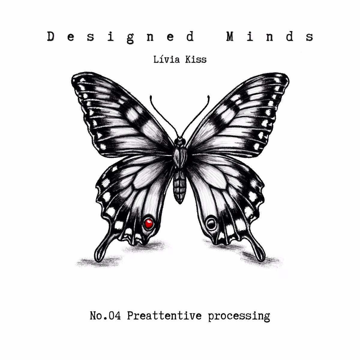
Find the red dot.
You already did. Before you even tried.
That's preattentive processing: one of the most powerful and underused concepts in visual design.
Neisser's research on visual search showed that certain features are processed by the brain before conscious attention kicks in. Color. Shape. Size. Orientation. Movement. The brain scans for these automatically, in parallel, across the entire visual field -in under 200 milliseconds.
You don't search for them. You just see them.
Now think about your last UI.
Is the most important element the one that registers first? Or did you make everything the same size, the same weight, the same color and then wonder why users miss the primary action?
Preattentive features are free attention. The user doesn't have to work for them. They just land.
A red notification badge. A bold price. A button that contrasts with everything around it. These aren't design choices made for aesthetics. They're design choices made for how cognition actually works.
If you want someone to see something first: make it preattentive. The brain will do the rest.
Designed Minds - where psychology meets everyday design. Every Friday.
The network for creativity
Join 1.25M professional creatives like you
Connect with clients, get discovered, and run your business 100% commission-free
Creatives on Contra have earned over $150M and we are just getting started
Related posts
🚀 Excited to share Symplinkify, my submission for the #Anything Ship & Sell Remixathon.
It’s a premium short-link platform with branded URLs, real-time click analytics, dashboard insights, QR/pro feature gates, authentication, SEO, and a polished SaaS-style landing page.
Built entirely with Anything.
🎥 Demo walkthrough attached below.
🔗 Try it here on build link: https://www.anything.com/build/pfZz_HIkRSe1XOWo3AAoNA?v=POoHooo8R8Wrr6F890ewbw
LinkedIn:
https://www.linkedin.com/posts/bobvasic_anything-anythingremixathon-ugcPost-7456536363128131584-zsfe?utm_source=share&utm_medium=member_desktop&rcm=ACoAAAWbOcYBym9kgZZll4IyyFfT9tR-b1MMg5U
X:
https://x.com/bobvasx/status/2050775412528083145?s=20
#AnythingRemixathon
Great one, Bob!
This is a remixable AI Visual Concept Generator template.
It helps users turn a simple idea into visual directions, image prompts, moodboards, style explorations, and creative briefs.
Remixers can adapt the niche, branding, input fields, examples, visual styles, prompt logic, tone, and outputs for product campaigns, fashion, branding, interiors, social content, posters, game art, cinematic scenes, or creative portfolios.
https://www.anything.com/build/Ecpq4Ch2QbaZWa6sSC6ZHg?v=nkSjUh-KR-ub4qdJHM9qBw
@Anything @Contra HQ
great, keep it up !
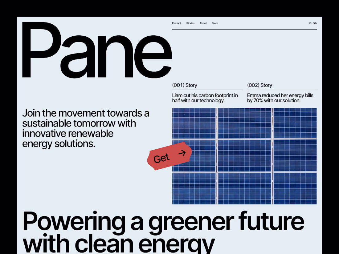
Solar Green Energy Website Design
We’ve all been there staring at rising electricity bills, wondering if there’s a way out. We know fossil fuels are harming the planet, but switching to clean energy? That sounds complicated, right?
That’s exactly why we designed this Sustainable Energy Website. We wanted to make renewable energy simple, accessible, and dare we say exciting. Whether it’s solar, wind, or hydropower, we lay out the best solutions in a way that actually makes sense. No jargon, no guesswork just a clear path to lower costs and a greener future.
Well Played
Trending
Claude
Claude has entered the design space. How are you using Claude Design?
Contra University
Learn from expert creatives how to earn more using next-gen AI tools.
creativeaiflow
Creative AI workflows are evolving. What tools do you use, and what are their strengths and weaknesses?
portfolioreview
The best portfolios tell a story, not just show a grid. Share yours for feedback.
freelancerlife
Freelancer life is wins, pivots, and everything in between. What’s yours right now?