The network for creativity
Join 1.25M professional creatives like you
Connect with clients, get discovered, and run your business 100% commission-free
Creatives on Contra have earned over $150M and we are just getting started
Back to feedPost

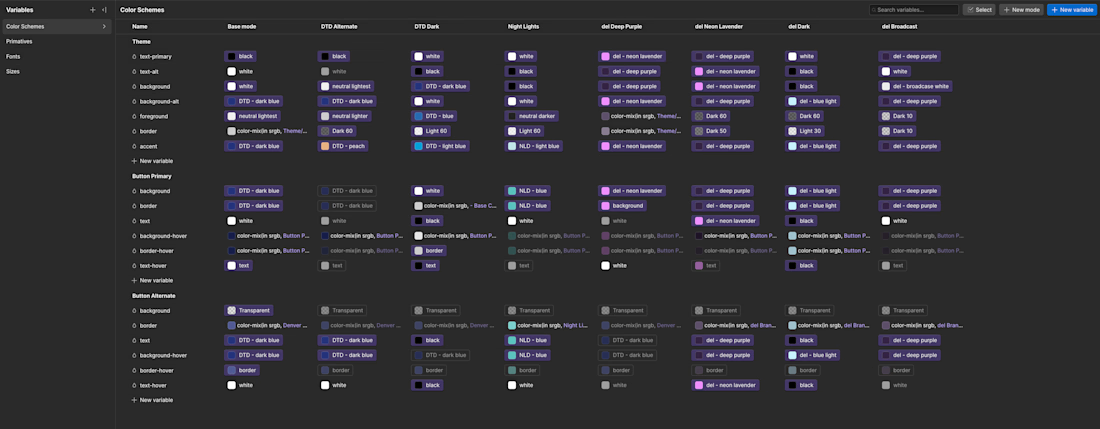
I’ve been getting a little wild with the number of color themes on this Webflow project.
Understanding how to work with color themes was one of the biggest unlocks for me in design and Webflow. Without it larger projects can start to become difficult to maintain and begin to look unprofessional.
The project below is unique in that the client has several brands and ongoing projects that each require their own branding. Each brand differs enough to require a couple different color themes (dark, light, etc.).
I’ve worked with this client for a while so this has evolved over time to make sure they can easily update a section or component with the appropriate branding.
Without an understanding of how these can be applied or how to configure them, adding a new brand or building new pages would be a much more manual process.
Now when the client is ready to add a new brand or ongoing project we’re able to add a new mode here in their Webflow variables, swap out the correct colors for each, and then they’re ready to start applying the branding to their components.
This keeps their website scalable and adaptable where they need it to be.
#webflow #design #color


wow this is awesome!
The network for creativity
Join 1.25M professional creatives like you
Connect with clients, get discovered, and run your business 100% commission-free
Creatives on Contra have earned over $150M and we are just getting started





Related posts

Happy to announce that we're officially a Webflow Partner! 🥳
We're so excited about this milestone. It's a big one in this new chapter for us.


Congratulations

AI didn't take my job. It became my business partner.
Every designer I know is asking the same question right now: what's left for us when AI can make something pretty in 10 seconds?
Here's my honest answer, from branding and from product.
The way I work has completely changed. Moodboards, variations, mockups, even clickable prototypes: what used to take days now takes hours.
But here's what nobody says out loud: people are making a lot of pretty things. And pretty doesn't build a brand.
Pretty doesn't tell a stranger why they should trust you.
Pretty doesn't make your offer clear in 5 seconds.
Pretty doesn't fix the screen where users give up.
That part is still on me. It's actually most of my job now.
So I stopped seeing AI as a competitor. It does the drafts, I do the thinking, and my clients get both, faster.
Designers, how has AI changed the way you work this year?

Wonderful presentation and I like your thought you shared

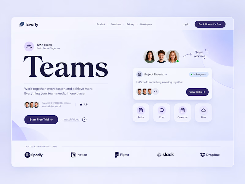
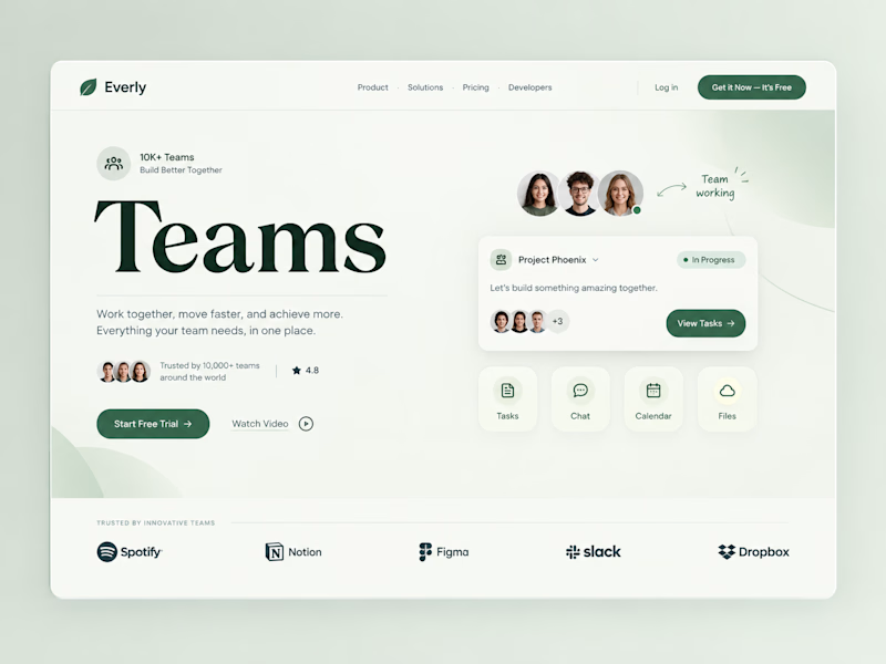
Two color directions, same team-collab pitch.
Sometimes the "safe" color isn't the smarter choice.
Which color would make you trust this tool with your team? 👇

1 voted
9%
10 voted
91%
11 votes
Closed
Both are amazing work; it's hard to choose one. Which one do you personally like?