The network for creativity
Join 1.25M professional creatives like you
Connect with clients, get discovered, and run your business 100% commission-free
Creatives on Contra have earned over $150M and we are just getting started
Back to feedPost

Turning Ideas Into Visuals That Mean Business.
A strong brand starts with a strong visual direction.
As a Graphic Designer & Brand Developer, I help businesses, startups, and creative teams transform ideas into visual identities that are clear, memorable, professional, and built to connect with the right audience.
My design services include:
• Logo & Brand Identity
• Brand Guidelines
• Packaging Design
• Social Media & Digital Design
• Marketing & Promotional Materials
• Print & Merchandise Design
• Visual Content & Creative Direction
I believe good design is more than making something look beautiful. It should communicate a message, build credibility, and give a brand a visual presence people can remember.
🚀 Open for freelance projects, collaborations, and long-term creative partnerships.
If you're looking for a designer who can help turn your ideas into a stronger visual identity, let's connect and create something meaningful.
#GraphicDesign #BrandIdentity #LogoDesign #Branding #GraphicDesigner #VisualIdentity #BrandDesigner #CreativeDesigner #FreelanceDesigner #DesignServices
The network for creativity
Join 1.25M professional creatives like you
Connect with clients, get discovered, and run your business 100% commission-free
Creatives on Contra have earned over $150M and we are just getting started







Related posts

What if Google Maps had been designed in the 1920s? 👀
For the #revival challenge, I reimagined Google Maps through the visual language of Soviet Constructivism.
Routes become bold diagonals, turns become oversized arrows, and ETA and distance become strong typographic statements. Navigation stops feeling like a quiet interface and starts feeling like a piece of graphic propaganda telling you exactly where to go.
Such a fun exercise in taking something extremely familiar and asking how differently it could have been designed in another time.
Your turn!
What modern product would you send back in time, and to which era? 👀


Curious whether the diagonals fought you at phone size — Constructivist posters were built for one long look from across a room, while a nav screen only gets half-second glances from someone already moving. For your question: airline safety cards, sent back to 1960s Swiss...

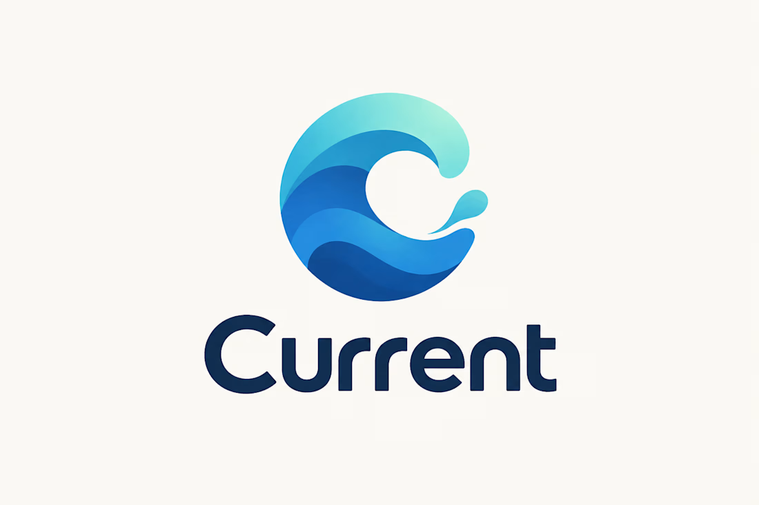
Logo & Brand Identity Concept
A modern logo concept designed for Current, using a flowing “C” symbol inspired by movement, waves, and continuous flow.
The layered blue and turquoise forms create a sense of motion, energy, and connectivity, while the clean wordmark gives the identity a professional and contemporary character.
The concept was developed with versatility in mind, allowing the logo to work across digital platforms, websites, social media, marketing materials, and branded assets.
Focus: Logo Design • Brand Identity • Visual Identity • Typography • Graphic Design
Style: Modern • Minimal • Fluid • Professional
Tools: Adobe Illustrator • Adobe Photoshop • Figma
#LogoDesign #BrandIdentity #BrandDesign #VisualIdentity #GraphicDesign #Typography #LogoConcept #ContraPortfolio



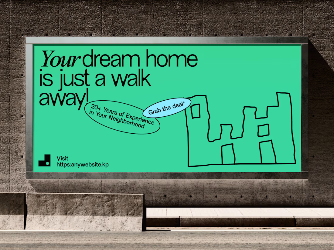
Aesthetic Real Estate Banner
Real estate advertising has one immediate challenge: get attention without taking attention away from the property.
For this banner concept, we built the composition around the property image and used typography, spacing and supporting details to create a more refined visual hierarchy.
The design keeps the message clear while giving the property enough space to make the first impression.
The result is an aesthetic real estate banner that can work across property promotions, digital campaigns and social media advertising.
Focus: Real Estate Banner Design · Property Marketing · Real Estate Advertising · Graphic Design · Brand Identity
Designed by WaxyWeb.
For real estate brands looking for a stronger visual direction:
realestatebannerrealestatebrandingrealestatedesignBrand DesignGraphic DesignVisual DesignAdobe SuiteFigma



excellent