The network for creativity
Join 1.25M professional creatives like you
Connect with clients, get discovered, and run your business 100% commission-free
Creatives on Contra have earned over $150M and we are just getting started
Back to feedPost

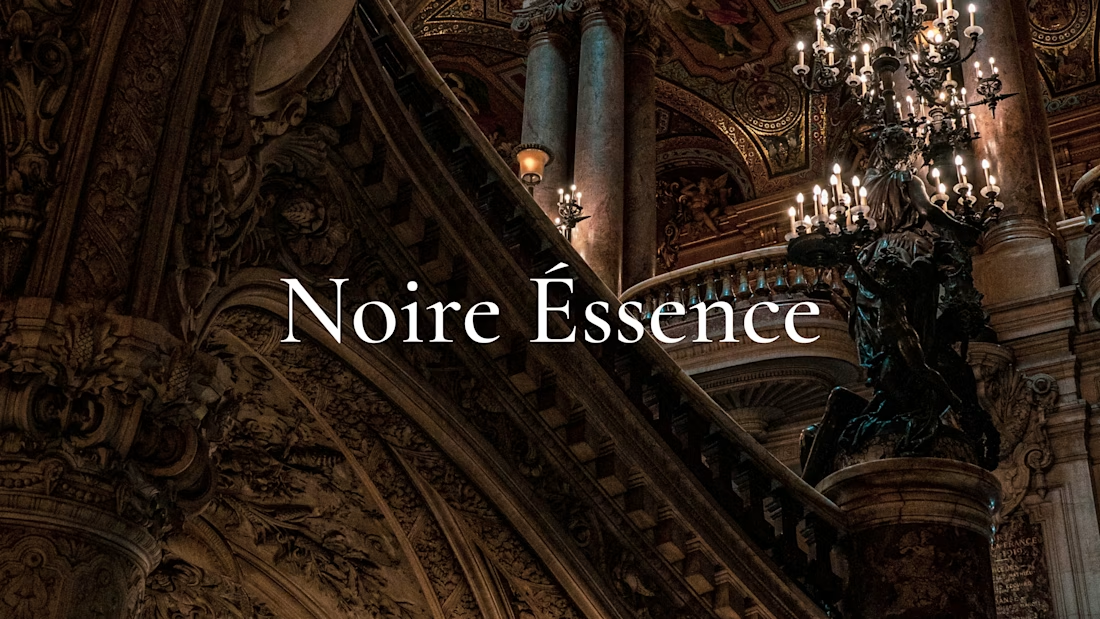
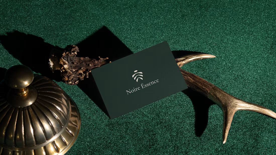
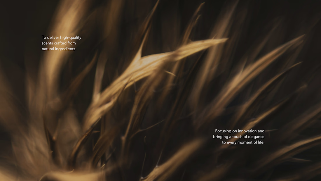
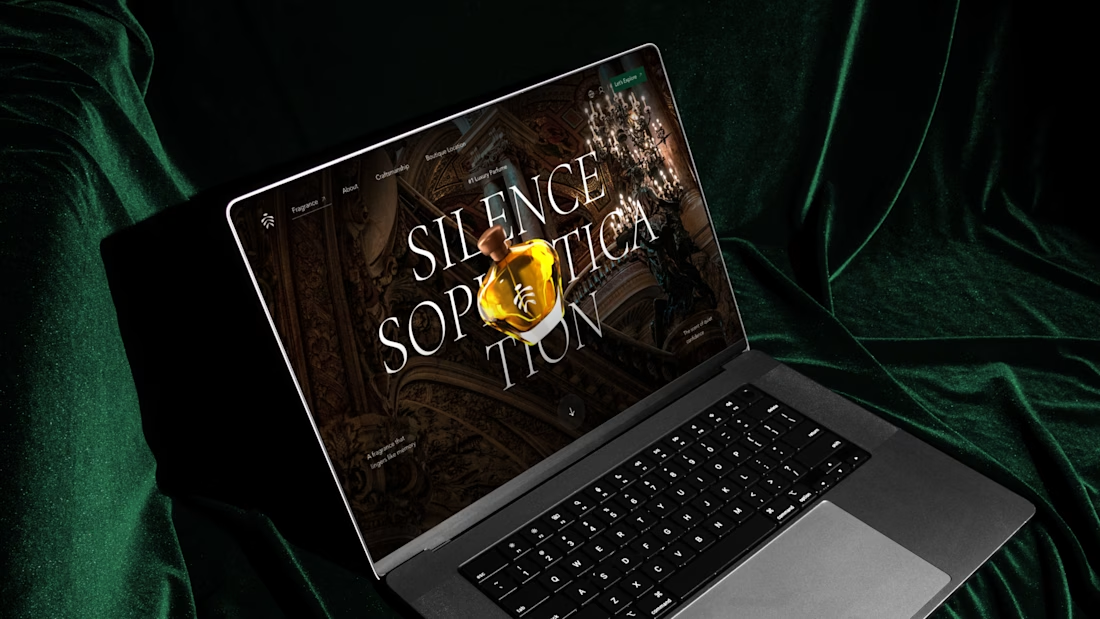
Noire Éssence is a fragrance brand that needed an identity able to feel composed in print and on screen. The main decision was pairing the deep green of the business card and velvet props with the amber tones of the botanical photography, so the palette holds from stationery to website. The gilded staircase from the cover returns as the website hero, and the amber bottle sits over the “Silence Sophistication” headline.
Which touchpoint tells you the most about a fragrance brand: the packaging, the website, or the card?

The network for creativity
Join 1.25M professional creatives like you
Connect with clients, get discovered, and run your business 100% commission-free
Creatives on Contra have earned over $150M and we are just getting started



Related posts

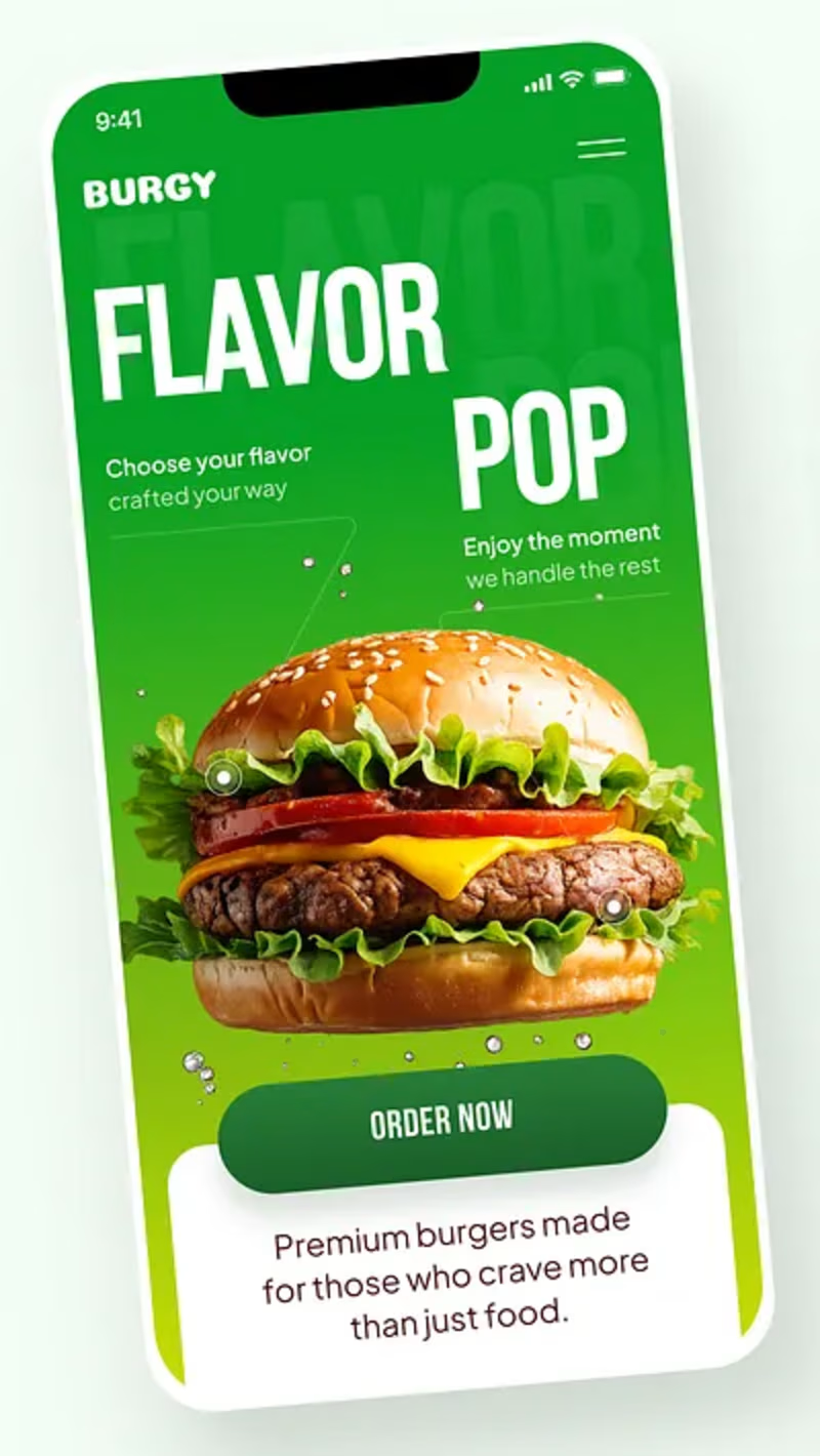
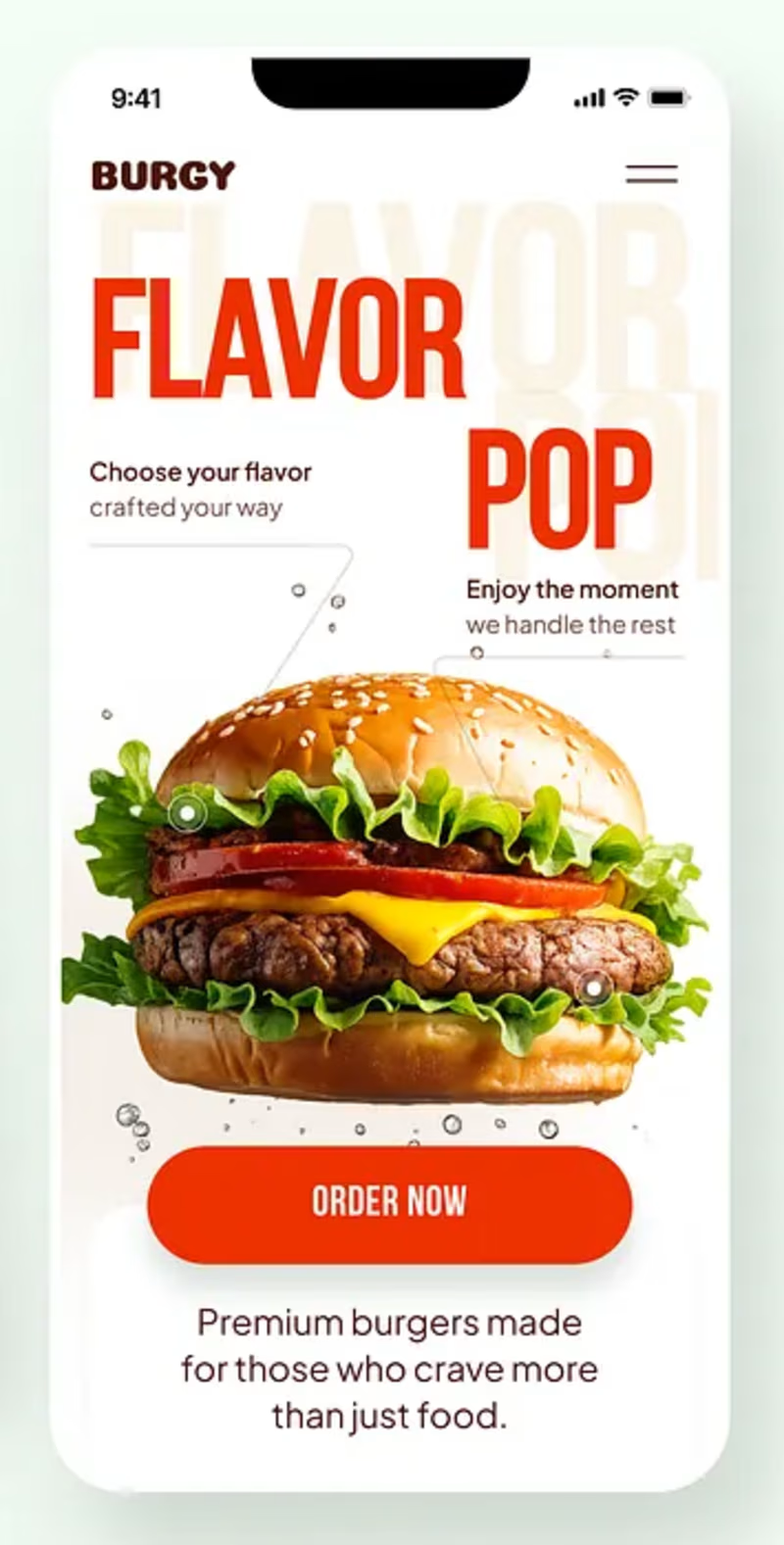
Burgy, a mobile concept for burger ordering. 🍔
Bold type, premium food visuals, and a fast path from craving to checkout.
Two color directions for the hero screen. Which one converts better?
Vote and tell me why 👇
Poll options: 🟢 Green | 🔴 Red
#UIDesign #MobileApp #FoodApp #AppDesign #UX #RestaurantApp

13 voted
43%
17 voted
57%
30 votes
Closed

Green for me, and I'd bet on it converting better too. The red version is loud in the way every food app is loud, while the green makes the burger the hero and the screen instantly recognizable in a feed. The green background also gives the white FLAVOR POP type far more contrast, so the message lands a beat faster.


Niceee

Luxury Travel Agency Landing Page Design
A modern luxury travel agency website concept designed to inspire premium travel experiences through elegant visuals, immersive storytelling, and a seamless user experience. The design combines cinematic destination imagery, refined typography, intuitive navigation, and sophisticated layouts to create a high-end digital presence for luxury travel brands.
The website focuses on increasing engagement and booking inquiries with a clean user journey, responsive design, premium destination showcases, curated travel packages, testimonials, and compelling call-to-action sections. Crafted in Figma with a strong emphasis on usability, aesthetics, and conversion-focused design.


