The network for creativity
Join 1.25M professional creatives like you
Connect with clients, get discovered, and run your business 100% commission-free
Creatives on Contra have earned over $150M and we are just getting started
Back to feedPost

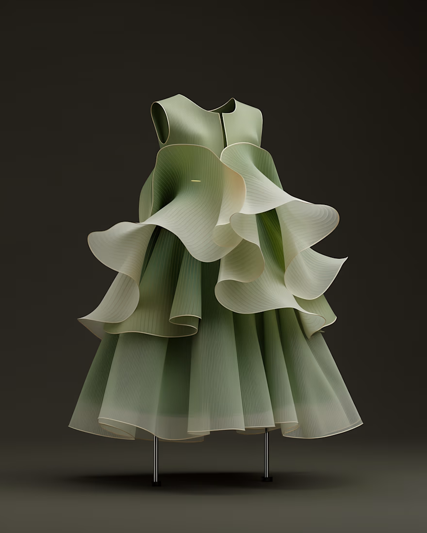
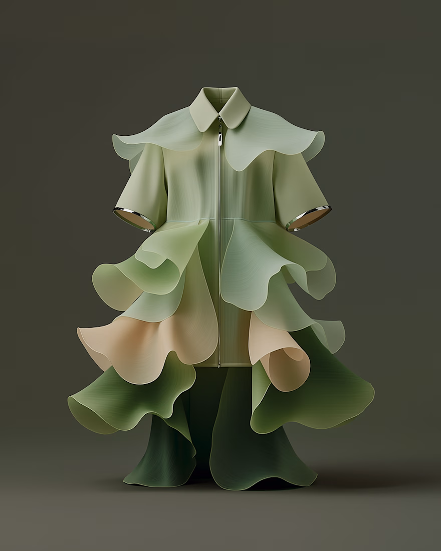
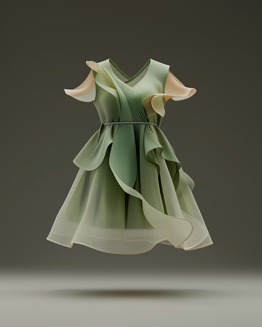
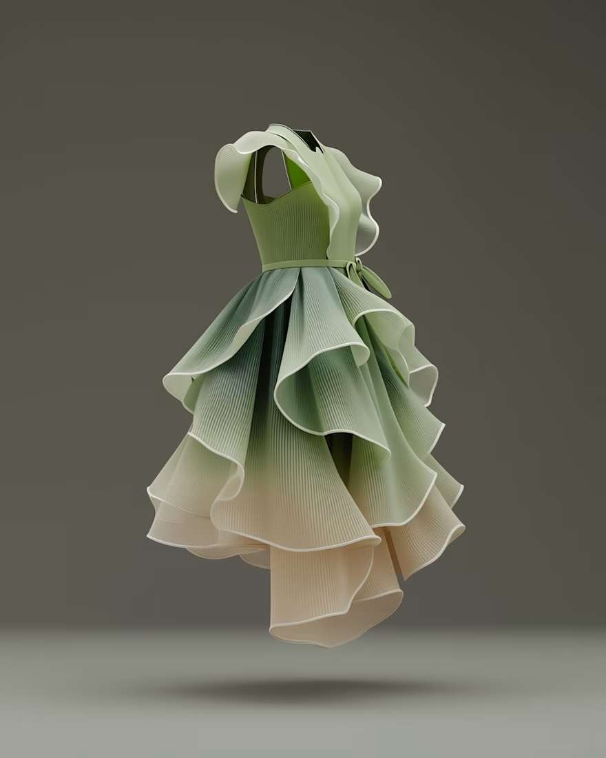
Something that fascinates me: how the same form language moves across design disciplines.
Started with botanical structures — leaves, stems, layered growth patterns — and explored how those shapes translate into fashion silhouettes.
A reminder that nature’s geometry moves easily between architecture, fashion, and spatial design.
Another study from my ongoing visual direction lab.

Love this idea. Nature inspiring design across disciplines is always fascinating.
Correct — especially today when we have so many ways to explore it.
Absolutely. It’s amazing how the same patterns show up in so many different design fields.
The network for creativity
Join 1.25M professional creatives like you
Connect with clients, get discovered, and run your business 100% commission-free
Creatives on Contra have earned over $150M and we are just getting started

Challenges
View all


Related posts

i’ve spent years designing websites with whatever tools were available
now i’m slowly getting used to the fact that i can also make the tool
for this project i wanted to explore more directions for the brand
collecting references or creating each direction from scratch would already become a project of its own
so i built a small generator and started playing with it
each output gives me something to react to
keep this
change that
try one more
and then one combination suddenly feels like a direction worth following
it’s still rough and i keep finding small things to fix
but honestly this is the part i’m enjoying most
doing the design and building the tool that helps me explore different visual languages at the same time

Making the tool instead of just using it is such an underrated superpower for designers. Once you can generate directions to react to, exploration stops feeling precious and starts being fun. This is the good kind of lazy.

Exploring geometry beyond familiar dimensions.
Procedural motion, transformation and structure.


The wireframe aesthetic on the black background really lets the geometry breathe. There's something almost architectural about these forms even when they're fully abstract. Procedural motion opens up a lot of interesting territory.

I’m testing two different creative directions and would love your honest opinion.
Version A focuses on a bright, minimal gallery experience with circular visual experiments.
Version B explores a darker, more cinematic product direction for Montairé with hardware-focused visuals.
Which one feels cooler, more premium, and more memorable — A or B?
I’d also love feedback on the typography, layout, animation, and overall art direction.
10 voted
53%
9 voted
47%
19 votes
Closed

I’d lean toward Version B. The darker direction gives the hardware more presence and makes the whole experience feel more intentional and engineered. Version A is visually interesting, but B gives Montairé a much clearer identity at first glance.