The network for creativity
Join 1.25M professional creatives like you
Connect with clients, get discovered, and run your business 100% commission-free
Creatives on Contra have earned over $150M and we are just getting started
Back to feedPost


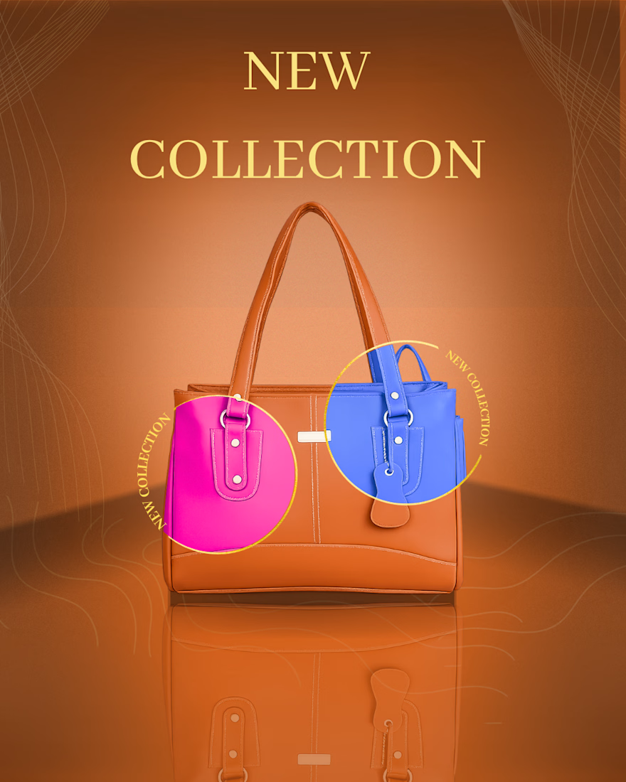
Thoughts on this design we're recently working on? Zoom in for the details!


Amazing design! 👏
The network for creativity
Join 1.25M professional creatives like you
Connect with clients, get discovered, and run your business 100% commission-free
Creatives on Contra have earned over $150M and we are just getting started





Related posts

redesigned Boardy website :)
what do you think?

THIS IS ONE OF THE PREMIUM DESIGN THAT I MADE FOR HAND BAG BRANDING.
Just have a look on it nd take out a little bit of time nd lrt me kn hows it looking?

I designed a practice flyer for a farm market. I feel the wordings of the first and second circle are a bit off but I'm still working on my skills. What do you think?