The network for creativity
Join 1.25M professional creatives like you
Connect with clients, get discovered, and run your business 100% commission-free
Creatives on Contra have earned over $150M and we are just getting started
Back to feedPost

Day 4–5 | Phase 2: Ideation & Iteration ⚡
This phase was all about turning ideas into visuals and finding faster ways to iterate.
I started by taking my hand-sketched wireframes into Figma Make to explore different directions and layouts. Instead of using the outputs as final screens, I treated them as inspiration to refine the experience.
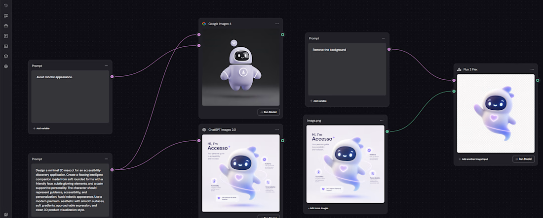
Alongside that, I had another challenge: creating the personality of Access Atlas.
I had a rough idea and a few 2D references for the AI companion, but wanted it to feel more alive. That became my first real experiment with Figma Weave.
Using Weave's node system, I tested multiple prompt paths and ran them through different LLMs to transform the initial concept into a 3D mascot that matched the look and feel I wanted.
That was when I realised the potential of the workflow.
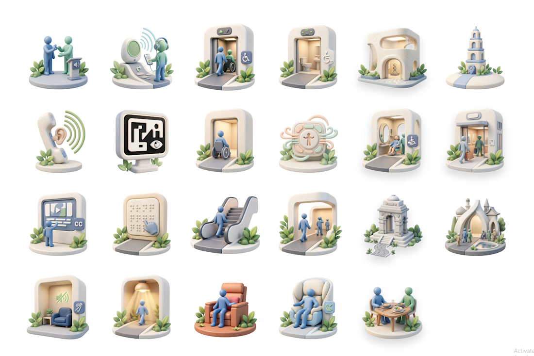
Then came the next challenge: icons.
I wanted a clean, consistent set of 3D accessibility icons, but the ones I needed were too specific and didn't exist.
So I built my own.
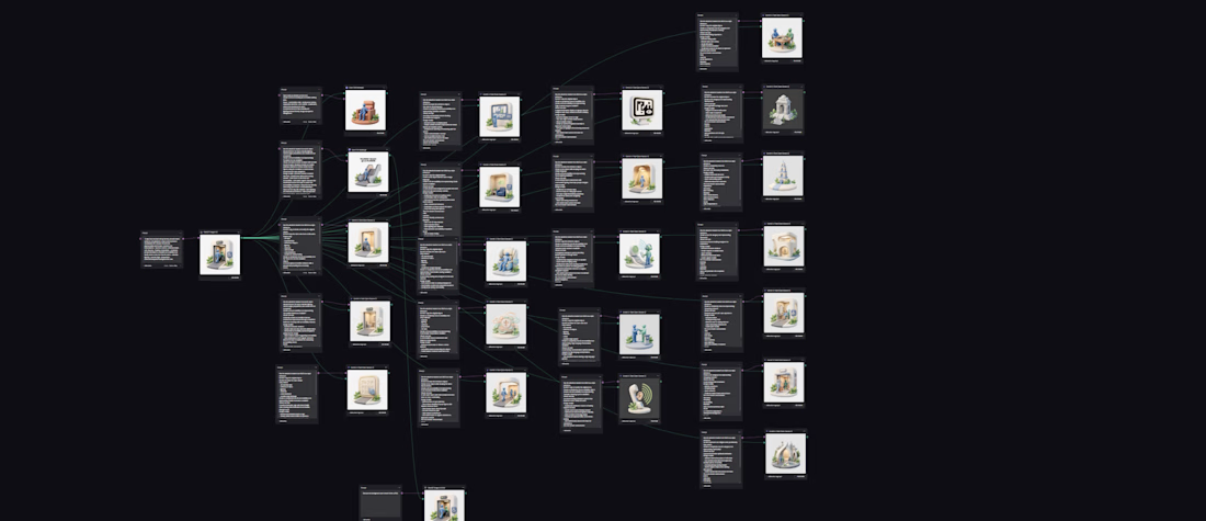
The Weave Workflow
→ Defined style, camera angle, colour palette, and visual language
→ Ran the brief through 3 prompt enhancers simultaneously
→ Refined one final prompt
→ Tested it across 4 LLMs in parallel
→ Selected one icon as the master reference
→ Created a variable prompt system (Wheelchair → Elevator → Escalator → etc.)
→ Generated a complete icon family in the same style
This workflow dramatically reduced repetitive work and made iteration much faster.
Phase 2 is almost complete.
From sketches → concepts → mascot → custom icon system

The network for creativity
Join 1.25M professional creatives like you
Connect with clients, get discovered, and run your business 100% commission-free
Creatives on Contra have earned over $150M and we are just getting started





Related posts

Post
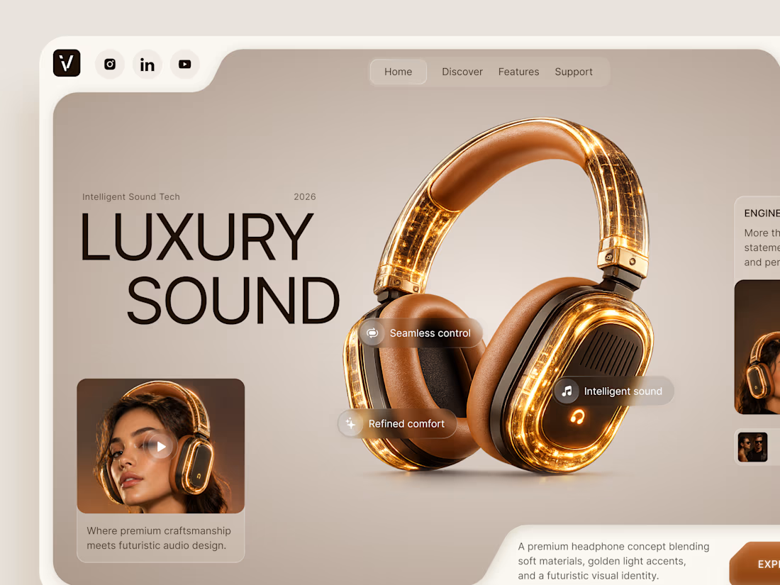
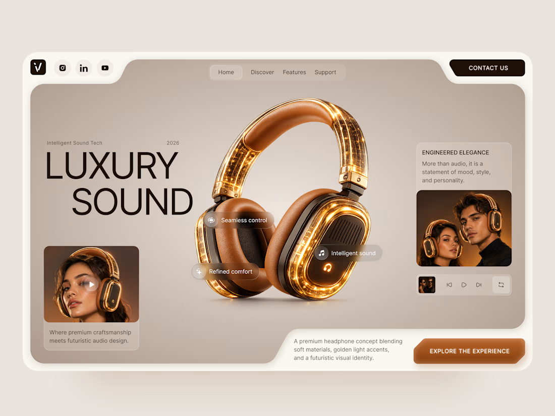
Luxury Sound — Premium Headphones Landing Page 🎧✨
A premium landing page concept for a luxury audio brand, built around a bold headphone design and a refined visual experience
The design combines warm neutral tones, glowing details, oversized product visuals, and minimal typography to create a futuristic yet elegant feel
Special attention was given to:
• Product-first composition
• Premium visual direction
• Feature highlights
• Lifestyle imagery
• Clear CTA placement
• Responsive mobile experience
The result is a clean, immersive product experience that makes the headphones feel like more than tech — they become part of the lifestyle 🔥


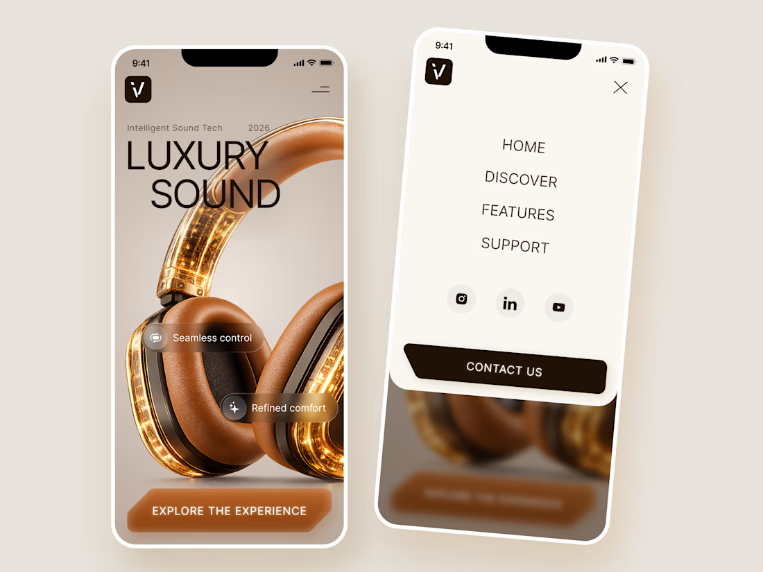

The amber glow on the headphones against that warm beige is lovely. How does the mobile menu handle the product image?


Collage


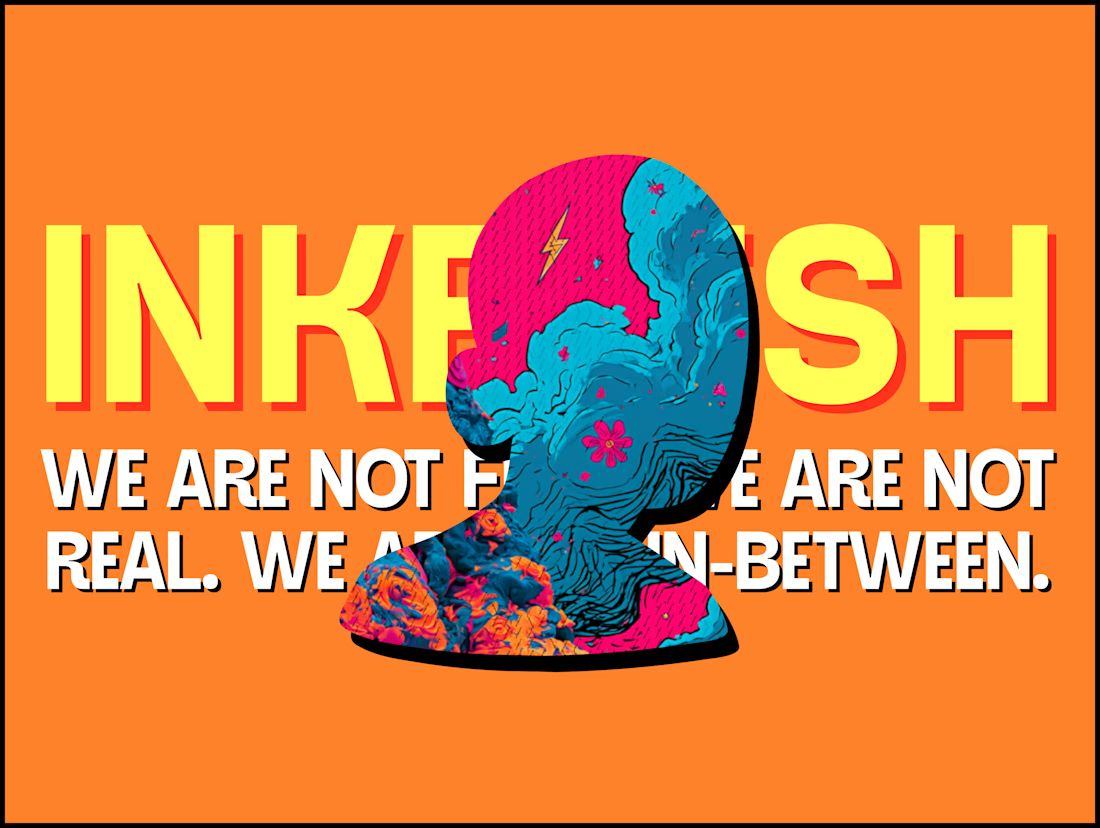
The INKFLESH mark I designed starts with an empty profile avatar. A deliberately plain shape for an identity full of strange characters.
The characters needed room to change. The identity also had to work on a woven label or an app icon, where a detailed illustrated face has very little space to do its job.
I kept the silhouette and palette constant, then let the artwork change around them. The mark can hold an illustration, appear as a solid stamp, or sit on its own at a small size. Each version still has the same shape underneath.
That was the useful constraint: decide what someone should recognise when the most expressive part of the design disappears.
If your identity depends on a detailed illustration, try its smallest application before approving the whole world around it.

Super bold and creative! Love the vibrant colors. 🔥