The network for creativity
Join 1.25M professional creatives like you
Connect with clients, get discovered, and run your business 100% commission-free
Creatives on Contra have earned over $150M and we are just getting started
Back to feedPost
Taste Test
One is familiar the other one is easy. A battle of UX
9 voted
50%
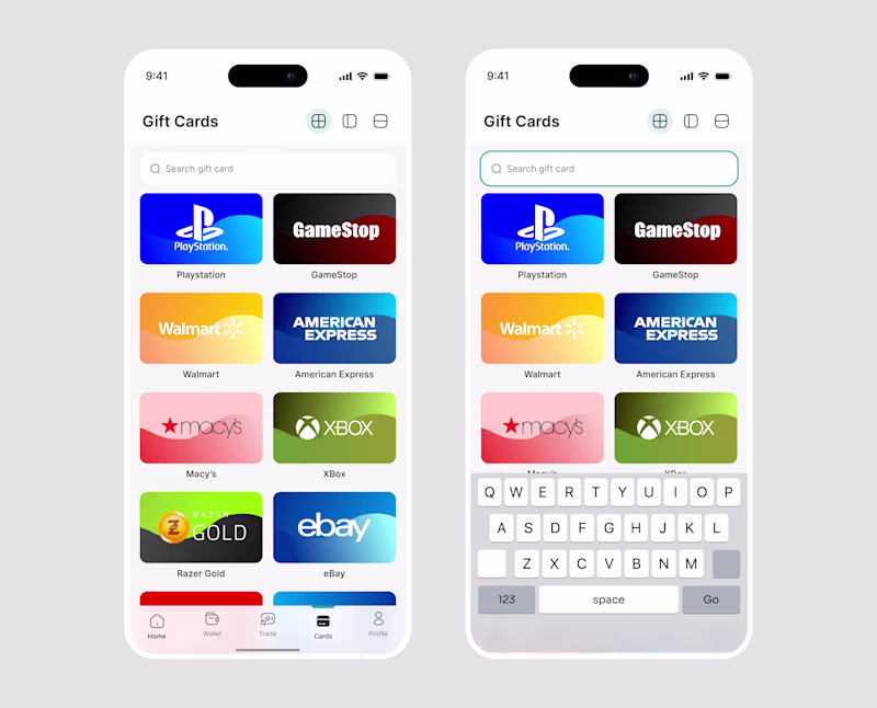
9 voted
50%
18 votes
Closed

top bar honestly feels more natural on mobile 🙌 the thumb reach debate will never die but your UI looks premium either way!

Thank you

Great work premium look . I will prefer the top search bar
Thank you

Top search bar always

Although top search bar is more common and looks better, I'd go with bottom one, since it's more accessible :)
Thank you

Spot on

asides from the rule of thumb, the bottom seems easier for eye movement even when the top one has been engraved into our memories as users
Thank you

Bottom bar is the most ergonomic pick especially on big screens. Top bar looks cleaner but it is really a stretch for one handed use!

creative and professional!
Thank you
The network for creativity
Join 1.25M professional creatives like you
Connect with clients, get discovered, and run your business 100% commission-free
Creatives on Contra have earned over $150M and we are just getting started
Related posts


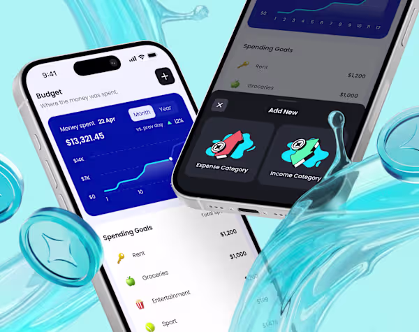
Truth is: tracking expenses is quite a boring task. The UX has to turn it into something enjoyable. 🧠💸
Just published my design for a new finance tracker. The secret sauce - engaging micro-interactions, and visual rewards for good financial habits.
Check it out
What’s your favorite UX/UI idea to keep users engaged with "boring" everyday tasks?


💡 Most people think building a website is the hardest part.
It’s not.
The hardest part is building something that people actually want to use.
A beautiful UI without good logic = users leave.
A powerful backend without good UX = users get confused.
The best products are built when design and engineering work together.
Before writing a single line of code, ask yourself:
Would someone actually use this?
Simple question.
Powerful impact.

𝐓𝐡𝐞 𝐏𝐬𝐲𝐜𝐡𝐨𝐥𝐨𝐠𝐲 𝐀𝐈 𝐒𝐭𝐢𝐥𝐥 𝐃𝐨𝐞𝐬𝐧’𝐭 𝐅𝐮𝐥𝐥𝐲 𝐔𝐧𝐝𝐞𝐫𝐬𝐭𝐚𝐧𝐝
AI can generate layouts.
But it doesn’t fully grasp:
• Emotional triggers
• Cognitive load
• User hesitation
• Trust signals
• Buyer anxiety
Design is 𝐩𝐬𝐲𝐜𝐡𝐨𝐥𝐨𝐠𝐲.
Spacing affects 𝐩𝐞𝐫𝐜𝐞𝐩𝐭𝐢𝐨𝐧.
Typography affects 𝐚𝐮𝐭𝐡𝐨𝐫𝐢𝐭𝐲.
Color affects 𝐞𝐦𝐨𝐭𝐢𝐨𝐧.
Microcopy affects 𝐜𝐨𝐧𝐟𝐢𝐝𝐞𝐧𝐜𝐞.
You can’t automate human behavior understanding.
That’s where strategic designers win.
If your product needs psychological-driven UX, I’d love to help.
Great work premium look


Trending
aivideo
AI video tools are moving at warp speed. Which ones are you experimenting with?
returntonature
Spring is a reset for creativity. What’s inspiring you outside the screen right now?
aidesignflow
AI tools are redefining design work. What's your current workflow?
freelancerlife
Freelancer life is wins, pivots, and everything in between. What’s yours right now?
allthingsmetal
Metal is having a design moment – from chrome to gates and grates. What designs are you forging?