The network for creativity
Join 1.25M professional creatives like you
Connect with clients, get discovered, and run your business 100% commission-free
Creatives on Contra have earned over $150M and we are just getting started
Back to feedPost

𝗗𝗲𝘀𝗶𝗴𝗻𝗲𝗱 𝗮 𝘄𝗲𝗯𝘀𝗶𝘁𝗲 𝗳𝗼𝗿 𝗕𝗢𝗚𝗔 ✅,
a website for users to order their
favorite burgers.
Visual direction in Figma, built with Claude Code.
If you need a website built, reach out orimoladeeniola65@gmail.com
#WebDesign #UIUX #BuildInPublic #ClaudeCode #LandingPage


Great work 👍
The network for creativity
Join 1.25M professional creatives like you
Connect with clients, get discovered, and run your business 100% commission-free
Creatives on Contra have earned over $150M and we are just getting started





Related posts

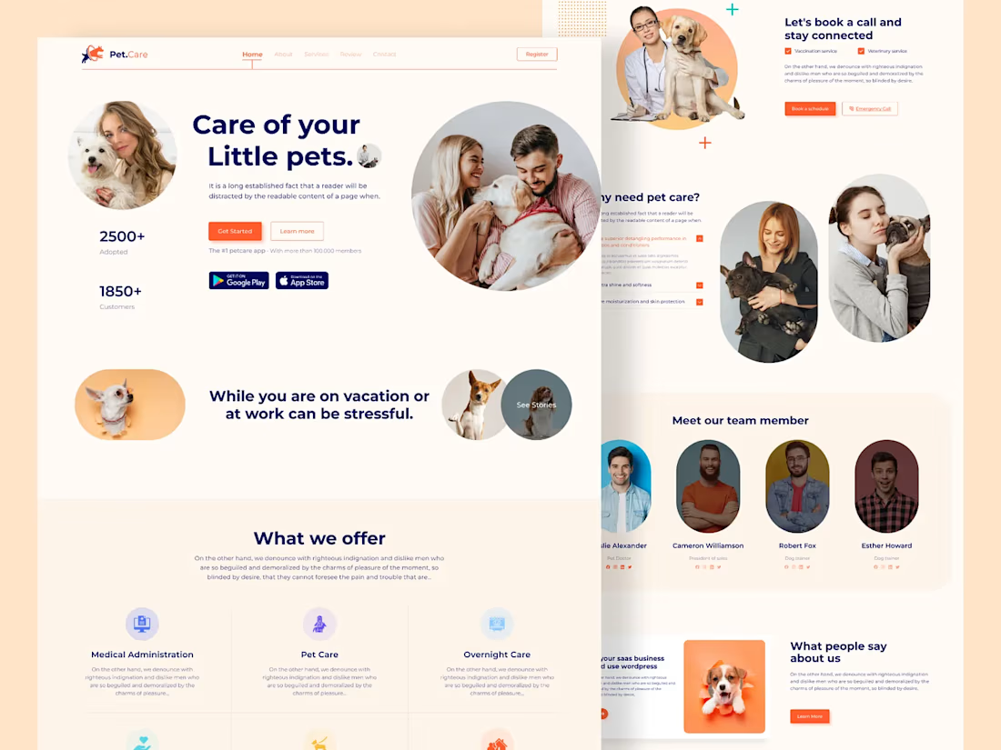
Pet Care Landing Page Design
Hope you're doing well. This is a, Pet Care Landing Page Design. Let me know what you are thinking about the design and don't forget to press the "L" button 😎



Outstanding work bro. Keep it up.

love this

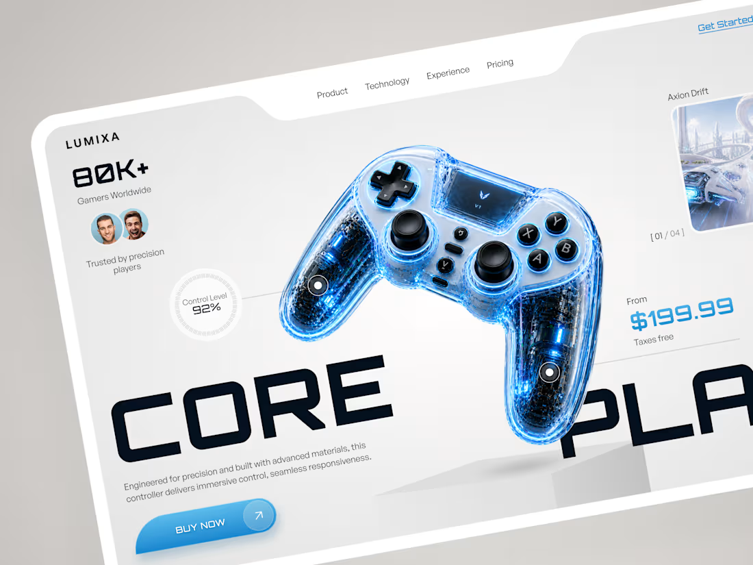
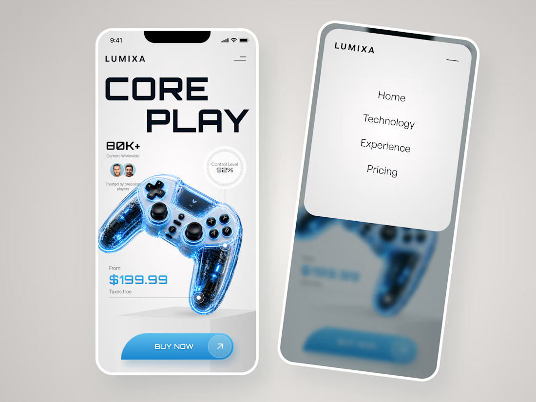
LUMIXA — Gaming Controller Product Landing Page 🎮⚡
LUMIXA is a futuristic product landing page concept created for a premium gaming controller built around precision, performance, and immersive play.
The goal was to make the product itself the center of the experience while...
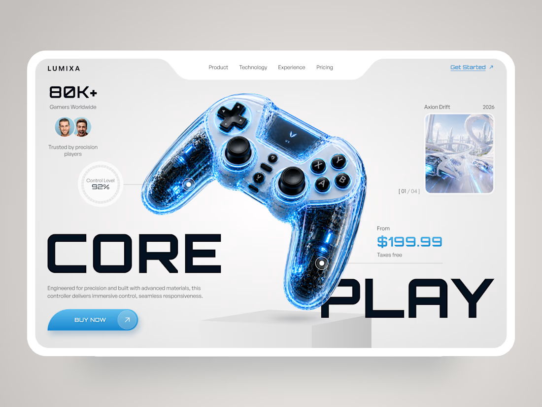

The product is clearly the hero here the clean layout and futuristic visuals make the controller stand out really well.

Light or refined - which E-Bike product breakdown section design would you choose?
Two concepts for the same AUREX e-bike. Same product, same components, two different presentation styles:
A - Soft Studio: subtle gray depth, larger product focus, and a more premium visual feel.
B - Clean Minimal: bright white background, tighter spacing, and a more technical editorial layout.
Which direction feels stronger for a premium e-bike brand and why?

5 voted
31%
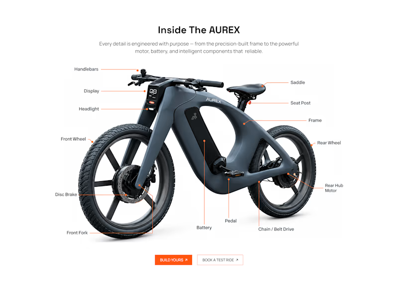
11 voted
69%
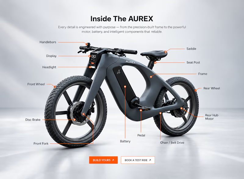
16 votes
Closed

A feels more premium to me. The soft gray depth and bigger product focus make the bike feel like something special. B is great for specs, but A sells the feeling