The network for creativity
Join 1.25M professional creatives like you
Connect with clients, get discovered, and run your business 100% commission-free
Creatives on Contra have earned over $150M and we are just getting started
Back to feedPost


Here's a question every presentation designer should ask:
If someone remembers your slides but forgets your message, was the presentation successful?
We spend so much time making presentations look polished that it's easy to forget what the slides are actually there to do.
A beautiful chart means little if the audience can't understand what the numbers reveal.
A clever headline means little if it doesn't move the story forward.
A visually impressive slide means little if the audience has no idea why it matters.
The problem isn't that presentations are too visual.
It's that sometimes, the visuals become the main event.
Good presentation design should make the message easier to understand, the story easier to follow, and the important decisions easier to make.
Every slide should earn its place.
Every visual should serve a purpose.
Every section should move the audience closer to understanding the bigger picture.
I don't believe a successful presentation is one where every slide tries to impress.
I believe it's one where every slide has a reason to exist.
Design should never compete with the message. It should make the message impossible to miss.
That's the difference between decorating slides and designing communication.
#PitchDeckDesign #PresentationDesign #VisualStorytelling #BusinessCommunication #
The network for creativity
Join 1.25M professional creatives like you
Connect with clients, get discovered, and run your business 100% commission-free
Creatives on Contra have earned over $150M and we are just getting started











Related posts

Same content, different experience. A few thoughtful design choices can completely change how a presentation feels, flows, and communicates. Which version would you choose?

11 voted
31%
24 voted
69%
35 votes
Closed

Verde Vista 1 is more modern and futuristic specially with blue colors and robotic hand❤️
Great job Rasid🎉🎉🔥🔥

What does a SaaS pitch deck look like when the brand gets out of the way of the story?
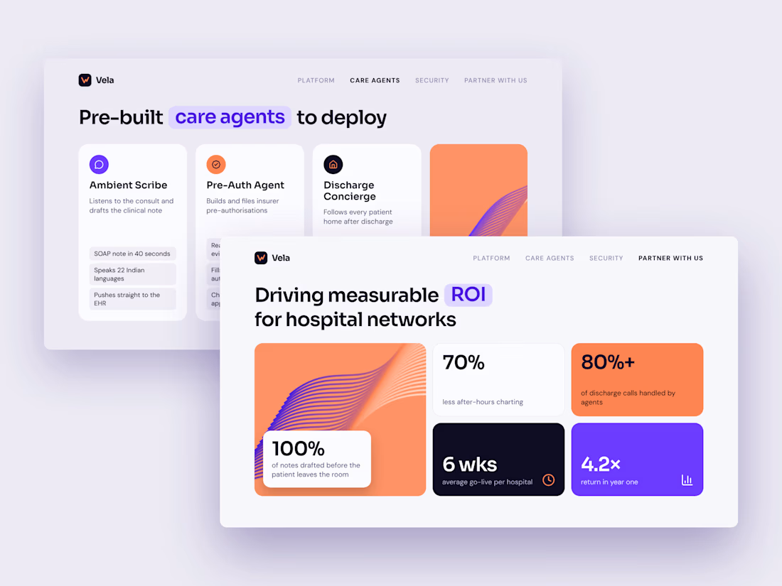
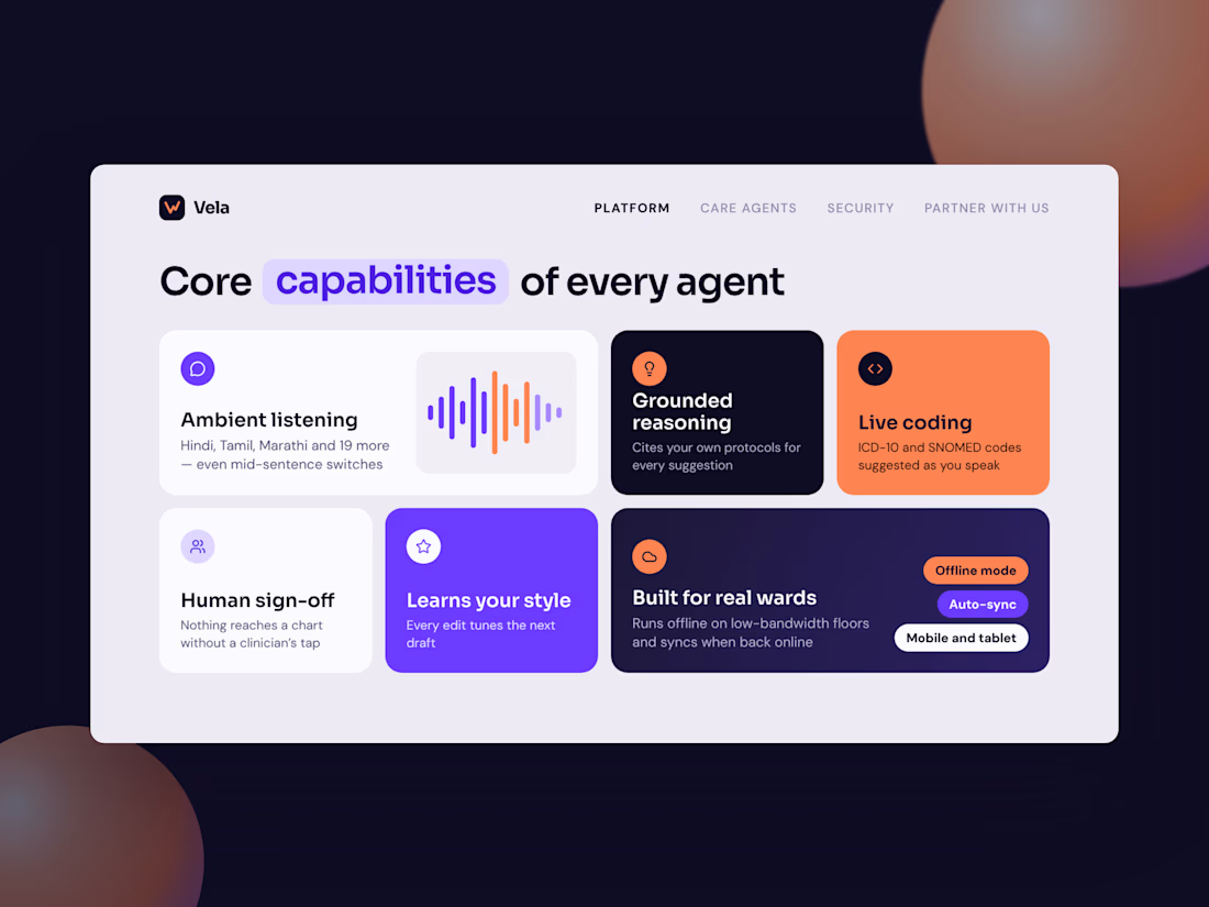
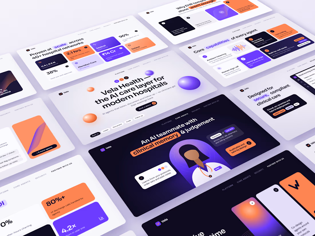
I gave myself a brief: an AI healthcare start-up pitching to hospital networks. No client and no brand guidelines, just a blank canvas.
Meet Vela Health (a concept brand), “the AI care layer for modern hospitals.”
The design choices:
→ Electric violet and coral instead of the usual safe healthcare blue
→ A bento-grid layout, so each slide makes one point at a glance
→ Key words in every headline highlighted in a colour pill
→ Glossy 3D spheres and flowing wave graphics in place of stock photos
→ A product dashboard designed from scratch, so the security slide shows the product instead of just describing it
11 slides covering the problem, the product, proof, rollout and ROI. It’s the full arc of an investor or enterprise pitch.
A good deck isn’t decoration. It’s how a complex product earns a 30-minute meeting.
If your SaaS deck still looks like 2019, let’s talk.
#PresentationDesign #PitchDeck #SaaSDesign #HealthTech #AIinHealthcare #BrandDesign #VisualDesign #Freelance




I really loved the color theme of this pitch deck

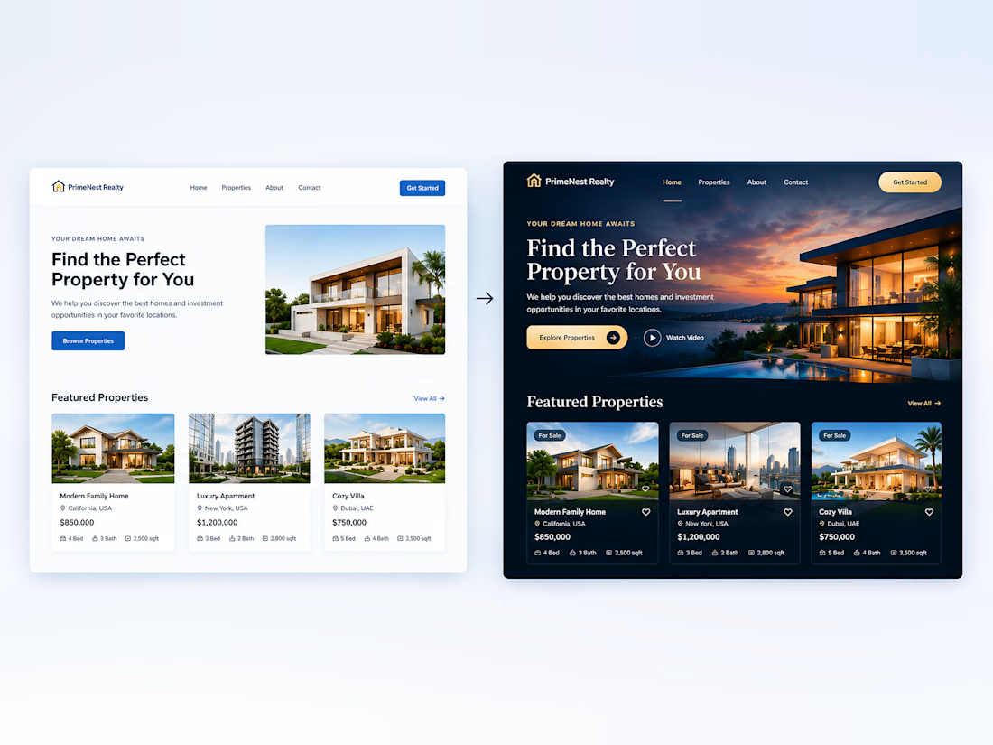
Small Design Changes. A Bigger Difference.
You don’t always need a complete redesign to make a website look more professional. Small improvements in color, typography, spacing, and visual effects can transform the entire experience.
Don’t you agree?