The network for creativity
Join 1.25M professional creatives like you
Connect with clients, get discovered, and run your business 100% commission-free
Creatives on Contra have earned over $150M and we are just getting started
Back to feedPost


Business X-Ray™ | Evidence-Led Organizational Diagnostic


The network for creativity
Join 1.25M professional creatives like you
Connect with clients, get discovered, and run your business 100% commission-free
Creatives on Contra have earned over $150M and we are just getting started



Related posts

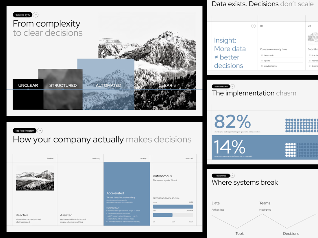
In the mountains, not seeing the road ahead is dangerous, and business works much the same way. This concept deck for an AI consulting firm shows clarity arriving step by step, from black fog to a sharp peak. What does clarity look like in your work?

Very nice 👍🏻

AI system that is capable of generating animated explainer videos including a script, voiceover, soundtrack, sound effects, scene components, camera control.


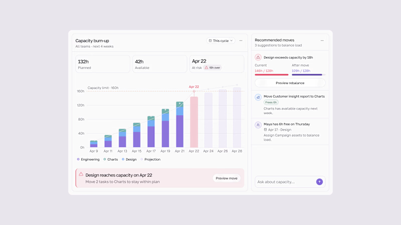
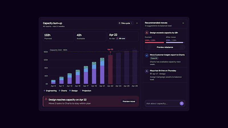
Capacity burn-up UI.
Track team workload, spot capacity risks early, and rebalance work before teams get overloaded.
Light & Dark modes.

2 voted
33%
4 voted
67%
6 votes
Closed

This is the kind of dashboard that actually gets used — the burn-up chart makes overload visible at a glance instead of hiding it in a table somewhere. I like that the point is spotting the risk early, not just reporting it after the fact. Both modes read well, though the dark one makes the chart pop a bit more for me.