The network for creativity
Join 1.25M professional creatives like you
Connect with clients, get discovered, and run your business 100% commission-free
Creatives on Contra have earned over $150M and we are just getting started
Back to feedPost
Finding focus through design 🍵
I recently wrapped up the Website design for Maxon, a premium matcha brand. The goal was to balance a bold, modern aesthetic with an intuitive shopping experience that reflects the purity of the product.
Key design highlights:
Bold Visual Hierarchy: Using oversized, high-contrast typography to immediately establish the brand’s "focus" mission.
Earth-Driven Palette: A monochromatic green scale to evoke freshness and organic quality.
Conversion-First Layout: Streamlined product grids and clear social proof sections to build trust quickly.
What do you think of the color story here? I’m also curious to hear your thoughts on the custom iconography and the flow from the educational content to the shop section.
Drop a comment below! 👇
clean work , looks premium
Thank you!
The network for creativity
Join 1.25M professional creatives like you
Connect with clients, get discovered, and run your business 100% commission-free
Creatives on Contra have earned over $150M and we are just getting started
Related posts
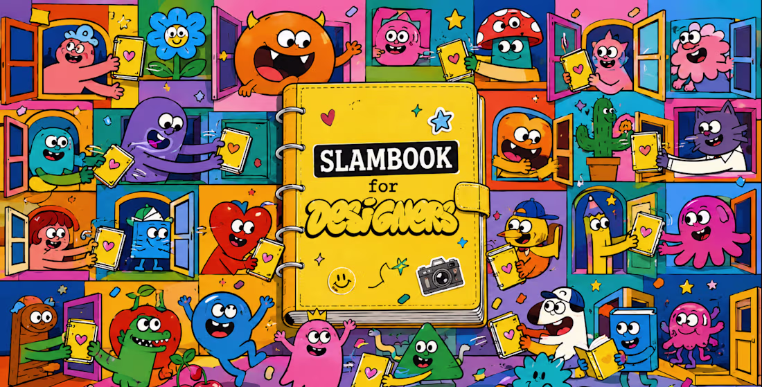
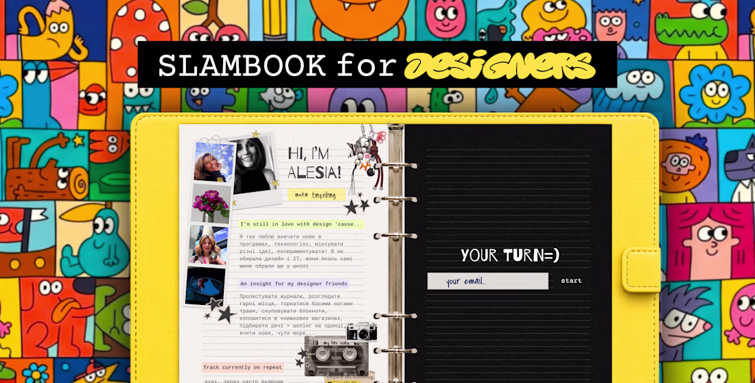
Hi creatives! 👋
For #ConfigMakeathon, I created SLAMBOOK for Designers ✨
https://slambook.figma.site
It's inspired by the slambooks many of us had as kids, but reimagined for the internet.
Designers from all over the world can create their own page by adding photos, favorite music, creative advice, inspirations, and a few fun facts about themselves. It's a playful way to discover people behind the portfolios and build new connections within the design community.
The best part? It lives online and can always be in your pocket, just add it to your home screen like an app.
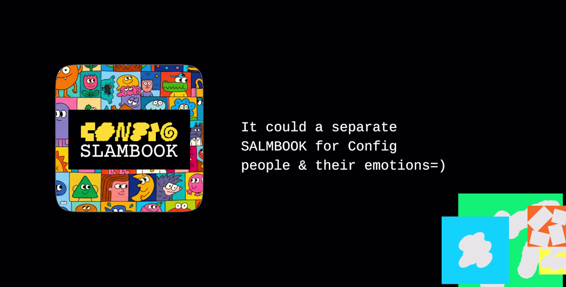
This concept could work for any community.
Imagine a special Config edition where attendees share their photos, inspirations, favorite talks, creative superpowers, or memorable moments from the event.
A little internet corner where creativity, personality, and community come together 💛
If it resonates, pass it on and start your own page 💛
If you really love it, I’d be sooo grateful for your support. Every goat, like, comment, share, means so much for me. Thank you!
Project Link:
https://slambook.figma.site
Video Instagram:
https://www.instagram.com/reel/DZpeUvBo4bs/?igsh=bDhhMnc1aXlzODls
Let's make this slambook really worldwide =))) Add your pages https://slambook.figma.site 😍 WHO NEXT?
Proud to share my submission for the #configMakeathon 🦋
Design has one job — make people feel something before they think something.
For the #ConfigMakeathon, I built a complete digital campaign experience for Butterfly Conservation's "Britain's Favourite Butterfly" — taking a public vote and transforming it into something people actually want to be part of.
The challenge wasn't technical. It was human. How do you make someone genuinely care about a species they've never noticed? How do you turn conservation data into something personal? How do you design an experience that moves people from passive viewers to active participants?
The answer was architecture — three distinct experiences working as one:
🗳️ Results Explorer — A fully filterable species discovery system built around personality vibes, wing colours, and rarity. Not a leaderboard. A world worth exploring.
🧬 Personality Quiz — A matching experience that gives every user a butterfly identity rooted in real behavioural traits. Flashy. Feisty. Adventurous. Rare. When someone sees themselves in a species, the relationship changes entirely.
🌿 Conservation Narrative — A story-first approach to ecological data that earns its urgency rather than demanding it. The stakes land harder when you already have a favourite.
This is the kind of work I find most meaningful — where design isn't decoration, it's the strategy itself.
🔗 Prototype:Prototype
Built with Figma · Figma Make · MCP
#ConfigMakeathon #Figma #UXDesign #ProductDesign #DesignForGood #ButterflyConservation @Figma @Contra @Contra HQ
Pretty Good!
Hi everyone! 👋
I'm Maria, a graphic designer from Ukraine and a Master's graduate in Marketing.
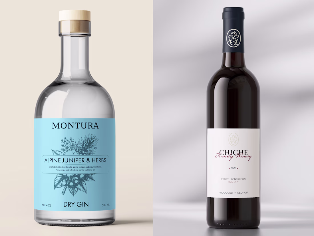
For the past 3+ years, I've been helping brands bring their ideas to life through thoughtful visual design. I specialize in branding, logo design, packaging, and visual identities, with a particular love for creating clean, modern, and memorable brand experiences.
My background in marketing allows me to look beyond aesthetics and think about how design can support a brand's positioning, communication, and growth. I enjoy combining strategy and creativity to create visuals that not only look good but also make sense for the business behind them.
Over the years, I've had the opportunity to work with clients from different industries and countries, collaborating on everything from startup brands to premium product packaging.
I'm joining Contra to connect with inspiring people, build meaningful collaborations, and continue growing as a designer. Happy to be here and excited for everything that's ahead. ✨
Дуже круті роботи🔥
Trending
Claude
Claude has entered the design space. How are you using Claude Design?
Contra University
Learn from expert creatives how to earn more using next-gen AI tools.
MagicPath
The canvas is infinite, and exploration is becoming the workflow. How are you using MagicPath?
creativeaiflow
Creative AI workflows are evolving. What tools do you use, and what are their strengths and weaknesses?
freelancerlife
Freelancer life is wins, pivots, and everything in between. What’s yours right now?