The network for creativity
Join 1.25M professional creatives like you
Connect with clients, get discovered, and run your business 100% commission-free
Creatives on Contra have earned over $150M and we are just getting started
Back to feedPost


Feature launch film for .amo - one card, any banking app, cashback follows. Storyboard to final grade.


Sick 🔥


Incredible work!
The network for creativity
Join 1.25M professional creatives like you
Connect with clients, get discovered, and run your business 100% commission-free
Creatives on Contra have earned over $150M and we are just getting started








Related posts


Fresh case study 🚀🚀🚀
Brand identity for Peak, an all-in-one website builder for WordPress that I design and build. A four-letter mark, a warm paper-and-ember palette and one system that runs from the favicon to the packaging.


A four-letter mark that has to hold from favicon to packaging is a tough constraint. Did you draw one letterform first and build the other three from it, or design them together as a set from the start?


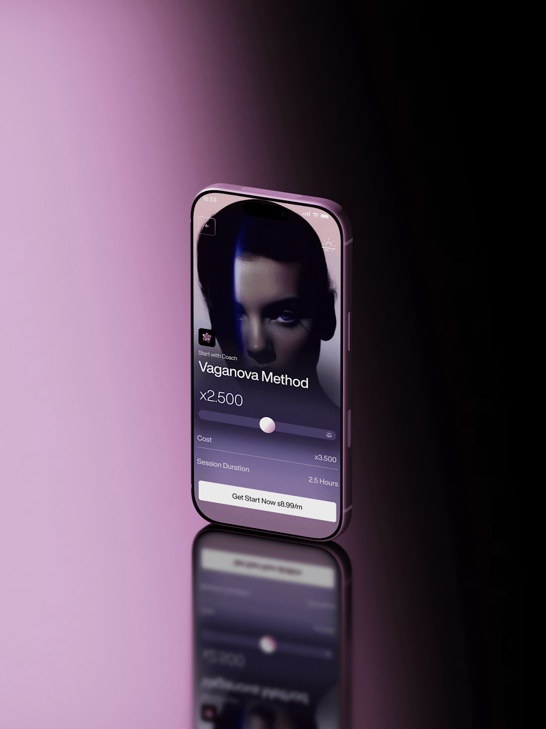
Super sleek presentation! ✨ The phone mockup with that purple gradient is looking premium. Clean editing!

One scene, from the rough visual to the final shot 👀
Made a quick breakdown of how the 3D, lighting, materials, textures, and motion came together.
This is probably my favorite kind of content to make. Just showing how the thing actually gets built.