The network for creativity
Join 1.25M professional creatives like you
Connect with clients, get discovered, and run your business 100% commission-free
Creatives on Contra have earned over $150M and we are just getting started
Back to feedPost

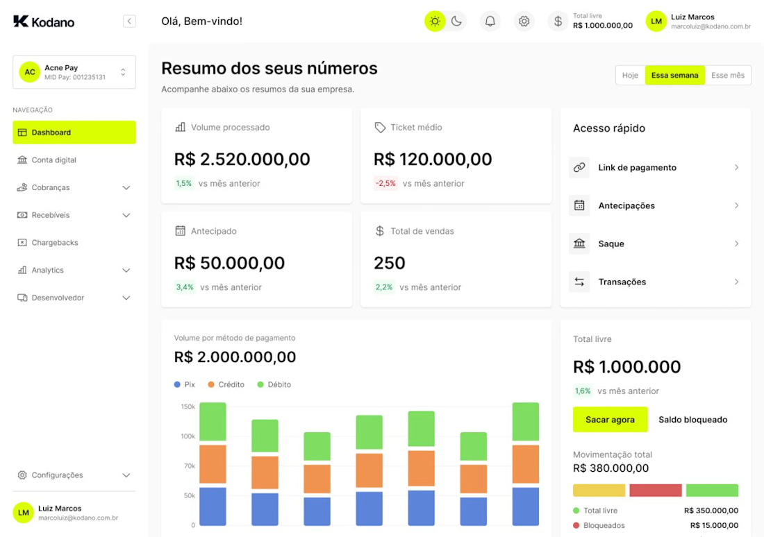
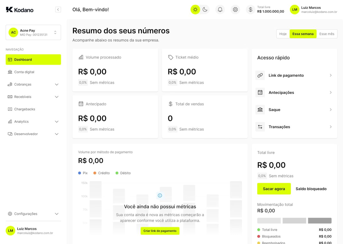
I was having trouble this week with creating an empty state that actually worked
Something visually interesting, illustrative… without leaving that feeling of a “dead” interface as soon as the user arrives at the product.
The most common approach has always been to use illustrations. And it makes sense, it's what works best.
But how to do that without time, or without someone dedicated to drawing everything? It would even be possible to generate it with AI, but arriving at a consistent line, with personality and aligned with the product… takes time.
So I thought, what if I kept the component itself there… but deactivated? And that's how I arrived at this result. A simple, visual, and contextual empty state.
It avoids that feeling of emptiness and also helps the user understand what will happen in that space when they start using the product. If it will be a table…
Sometimes, the best solution is not to add more elements. It's to reuse the context that already exists in the interface.

The network for creativity
Join 1.25M professional creatives like you
Connect with clients, get discovered, and run your business 100% commission-free
Creatives on Contra have earned over $150M and we are just getting started
Related posts


Web concept for bem. The product turns messy documents into structured data, so the brand does the same thing visually. Every image dissolves into pixels, every layout resolves back into grid.
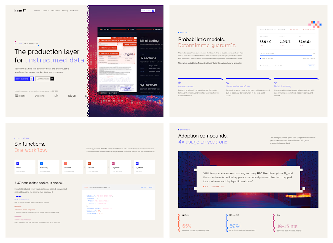

How did you first come up with the idea to use pixel dissolution to represent unstructured data? Did you explore any other visual metaphors before landing on this one?


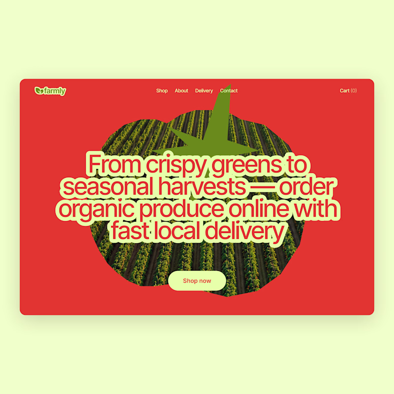
I already shared the first concept a few days ago, but I couldn’t stop exploring 😅
So here’s an alternative direction.
Which one would you pick?
Vote below 👇
75 voted
63%
45 voted
37%
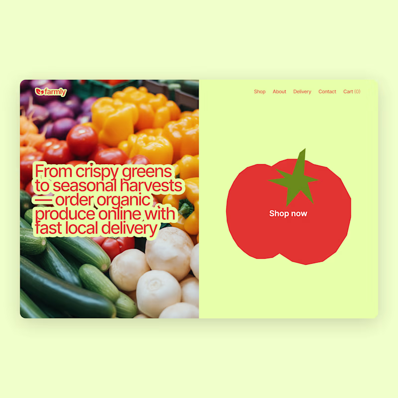
120 votes
Closed


recent static ad work for an AI-native B2B marketing automation platform
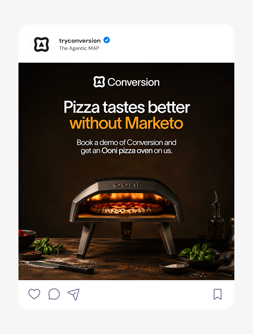
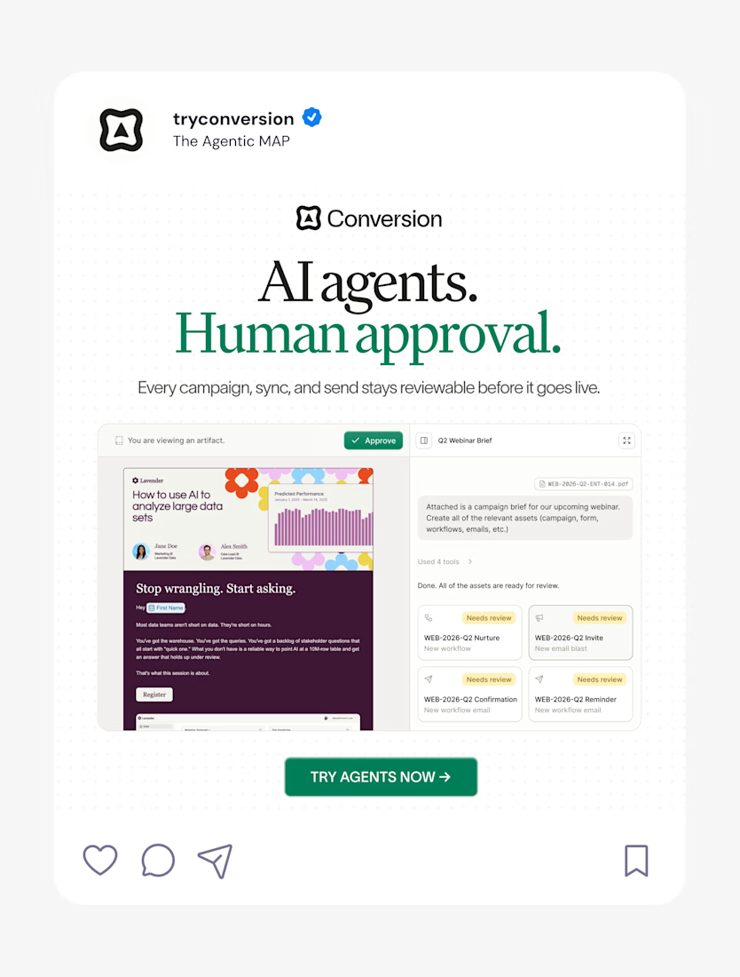


Nice work as usual! The layout balance here is exactly what makes high-converting landing page hero sections work.










Trending

Claude
Claude has entered the design space. How are you using Claude Design?

Contra University
Learn from expert creatives how to earn more using next-gen AI tools.
creativeaiflow
Creative AI workflows are evolving. What tools do you use, and what are their strengths and weaknesses?
freelancerlife
Freelancer life is wins, pivots, and everything in between. What’s yours right now?