The network for creativity
Join 1.25M professional creatives like you
Connect with clients, get discovered, and run your business 100% commission-free
Creatives on Contra have earned over $150M and we are just getting started
Back to feedPost

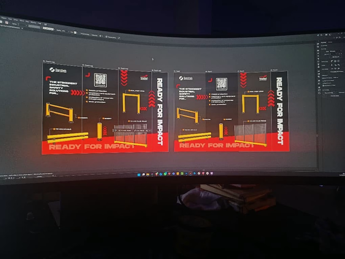
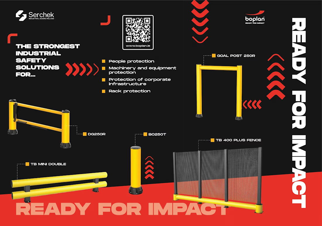
Boplan and Serchek already had their message: the strongest industrial safety solutions, and ready for impact. The design job was making sure it survived a busy exhibition hall. The yellow products are the loudest thing on the wall and everything else goes dark.
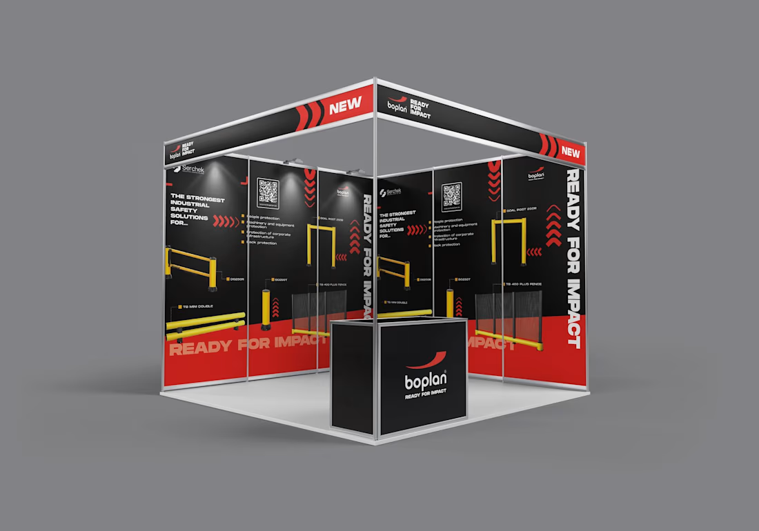
Red chevrons pull the eye from one panel to the next. The QR code sits where a hand would naturally reach. “Ready for impact” runs vertical and huge, because people read the big words from across the room and the small ones only if the big ones worked.
Each of those is a decision, and a good designer makes dozens of them before anyone sees the file. Get them wrong and the stand still looks fine, but the message gets lost. If people can’t read the wall in three seconds, they keep walking.
That’s why I’d push for bringing a designer in early, not once the content is locked. The product and the pitch are yours. Someone who thinks all day about hierarchy, contrast and how print behaves under hall lighting will help that pitch land harder.
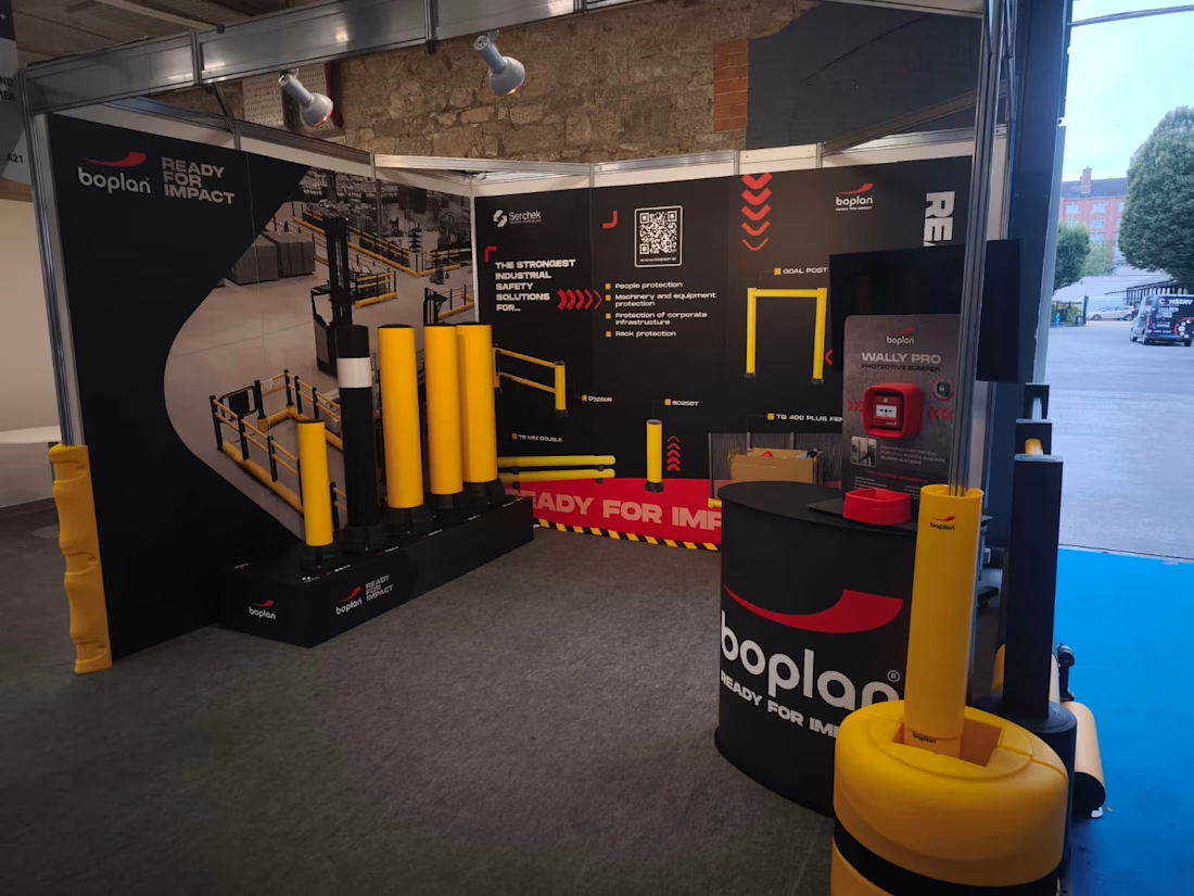
Here's the image of the design on the canvas in my design software and the design in action at the recent Royal Institute of the Architects of Ireland (RIAI) Architecture & Building Expo, with the real barrier standing next to the printed one. When the design is working, nobody notices it. They just get the message.
The network for creativity
Join 1.25M professional creatives like you
Connect with clients, get discovered, and run your business 100% commission-free
Creatives on Contra have earned over $150M and we are just getting started











Related posts

From complex AI governance content to a polished, professional publication. 🤖📘
A look at Drafting Your AI Policy: A Practical Guide for Enzai — a detailed corporate guide covering responsible AI governance, technical safeguards, legal compliance, and organisational policies.
This project brings together editorial design, structured long-form content, and a consistent visual identity to make complex information easier to navigate.
✨ Key design highlights:
Professional multi-page publication layout
Clear typography and information hierarchy
Structured content, section dividers, and callout elements
Consistent branding across the guide
Readable layouts for detailed business and technical information
I specialise in designing corporate reports, white papers, brand books, policy guides, eBooks, company profiles, and other multi-page business publications using Canva and Adobe design tools.
Have a detailed document that needs a professional design upgrade? Let's turn your content into a polished publication.
Contact me on Contra to discuss your next project!
#BrandBook #CanvaDesign #AdobeInDesign #AdobeIllustrator #EditorialDesign #PublicationDesign #DocumentDesign #CorporateDesign #ReportDesign #GraphicDesigner
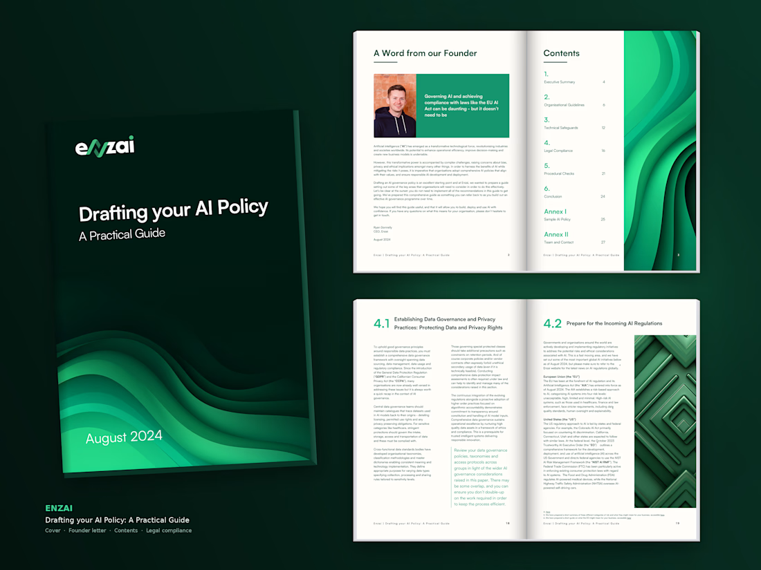

The dark green cover with that wave motif does a lot of heavy lifting here. It makes a policy document feel like something you actually want to pick up. The interior spreads keep the same energy with clean hierarchy and callouts that break up the density. For a document this...


Always wonder at your perfect work

Title: Proper Form — Brand Identity & Visual Language
A brand identity for Proper Form built around a more modern, movement-driven take on recovery and healthcare.
The visual system extends the logo into a complete language through color, typography, imagery and layout, creating a consistent identity across different brand touchpoints.
Created by Lepisov Branding in collaboration with @Creative Mints
Logo design: Ilya Gorchanyuk
Creative direction: Dmitry Lepisov
Brand identity: Lepisov Branding × Creative Mints


Using the logo mark as the big graphic across the layouts is smart. The purple to pink gradient gives recovery a more energetic feel.