The network for creativity
Join 1.25M professional creatives like you
Connect with clients, get discovered, and run your business 100% commission-free
Creatives on Contra have earned over $150M and we are just getting started
Back to feedPost

🎥 New here? This is me — 20+ years deep in UX/UI, still as obsessed with good design as day one.
I made this short intro so you know who's behind the work before you scroll through it.
👋 What I do: turn ideas into interfaces people actually enjoy using — apps, websites, products, all of it.
This community is full of incredible talent, and I wanted to put a face (and voice) to the portfolio.
🎬 Video's on my profile — give it a watch and tell me: what's one thing that makes you trust a designer's work in the first 10 seconds? And while you're at it, what would you rate it out of 10?
/dotoxygen
Let's connect. 👇
The network for creativity
Join 1.25M professional creatives like you
Connect with clients, get discovered, and run your business 100% commission-free
Creatives on Contra have earned over $150M and we are just getting started



Related posts

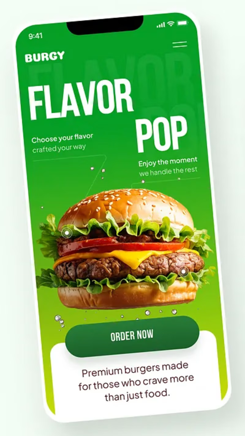
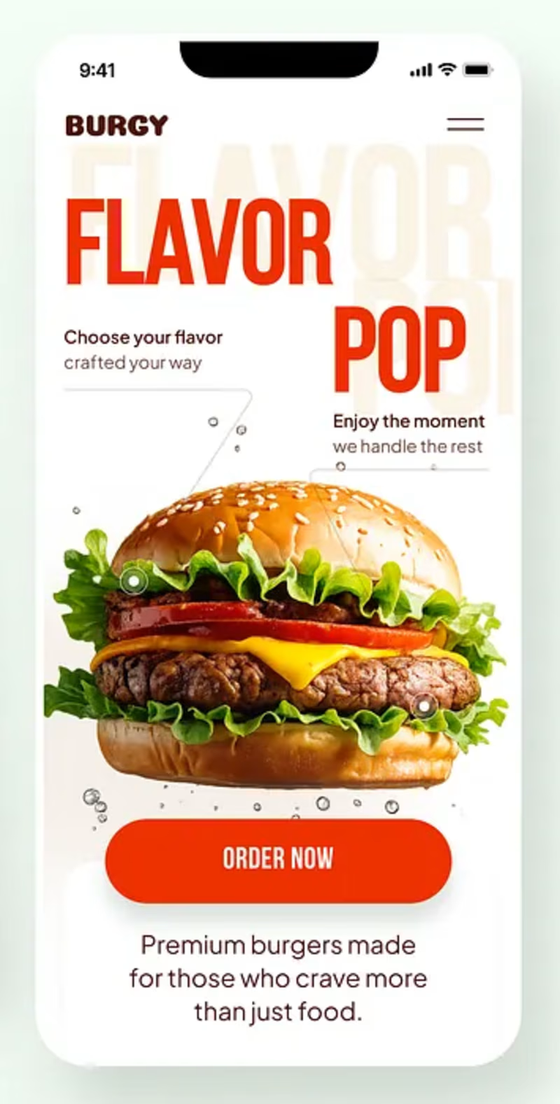
Burgy, a mobile concept for burger ordering. 🍔
Bold type, premium food visuals, and a fast path from craving to checkout.
Two color directions for the hero screen. Which one converts better?
Vote and tell me why 👇
Poll options: 🟢 Green | 🔴 Red
#UIDesign #MobileApp #FoodApp #AppDesign #UX #RestaurantApp


13 voted
43%
17 voted
57%
30 votes
Closed

Green for me, and I'd bet on it converting better too. The red version is loud in the way every food app is loud, while the green makes the burger the hero and the screen instantly recognizable in a feed. The green background also gives the white FLAVOR POP type far more contrast, so the message lands a beat faster.

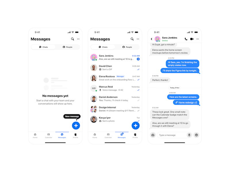
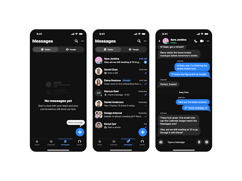
Started this messages flow in light mode. then I did a dark version just to check. Now I can’t pick, so i’ve handed the decision to strangers on the internet
0 voted
0%
12 voted
100%
12 votes
Closed
Light mode gets my vote here. The message bubbles and the blue accent have room to breathe against the white, and the timestamps stay readable at a glance. The dark version looks slick, but for a screen people stare at all day, the light one will feel easier on the eyes over a long chat.


Which homepage would make you more likely to explore the platform?
HackStack features bold typography, teal gradients, and a centered layout focused on AI tools and automation. DataVistaHQ uses purple accents, a split layout, and a prominent dashboard preview to introduce its business intelligence platform.
I would like your perspective on the visual design, clarity, and first impression. Which approach communicates its value more effectively and makes you want to take the next step?
Vote for your preferred design and share what influenced your choice: the colors, headline, layout, dashboard preview, or overall presentation.
#WebDesign #AIWebsites #UIUXDesign #SaaSDesign #TransformedDesign


2 voted
17%

10 voted
83%

12 votes
Closed

Visually, I lean toward DataVistaHQ, but the cognitive load is really high. The value proposition and the stats feel like they're competing for attention.
On the other hand, HackStack has a much better visual hierarchy. The value proposition and CTA group immediately give me a...