The network for creativity
Join 1.25M professional creatives like you
Connect with clients, get discovered, and run your business 100% commission-free
Creatives on Contra have earned over $150M and we are just getting started
Back to feedPost

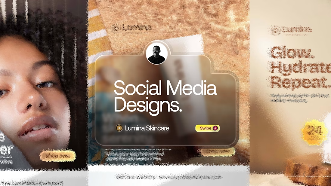
A little creativity, a lot of visual fluidity. ✨
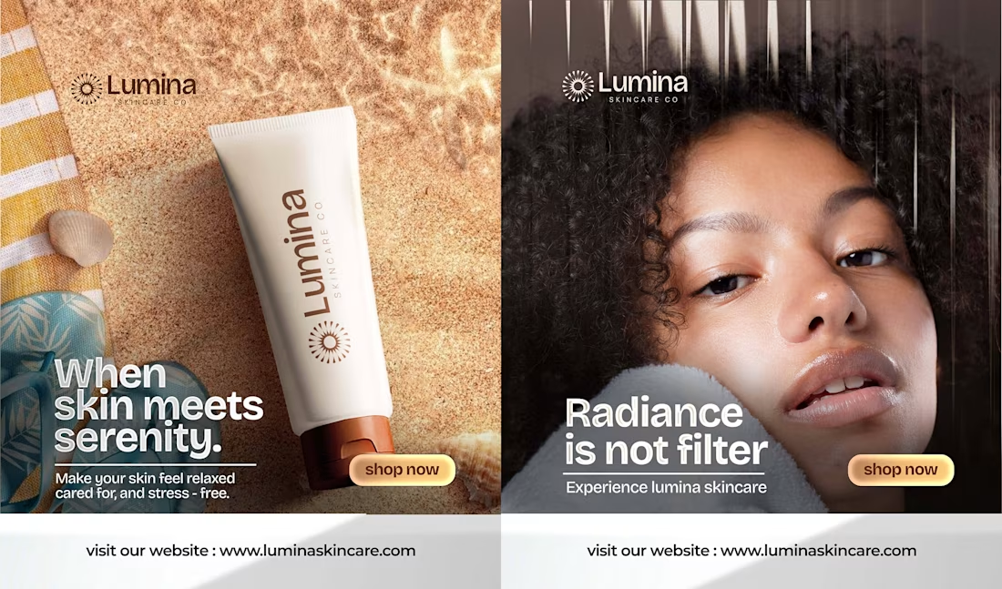
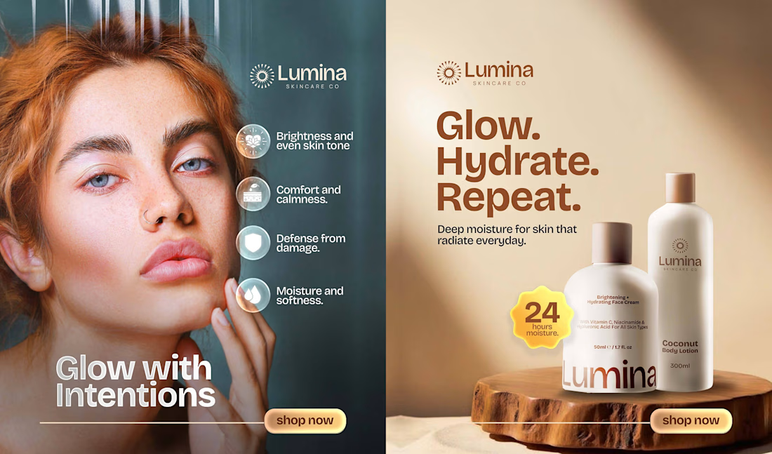
For Lumina Skincare, I explored a visual direction that communicates radiance, beauty, and the brand's skincare identity.
Every detail was intentional, from the colours to the visual composition.
Design that doesn't just catch the eye, but communicates the brand.
#SocialMediaDesign #BrandDesign #CreativeDirection #LuminaSkincare
The network for creativity
Join 1.25M professional creatives like you
Connect with clients, get discovered, and run your business 100% commission-free
Creatives on Contra have earned over $150M and we are just getting started



Related posts

Ovéa — care with character.
One skincare identity across bottles, jars and tubes. I designed the wordmark, pink-and-cobalt packaging system, campaign applications and digital mockups, then brought the collection into motion.
A consistent visual language, with room for each product to feel individual.
View the full case study. Building a skincare brand? Let’s talk about your identity and packaging.

Love the colour direction and the visual language. Everything feels so well thought out. The overall look is beautiful.

I was working on the visual identity for the Ivy and wanted to experiment with stippling.
Thousands of tiny dots forming an image. Simple enough as an idea.
Figma had other plans.
I tried plugins, but the number of SVG elements was too much.
My laptop slowed down, and eventually the workflow became unusable.
I remember thinking, "Why am I trying so hard to make this work inside Figma?"
I didn't need another plugin. I needed a different tool.
So I built one.
It's called Stippling Studio.
Nothing revolutionary.
Just a tool that lets me experiment with the visual treatment I had in mind.
But the experience stuck with me.
For years, I learned to work around the limitations of my tools. Now I can sometimes build my way around them.
https://stippling.pash.website/

So cool!!

Working on a new brand identity for a curly-coated dog grooming brand!
We're exploring the initial visual directions and atmosphere. Which mood board speaks to you more?
19 voted
66%
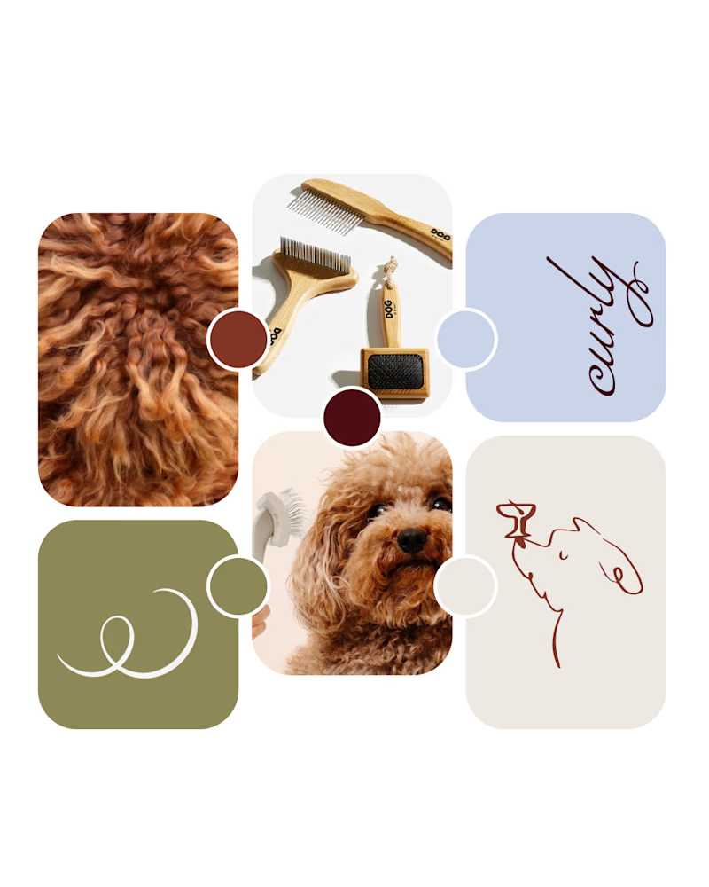
10 voted
34%
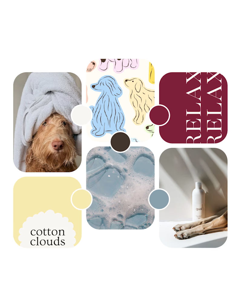
29 votes
Closed
Option 1 looks amazing!