The network for creativity
Join 1.25M professional creatives like you
Connect with clients, get discovered, and run your business 100% commission-free
Creatives on Contra have earned over $150M and we are just getting started
Back to feedPost

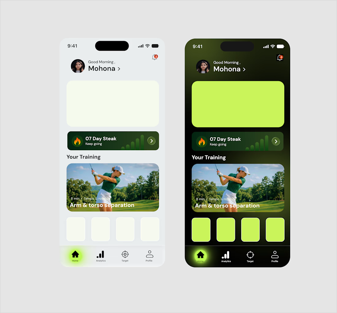
Light mode or Dark mode? Which vibe fits this fitness UI better?
Just wrapped up designing the UI for this fitness & sensor tracking mobile app. I wanted to explore both a clean, airy Light Mode and an immersive, glowing Dark Mode with subtle gradients and neon accents.
Both versions maintain high contrast and readability, but they give completely different user experiences.
👉 Let me know in the comments: Are you team Light Mode ☀️ or team Dark Mode 🌙?
#UIUX #MobileApp #Figma #DesignCommunity #UserInterface #DarkVsLight



Stunning
The network for creativity
Join 1.25M professional creatives like you
Connect with clients, get discovered, and run your business 100% commission-free
Creatives on Contra have earned over $150M and we are just getting started







Related posts


Every element feels perfectly placed! 👏

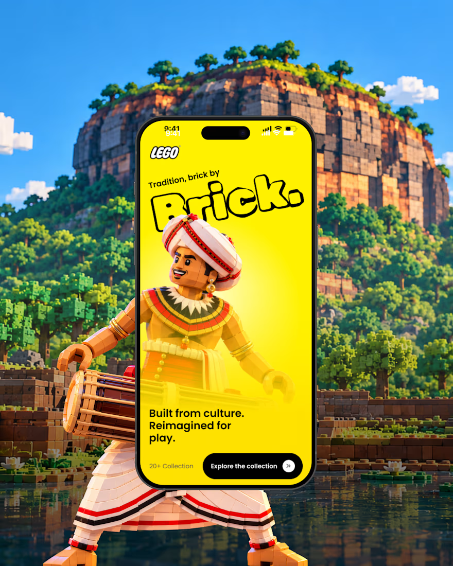
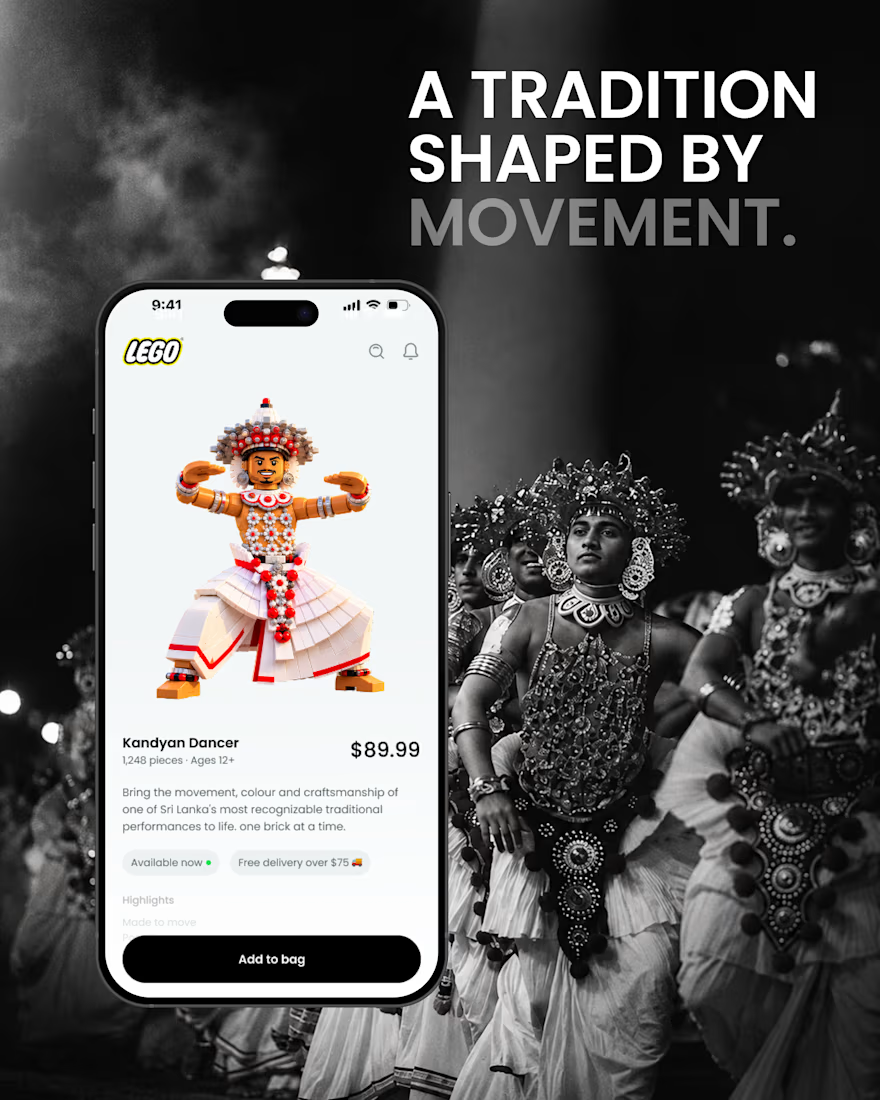
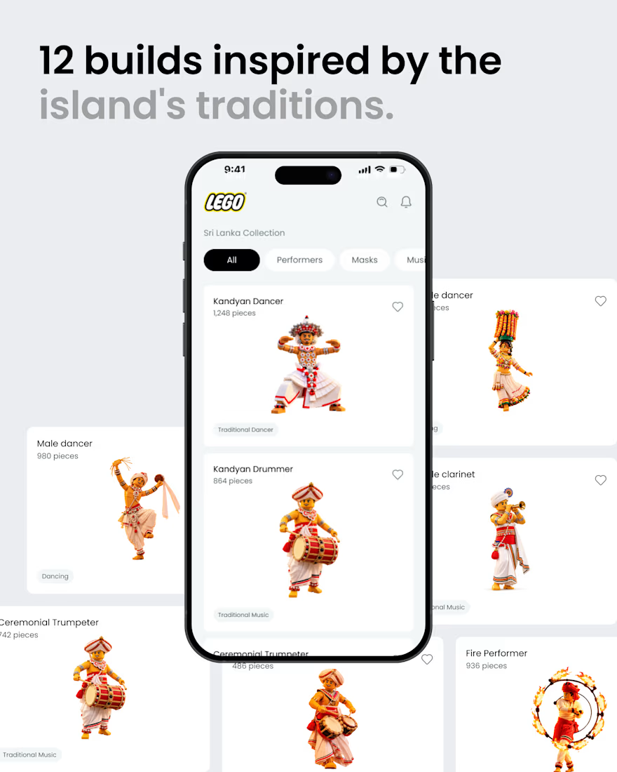
What if Sri Lankan tradition found its way into the LEGO app? 🇱🇰🧱
A small product design exploration.
Had a small idea and decided to visualize it. ✌️
I reimagined a few elements of Sri Lankan culture traditional dancers, masks, musicians, and instruments as brick built characters, then explored how they might live inside a LEGO style mobile experience.
Just a hypothetical design experiment combining culture, product design, and a little AI-assisted exploration.
Not affiliated with or endorsed by LEGO.
#ProductDesign #UIDesign #DesignConcept #DesignExploration #CreativeAI #SriLanka #SriLankanCulture #LEGO

That's awesome great job 🎉🎉

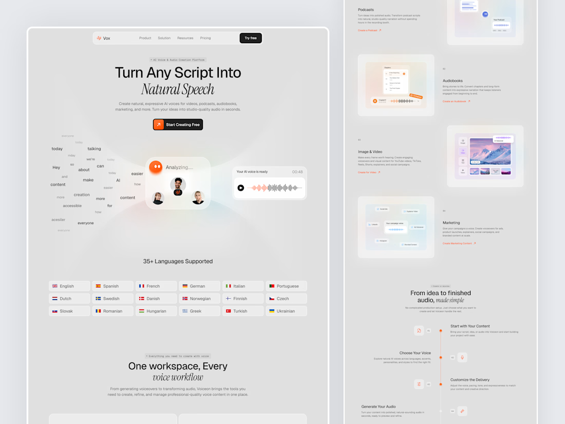
Designed a modern AI Voice SaaS Landing Page.
A soft light interface with gentle color glows, warm orange accents, and elegant italic serif headlines for a calm and creative first impression.
A floating word cloud turning into a voice wave, a language grid, use case cards for podcasts, audiobooks, video, and marketing, plus a simple step by step flow make AI voice creation feel easy to understand. Clean spacing and soft cards keep the whole page light and easy to explore.



Nice UI