The network for creativity
Join 1.25M professional creatives like you
Connect with clients, get discovered, and run your business 100% commission-free
Creatives on Contra have earned over $150M and we are just getting started
Back to feedPost


The network for creativity
Join 1.25M professional creatives like you
Connect with clients, get discovered, and run your business 100% commission-free
Creatives on Contra have earned over $150M and we are just getting started








Related posts

New case study added!
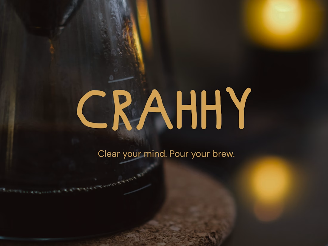
Crahhy is a speciality coffee brand rooted in the relatable human psychology of coffee cravings.
The objective was to design a brand that is minimal on the outside yet delightfully chaotic on the inside, blending specialty coffee aesthetics with honest, humorous storytelling.


minimal outside chaotic inside is the right brief for coffee

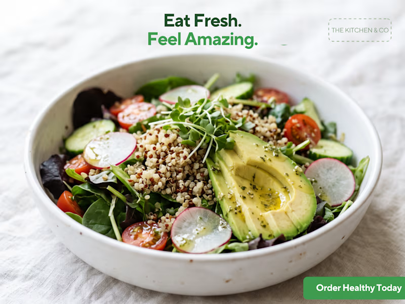
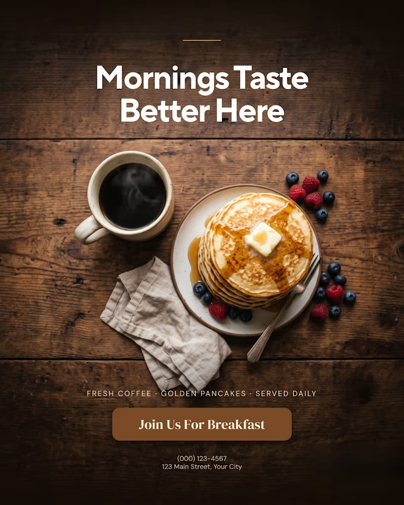
A creative food advertising design series focused on bold typography, visual hierarchy, and appetizing food photography.
The first design uses warm, rustic tones and expressive typography to create a cozy breakfast feel, while the second combines fresh green typography with a clean, modern layout for a healthy food concept.
Both designs explore how typography, color, and composition can communicate different food brand identities.
Which design do you prefer, the warm breakfast aesthetic or the fresh, minimal look?
1 voted
11%
8 voted
89%
9 votes
Closed

That is more attractive to me great job Malaika🎉🎉🎉

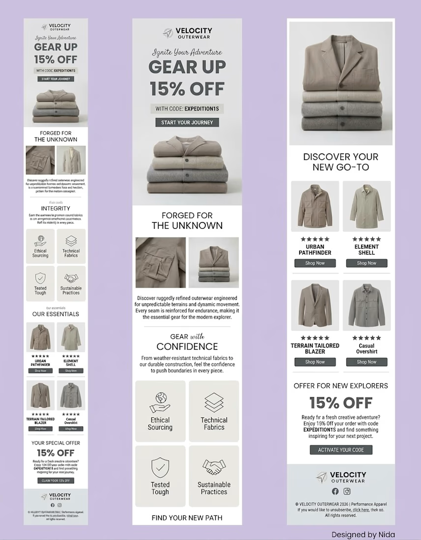
Email Newsletter Design for Velocity Outerwear
A clean, conversion-focused email newsletter design for a concept apparel brand. Includes a bold hero banner, brand story section, icon-based features, product showcase and clear CTA buttons. Built to look great on both desktop and mobile.
Available for email design, newsletters and marketing visuals.
Email Marketing DesignEmail MarketingMarketing StrategyFigmaKlaviyoMailChimpemaildesigngraphicdesignemailmarketing