The network for creativity
Join 1.25M professional creatives like you
Connect with clients, get discovered, and run your business 100% commission-free
Creatives on Contra have earned over $150M and we are just getting started

The network for creativity
Join 1.25M professional creatives like you
Connect with clients, get discovered, and run your business 100% commission-free
Creatives on Contra have earned over $150M and we are just getting started





Related posts


Good logo

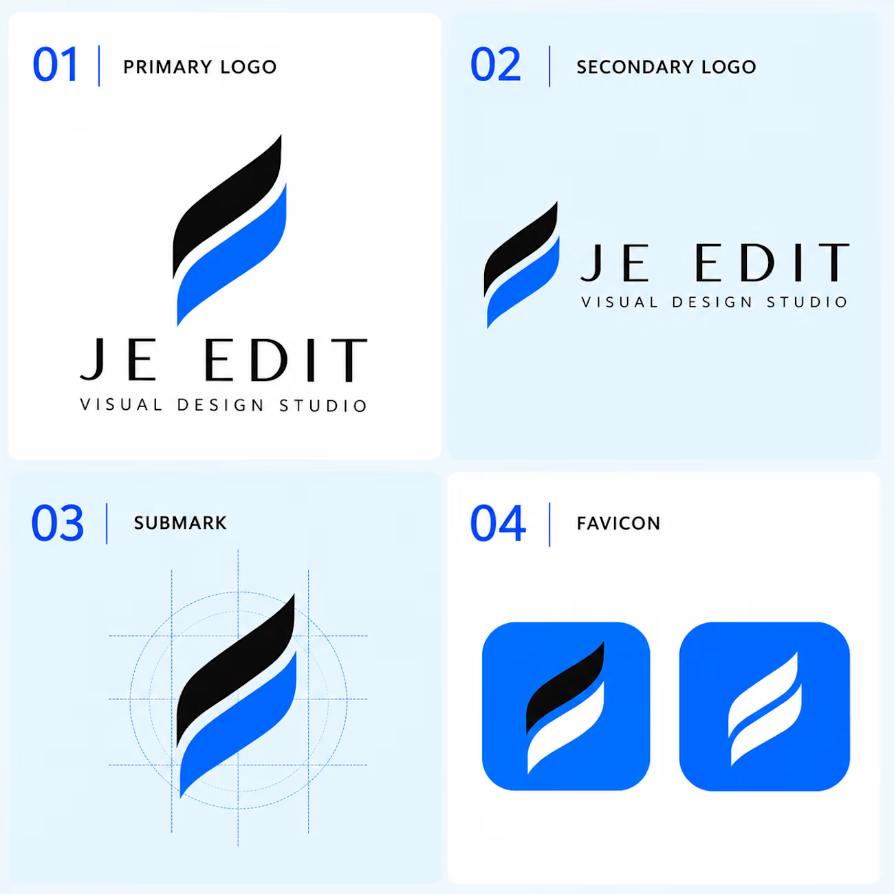
JE EDIT — Logo System & Visual Identity
Follow the design journey → @je_edit_
Instagram — @je_edit_
Your support through a follow, like, save or share helps JE EDIT grow.
A logo is not just a mark. It is the foundation of a visual system.
For JE EDIT — Visual Design Studio, I developed a flexible identity built around movement, precision, simplicity, and visual transformation.
The identity explores how a single visual idea can become a complete, consistent system across different brand touchpoints.
01 — Primary Logo
The core brand signature for the strongest and most recognizable presentation.
02 — Secondary Logo
A horizontal configuration created for wider layouts and communication applications.
03 — Submark
The symbol reduced to its essential form and supported by a structured construction system.
04 — Favicon
A compact expression designed to maintain recognition at small digital sizes.
Design Philosophy
The objective was not simply to create a logo, but to build a visual foundation that can adapt, scale and remain recognizable across different environments.
One symbol.
Multiple applications.
One consistent identity.
Designed & developed by JE EDIT — Visual Design Studio.



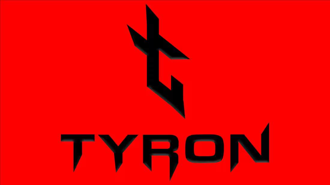
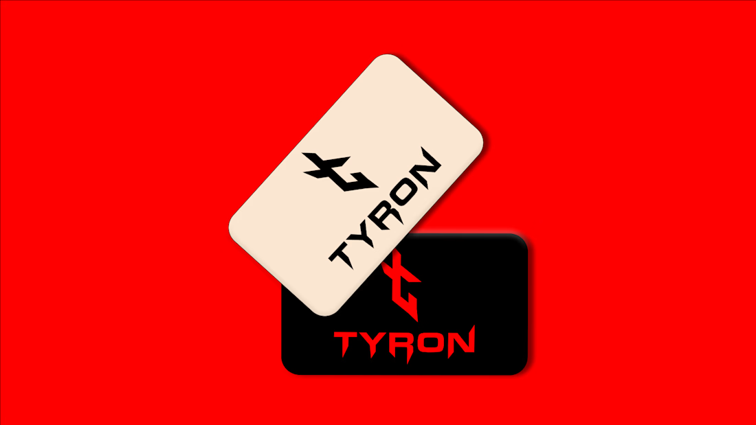
TYRON — Logo Design
TYRON is a conceptual logo design focused on creating a bold, distinctive, and memorable visual mark.
The logo combines a custom geometric symbol with a sharp, modern wordmark, creating a strong identity that remains clean and versatile across different applications.
Scope: Logo Design · Logomark · Custom Wordmark · Visual Exploration