The network for creativity
Join 1.25M professional creatives like you
Connect with clients, get discovered, and run your business 100% commission-free
Creatives on Contra have earned over $150M and we are just getting started
Back to feedPost

Your website looks incredible. But if it isn't ranking on page one of Google, it is essentially invisible.
I talk to service business founders all the time who spent thousands on a beautiful website, only to realise their phone isn't ringing.
Design gets people to trust you, but technical SEO is what gets them to find you in the first place. You cannot just slap some keywords on a page and expect to outrank your competitors in 2026.
When I build or rebuild a platform, I engineer it for search visibility from the ground up:
The Foundation: Clean, lightweight code and ultra-fast hosting configurations so Google crawls your site instantly.
Strategic Architecture: Proper H1/H2 tagging, smart internal linking, and optimised metadata so search engines understand exactly what services you offer.
The Conversion Engine: Once they land on the page, the UI is designed to do one thing—turn that traffic into a booked client through seamless navigation and clear calls to action.
A website should be your hardest-working salesperson. If your current platform looks great but generates zero leads, we need to look under the hood.
📌 I am currently taking on new development projects for brands that are ready to scale their organic traffic. Let’s build something that ranks.
#SEOWebDesign #WordPressDeveloper #LocalSEO #WebDevelopment #LeadGeneration #BusinessGrowth #FrontendDeveloper

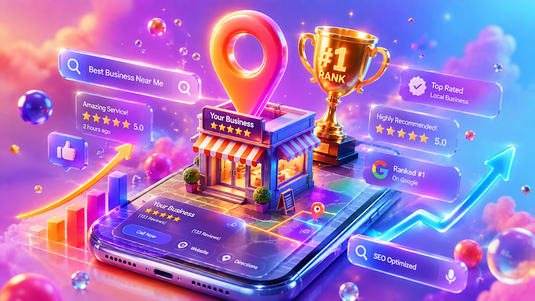

The distinction between visual credibility and discoverability is important for service-business founders. A beautiful site creates trust only when the right prospects can actually find it.
The network for creativity
Join 1.25M professional creatives like you
Connect with clients, get discovered, and run your business 100% commission-free
Creatives on Contra have earned over $150M and we are just getting started



Related posts


Site of the Day!
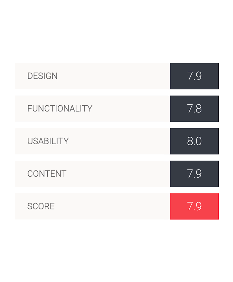
Heed Collective's first award, and I couldn't be prouder of what we created together. Celebrating a project we poured so much care into ✨

how exciting, so well deserved.


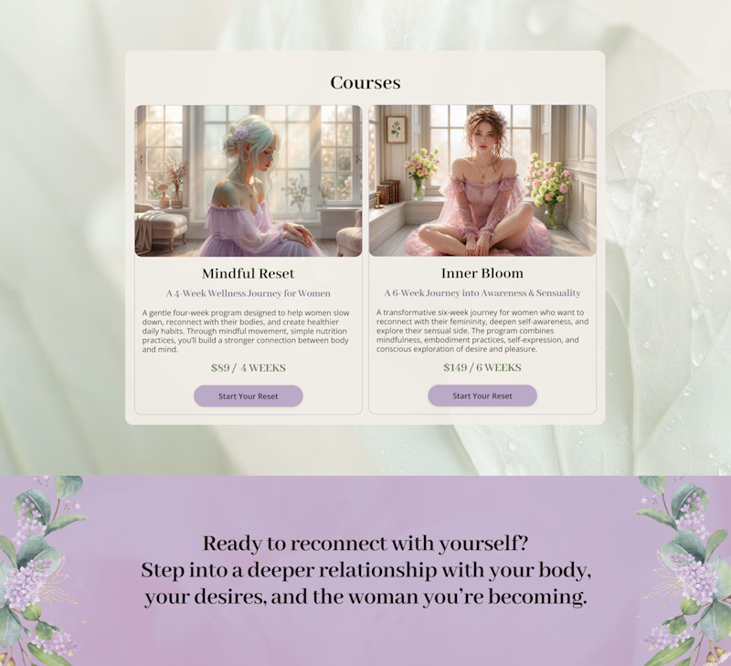
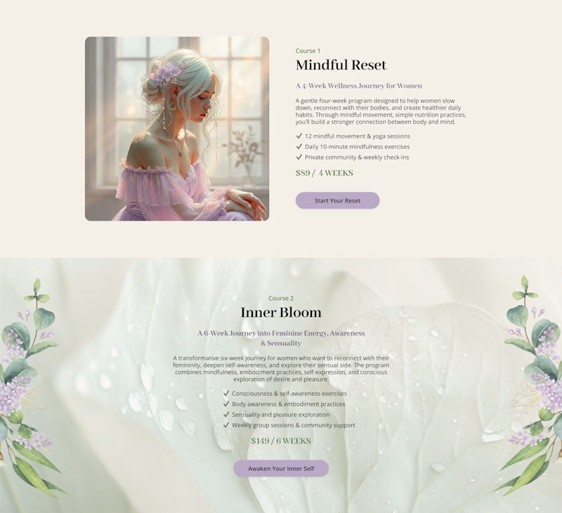
Cards or sections? How should you showcase courses on a Kajabi website?
It depends on what you want visitors to see first.
Course cards are great when you want to show the full picture at a glance – “Here are all the programs we offer.” They make the product range clear before visitors start scrolling.
Separate sections work better when each course needs more attention – its story, audience, benefits, and outcomes.
When we design Kajabi websites, we don’t use one layout for every course.
We choose the structure that makes the offer easier to understand – and easier to explore.

28 voted
65%
15 voted
35%
43 votes
Closed


the course cards make the offer easy to scan. did you test sections too?


Hot take: aesthetics and clinical results should walk hand in hand.
Most brands in this space lean into cold, sterile whites or aggressive dark tones. It reads functional, but it also feels like something you'd hide in a medicine cabinet, not display on your vanity.
For this rebrand, we anchored the identity in classical beauty and organic sophistication. By combining warm earthy tones, botanical cues, and timeless iconography, we moved away from the "pharmacy product" feel into true high-end personal care.
It was a deliberate shift: positioning the brand not for someone who feels like they are treating a flaw, but for someone investing in a premium daily ritual.
Would a piece like this deserve a spot on your display shelf?






This is brilliant!