The network for creativity
Join 1.25M professional creatives like you
Connect with clients, get discovered, and run your business 100% commission-free
Creatives on Contra have earned over $150M and we are just getting started
Back to feedPost

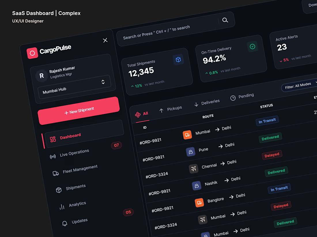
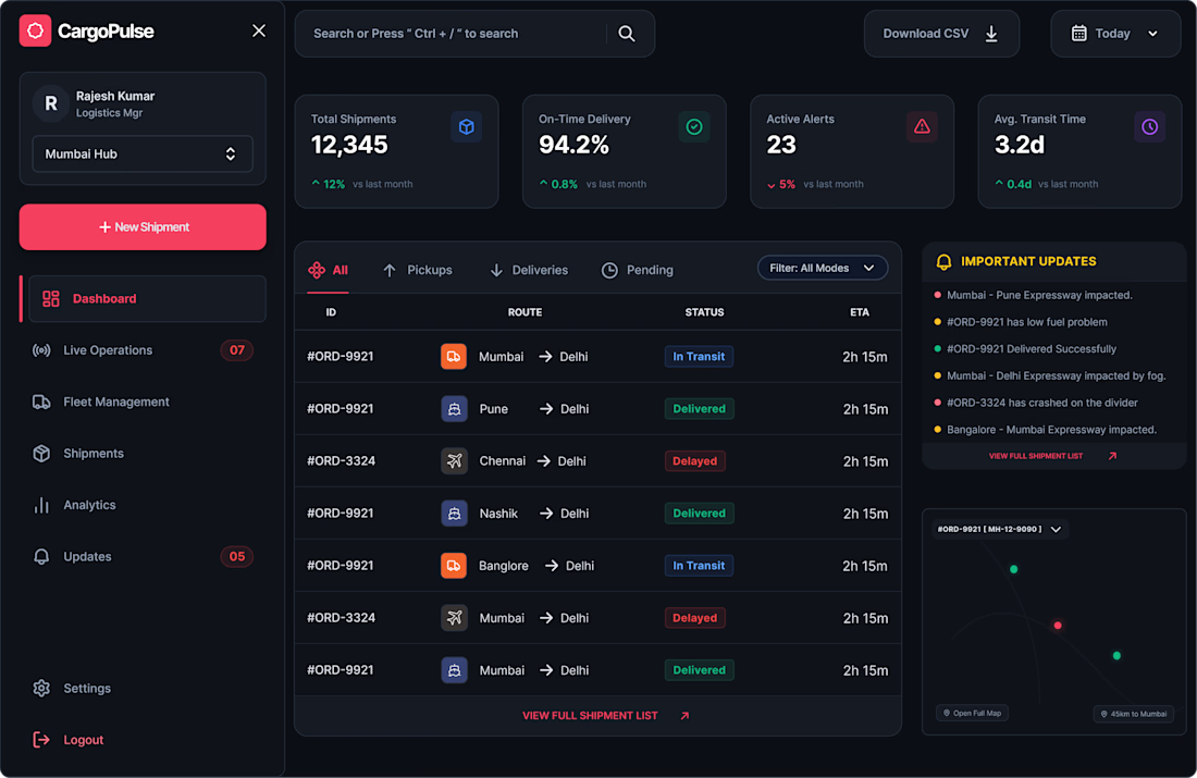
SaaS Dashboard | Complex UX/UI | Logistic & Cargo Industry | Figma | Leveraging AI & Prompt Engineering |
The network for creativity
Join 1.25M professional creatives like you
Connect with clients, get discovered, and run your business 100% commission-free
Creatives on Contra have earned over $150M and we are just getting started











Related posts


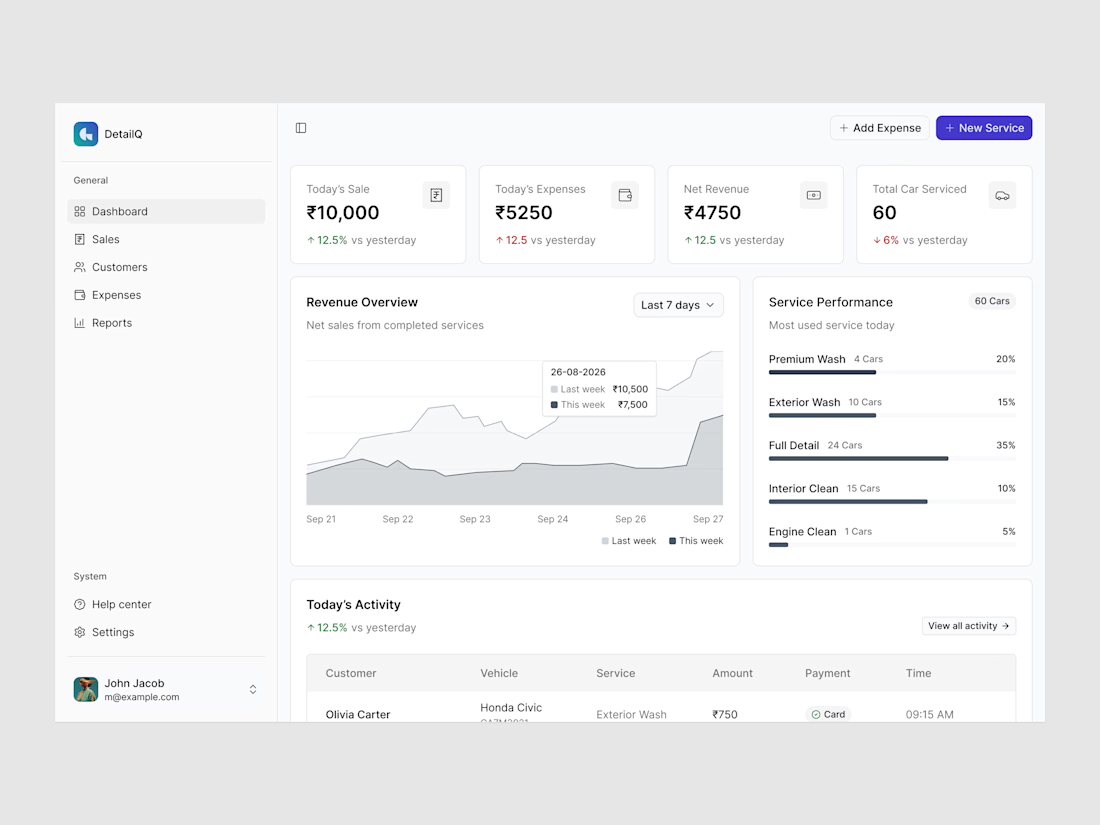
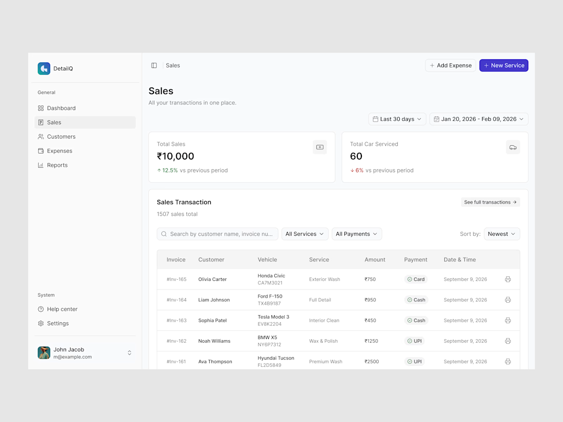
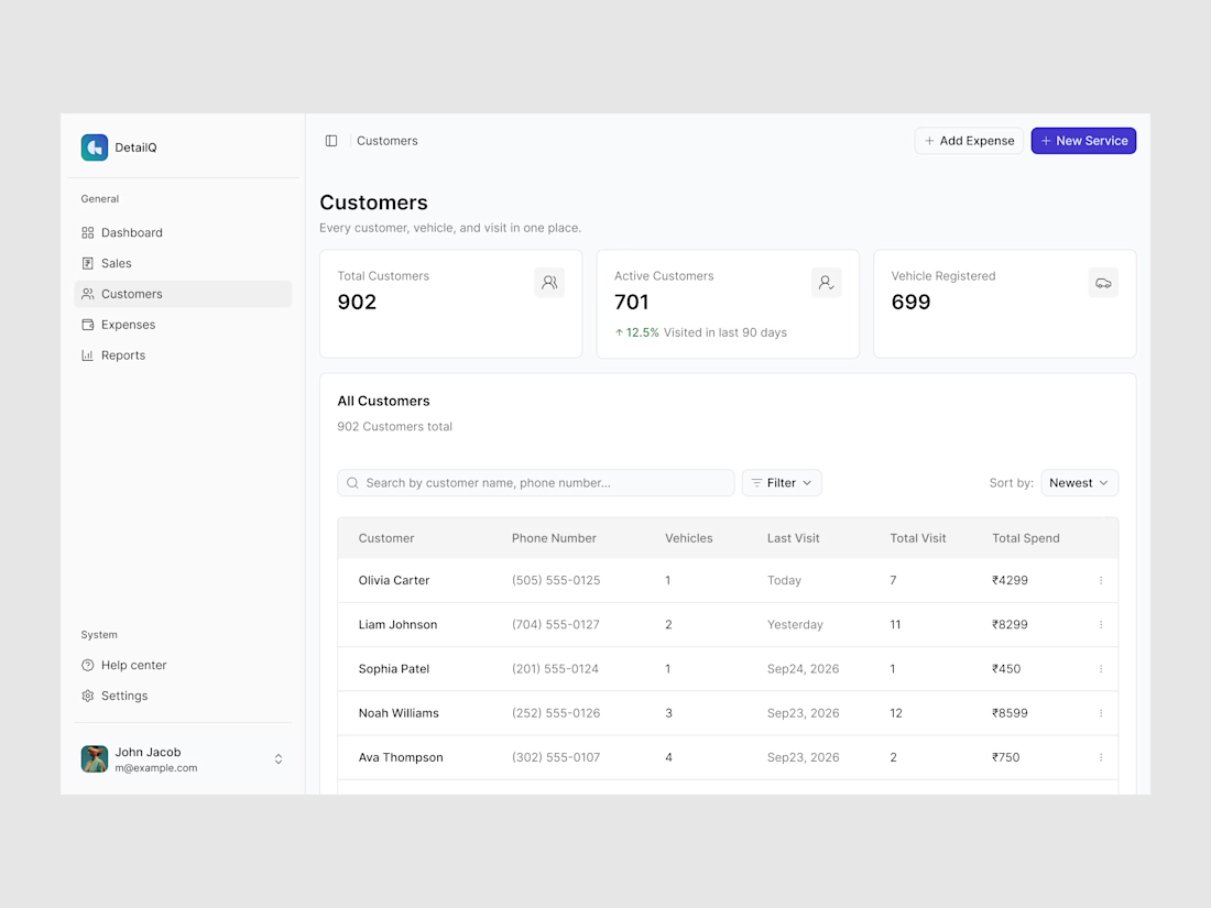
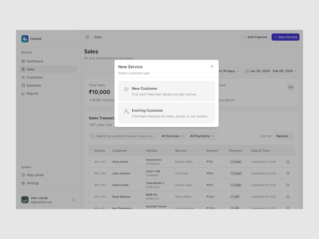

Super clean dashboard! 👏 Never thought car wash shops needed this level of business management but it makes total sense — sales tracking, customer data, revenue overview all in one place. The Figma layout looks very organized and easy for non-tech owners to use. Great niche...

Working on a SaaS dashboard concept in Figma. 🚀
The goal is to make complex business data easier to scan and understand through clear visual hierarchy, structured analytics cards, and organized navigation.
Still refining the details and exploring ways to make the experience more intuitive.
What matters more to you in a dashboard: clean visuals or faster access to insightful?
#Ui designs #Ux design #Saas design #Figma
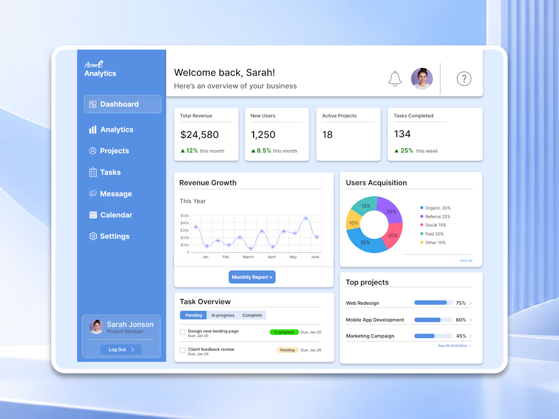

For a dashboard like this, I’d test whether the key action stays visible when the cards are filled with real, uneven data—not just placeholder numbers. What kind of business data are you designing the first view around?

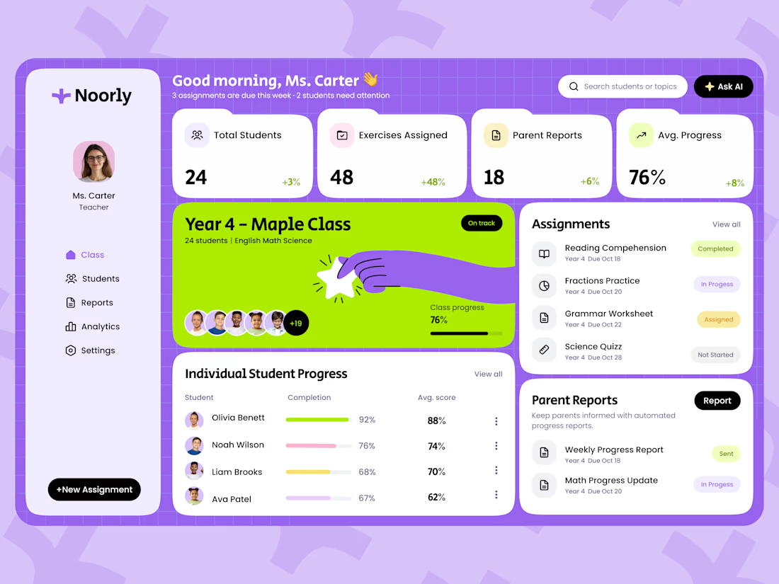
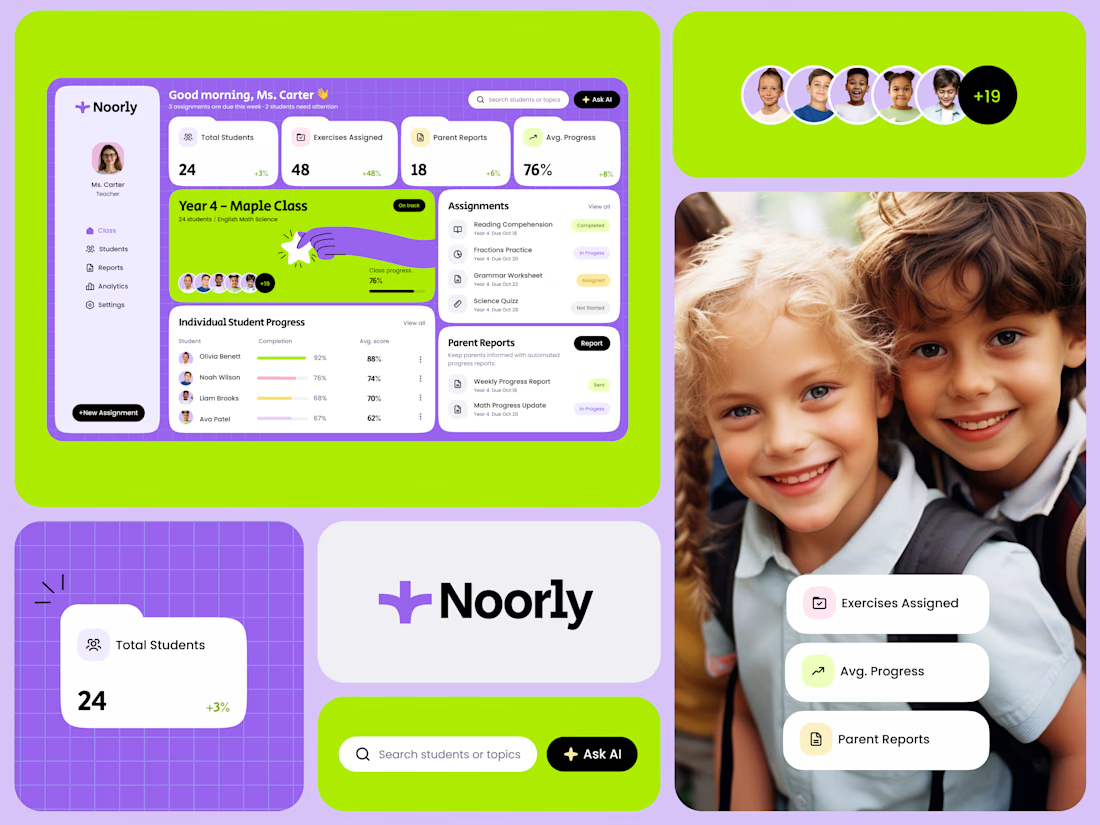
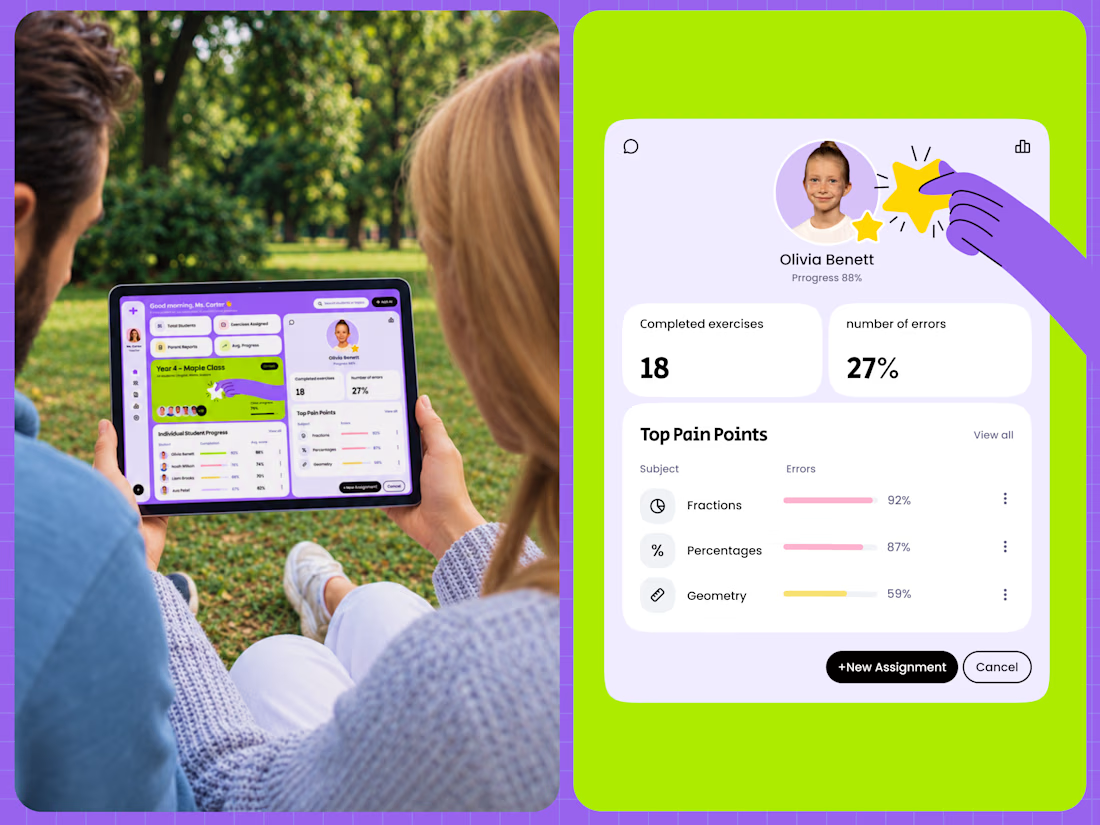
Noorly is a modern EdTech SaaS dashboard designed for teachers, students, and parents.
The platform brings classroom management, assignments, student analytics, performance reports, and parent communication into one cohesive experience. The design combines a playful purple and lime green color palette with soft pastel tones, rounded cards, and clear data visualizations.
The goal was to make complex educational information easier to navigate while helping teachers save time and make more informed decisions.
View the project:
https://dribbble.com/shots/27817401-Dashboard-Education-SaaS