The network for creativity
Join 1.25M professional creatives like you
Connect with clients, get discovered, and run your business 100% commission-free
Creatives on Contra have earned over $150M and we are just getting started
Back to feedPost

NARA is a self-initiated branding project exploring how a botanical skincare brand can communicate nature without relying on the visual clichés commonly associated with “natural” products.
The project began by defining the brand’s positioning, audience, personality, and visual challenge. I wanted NARA to feel calm, contemporary, and refined while maintaining a clear connection to botanical ingredients and natural materials.
From there, I developed a visual territory through references to botanical textures, frosted glass, natural stone, uncoated paper, soft shadows, and muted botanical tones. These references established a visual language that feels natural without becoming rustic or overly luxurious.
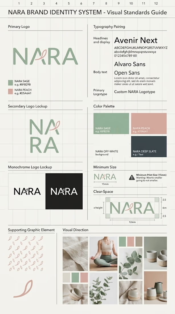
The identity development focused on simplicity, proportion, typography, spacing, and clarity rather than relying on literal botanical symbols. The goal was to create an identity that could remain distinctive across different scales and environments.
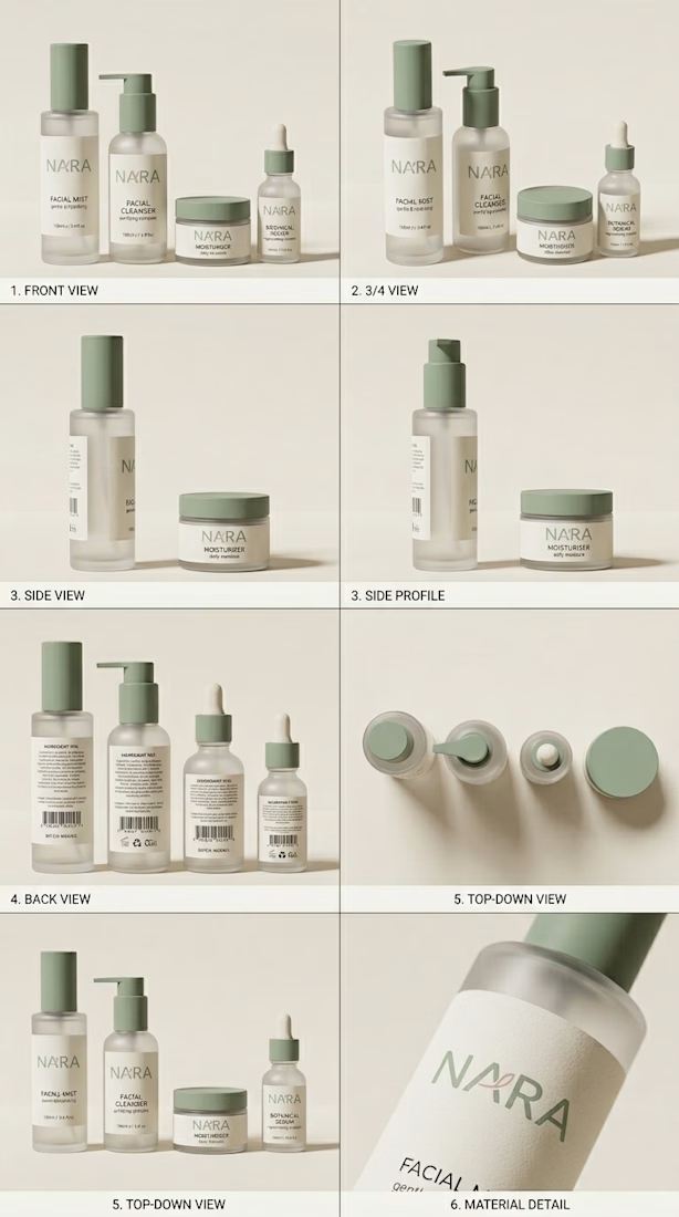
The resulting visual system combines typography, color, graphic elements, photography direction, and material language into one consistent framework. The system was then translated into a skincare packaging range consisting of cleanser, serum, moisturizer, and facial mist.
Packaging became an important test of consistency. I explored multiple perspectives, proportions, materials, and applications to evaluate how the identity performs beyond a single presentation image.
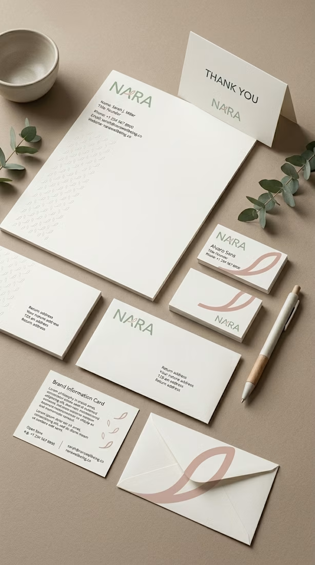
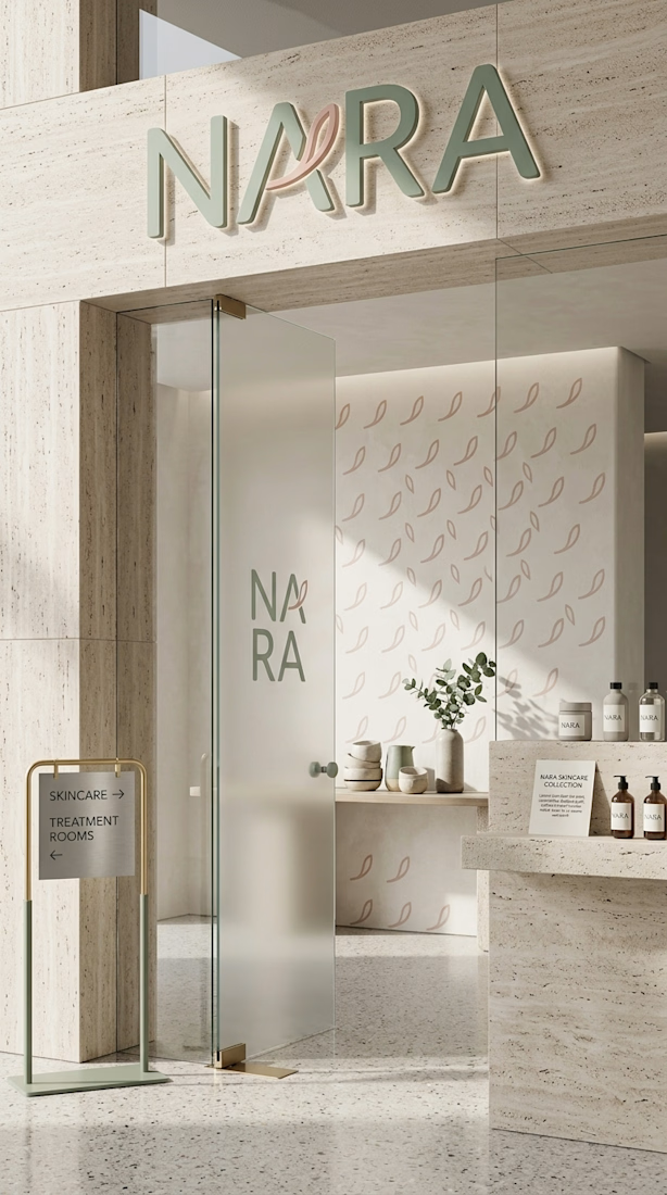
The system was then extended into stationery, digital applications, social media, retail environments, and environmental branding. Each application was designed to follow the same principles of hierarchy, spacing, typography, color, and visual direction.
The final result is a contemporary botanical identity built around restraint, materiality, and clarity.
Rather than making “natural” the entire visual identity, NARA treats nature as one part of a broader design language.
The project reflects my approach to branding: start with the problem, establish a clear direction, build a coherent system, and then test that system across real-world applications.
Project Type: Self-Initiated Concept
Role: Brand Designer
Focus: Brand Strategy · Visual Identity · Packaging · Art Direction
The network for creativity
Join 1.25M professional creatives like you
Connect with clients, get discovered, and run your business 100% commission-free
Creatives on Contra have earned over $150M and we are just getting started
Trending
retrofuturism
Share your favorite designs from the past exploring the distant future. Or your own take on the aesthetic 🚀
halftone
Dots. Texture. Grain. Let's see your designs using the halftone technique.

Midjourney
Creatives are showing off what they're making with Midjourney.
colorgrade
Video editors sound off: How do you enhance the mood of your video in color grading?





Related posts

Do you want to generate consistent, eye catching images and mockups like these for your wellness or cosmetic industry clients?
I’ve been creating AI-generated packaging and lifestyle imagery, and I recently made a few updates to my Brand Image Prompt Kit for Skincare Brands.
If you’re tired of getting random results that look nothing like your brand or are inconsistent, this product ✨ will help ✨
Includes 4 core prompt scenarios, and 20+ ready to use images.

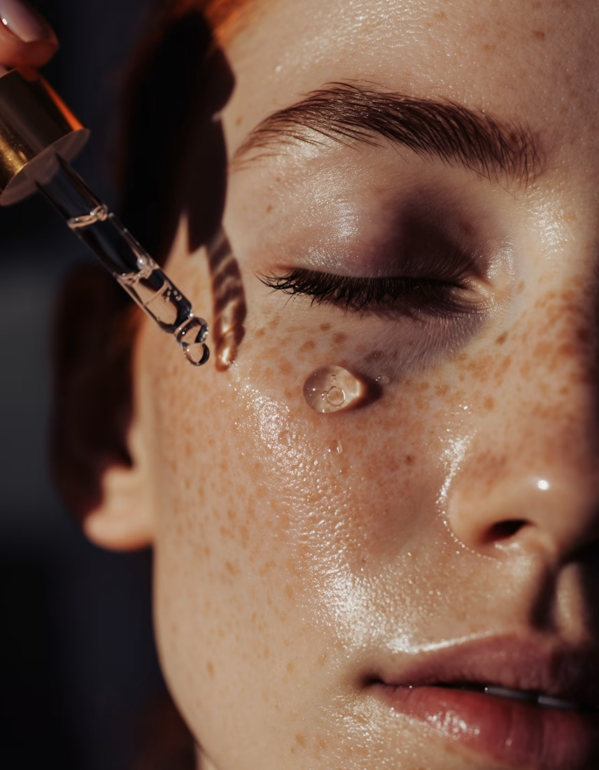
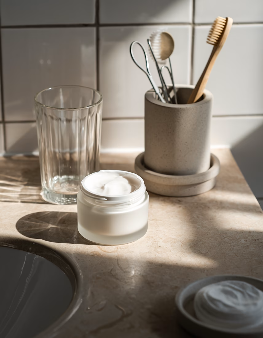
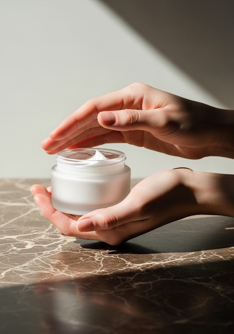
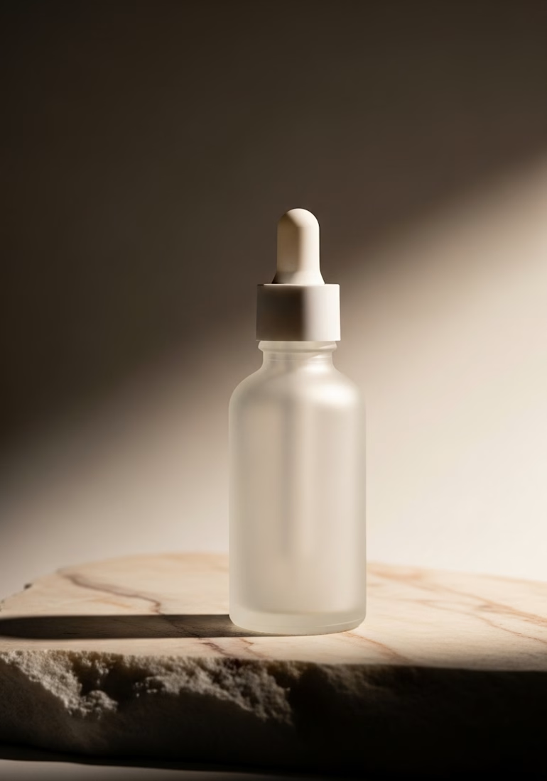

Clean work! Maintaining consistency in AI mockups is such a struggle for brands, so a ready-to-use kit is super practical.

Built a coffee brand around the feeling of being local. ☕️
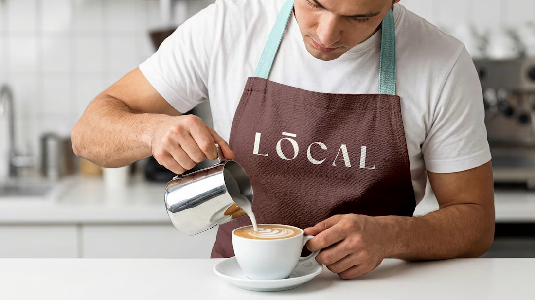
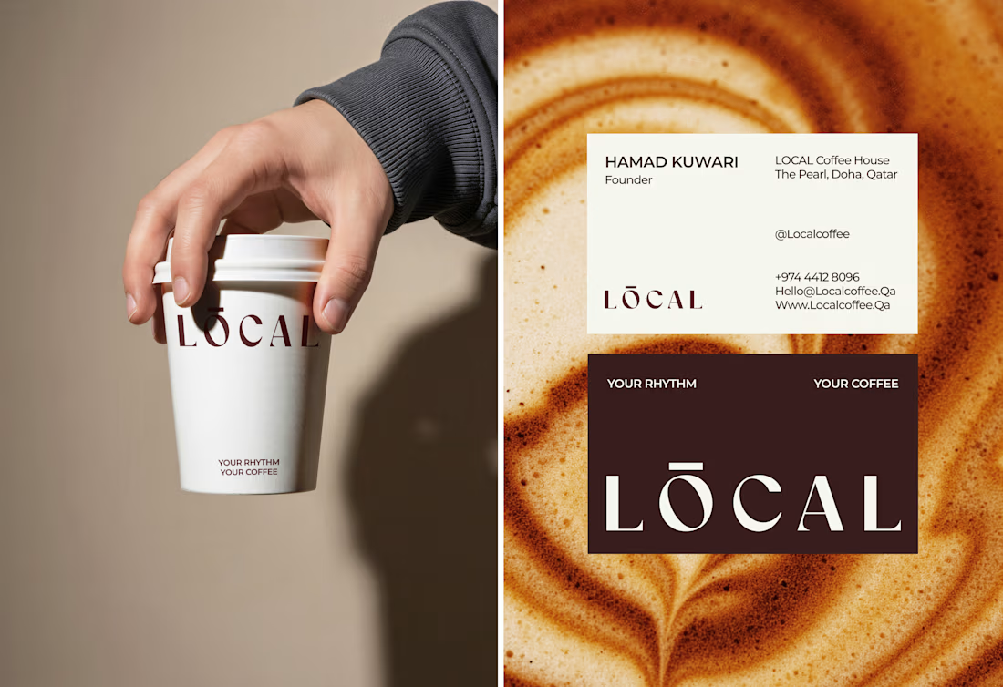
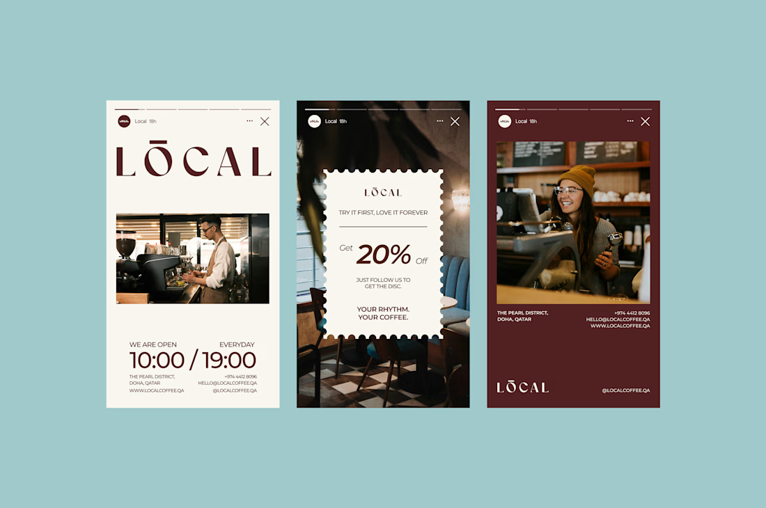
LOCAL is a modern café identity designed to feel warm, calm, premium, and familiar - without falling into the usual coffee-brand clichés.
From the wordmark and earthy color palette to typography, packaging, uniforms, and real-world applications, every detail was created to make the brand feel like a natural part of everyday life.
Brand Identity • Art Direction • Packaging • Visual System
What do you think - would you stop by LOCAL for a coffee? 👀
#BrandIdentity #Branding #CoffeeBrand #CafeBranding #PackagingDesign #VisualIdentity #GraphicDesign #BrandDesigner #CreativeDirection #ContraDesigner



Branding 😍

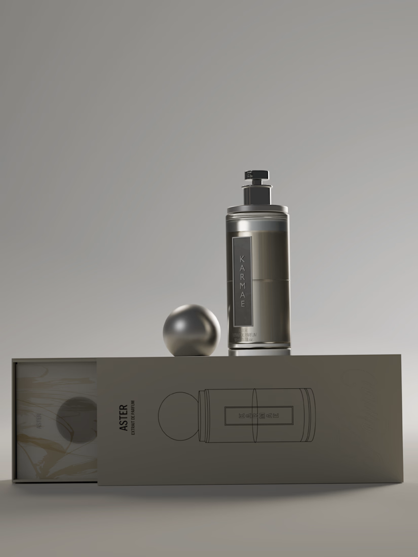
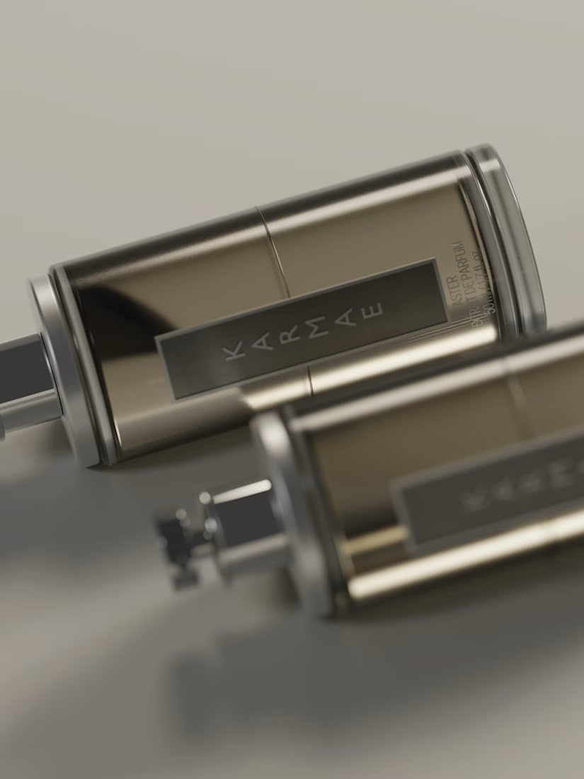
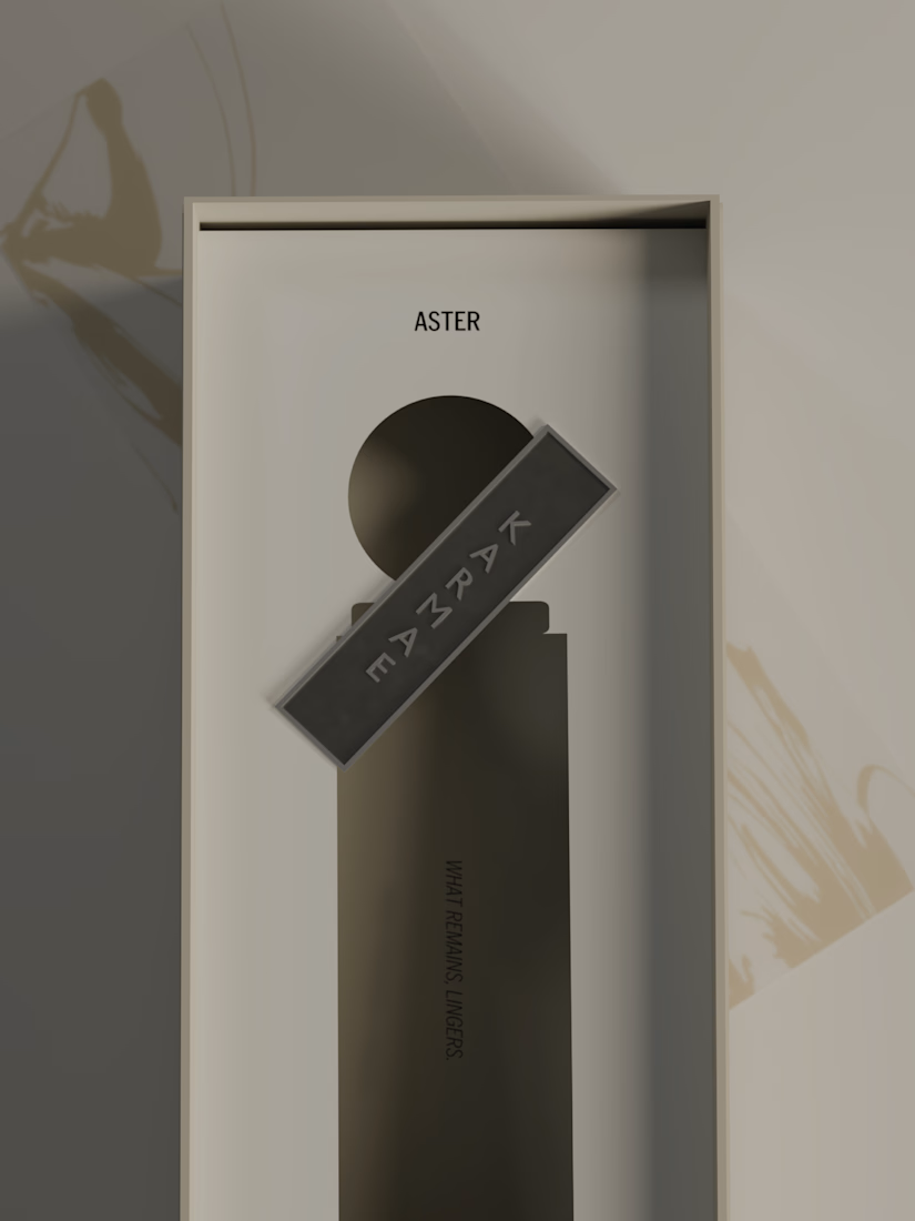
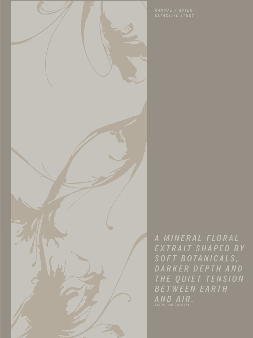
KARMAE: ASTER | Brand Identity, Packaging & 3D Direction
ASTER explores the softer side of KARMAE.
Where Orbit leaned into shadow, mineral weight and atmosphere, ASTER brings the same brand world closer to light. Frosted glass, pale botanicals, muted metallics and softer tonal contrast create a quieter, more tactile expression without losing the core identity behind it.
For this refresh, I kept the original KARMAE foundation and expanded the system rather than replacing it. The goal was to show how one brand can hold two very different moods while still feeling cohesive across product, packaging and visual direction.
Everything shown here was designed and directed by me from start to finish, including the product design, packaging, environments, materials and final 3D renders built in Blender.
Part one of ASTER.



aster > orbit ngl