The network for creativity
Join 1.25M professional creatives like you
Connect with clients, get discovered, and run your business 100% commission-free
Creatives on Contra have earned over $150M and we are just getting started
Back to feedPost

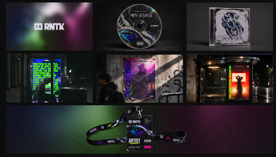
RNTK Records — Underground Hip-Hop Brand Identity
No Rules. No Permission.
RNTK is a visual identity concept for a global underground hip-hop music label built around rebellion, raw expression, and independent music culture.
The identity combines grunge-inspired graphic design, distressed typography, experimental layouts, analog textures, and bold neon colors to create a distinctive visual language that lives outside the mainstream.
From music release artwork and CD packaging to artist merchandise, concert posters, backstage passes, outdoor advertising, and event branding, every application extends the same unapologetic underground aesthetic.
Built From the Underground.
#BrandIdentity #MusicBranding #HipHopBranding #GraphicDesign #ArtDirection #VisualIdentity #GrungeDesign #AlbumArtwork #MusicMarketing #CreativeDirection


The network for creativity
Join 1.25M professional creatives like you
Connect with clients, get discovered, and run your business 100% commission-free
Creatives on Contra have earned over $150M and we are just getting started

Related posts

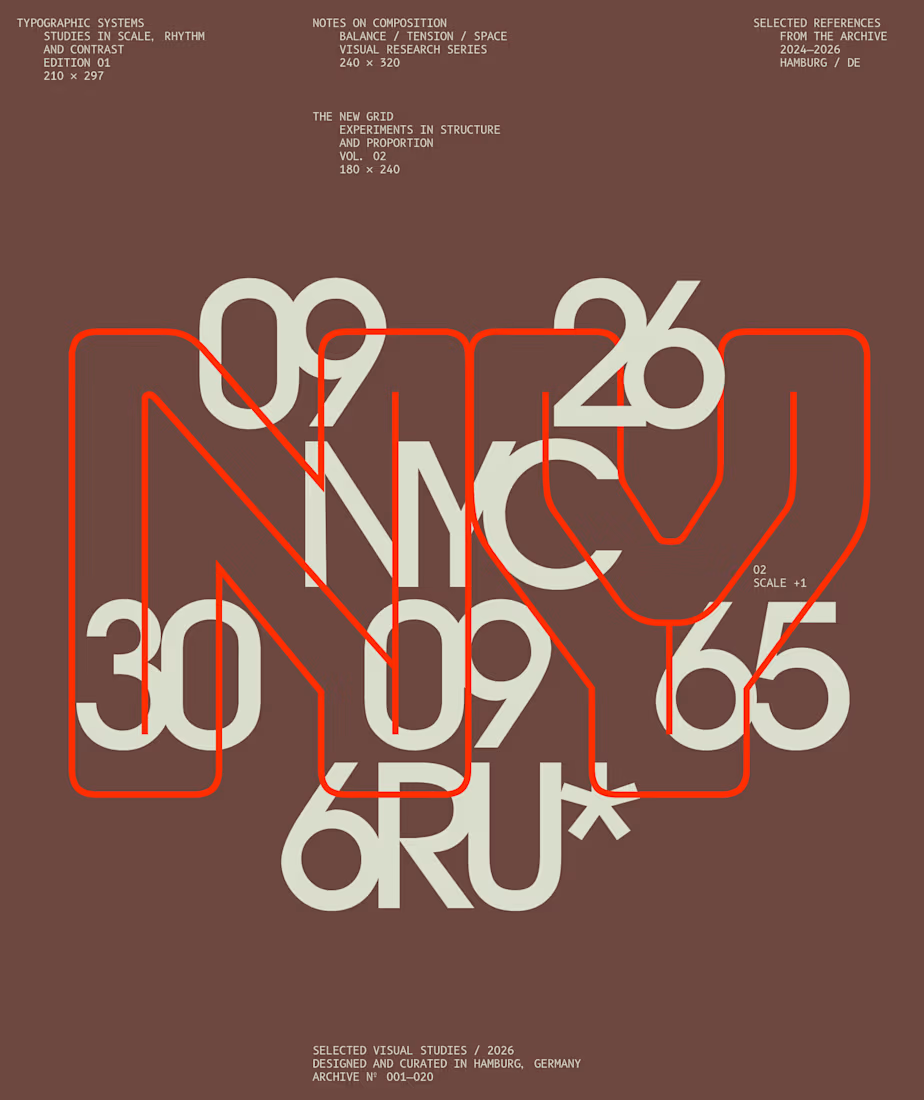
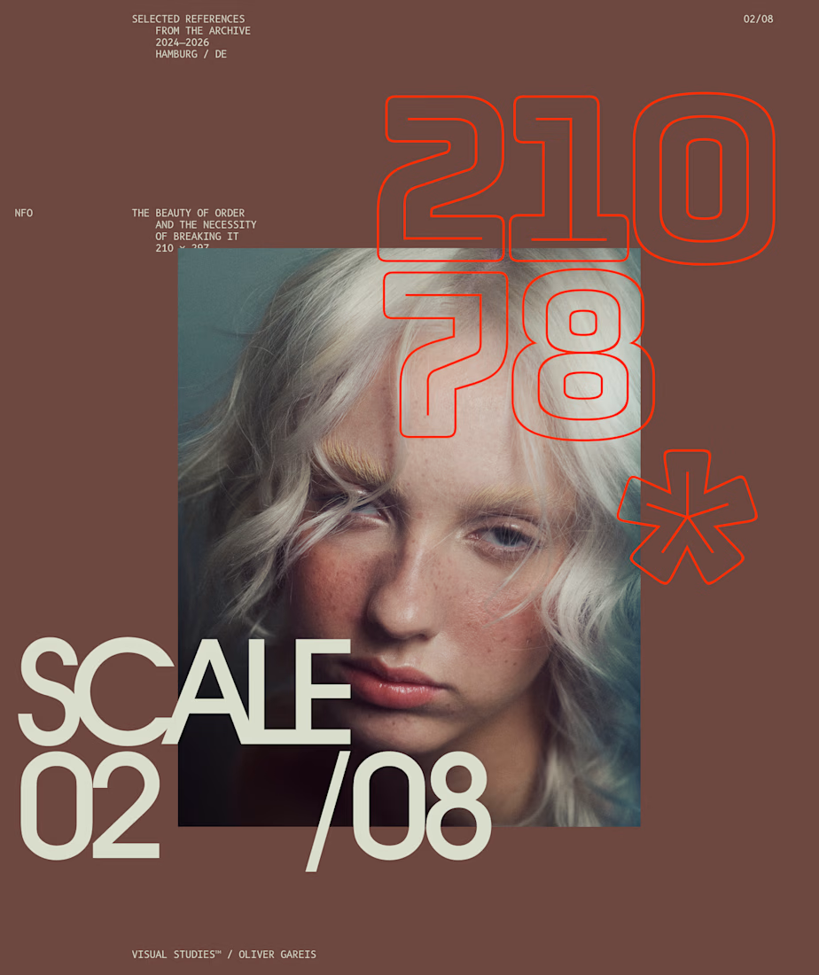
I designed these typographic layouts as part of my ongoing visual series on scale, grid and rhythm
↳ Master typography & layout - The foundation of timeless web design. Join 350+ designers inside my 13-hour online course https://typomonday.com/course


Beautiful wo

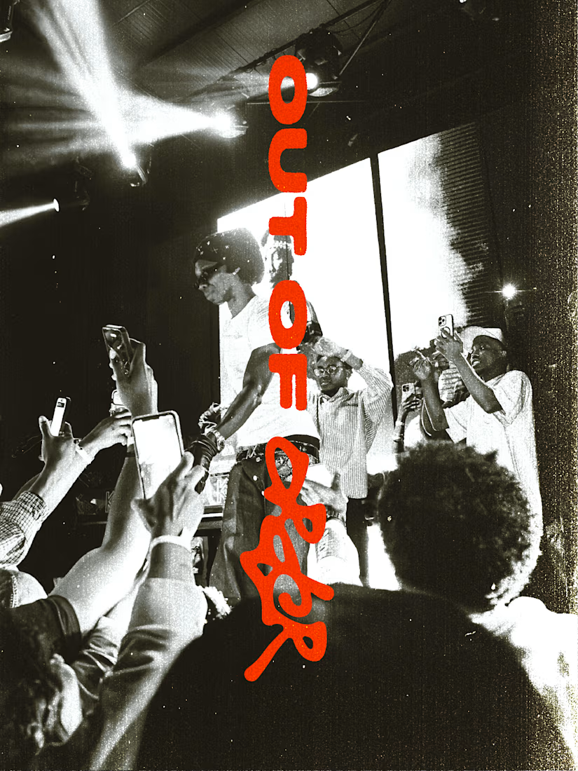
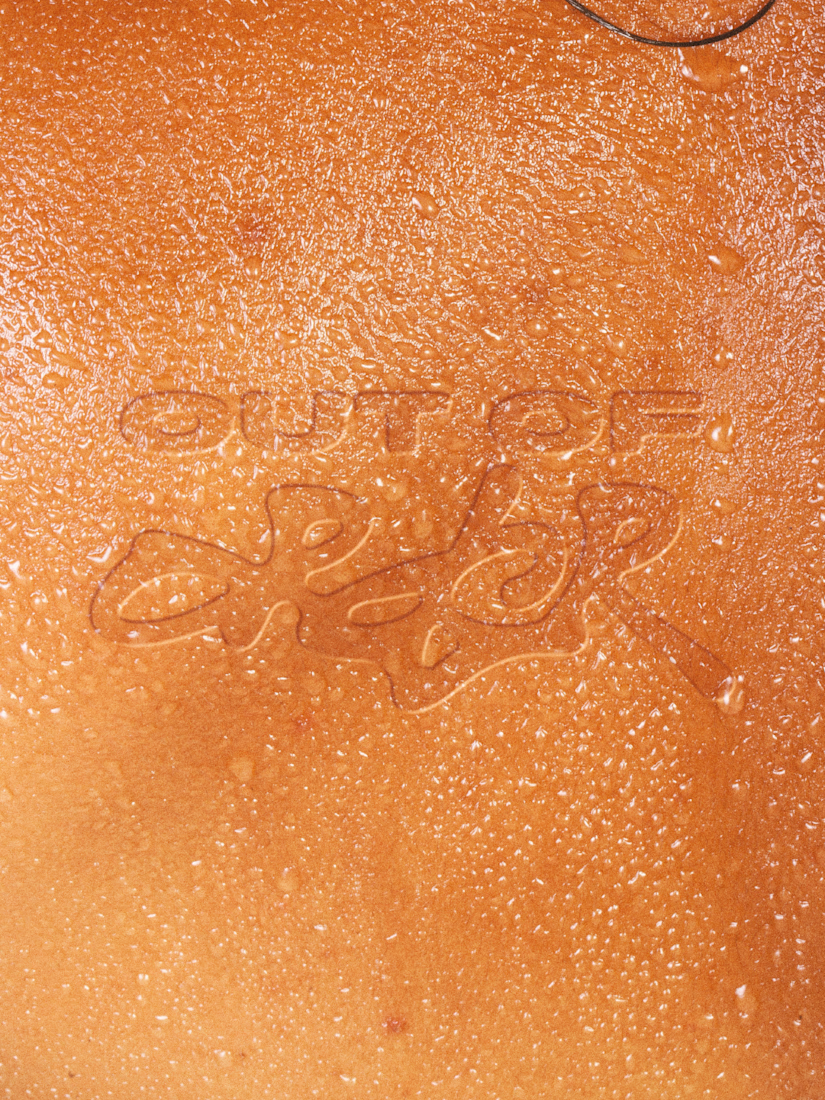
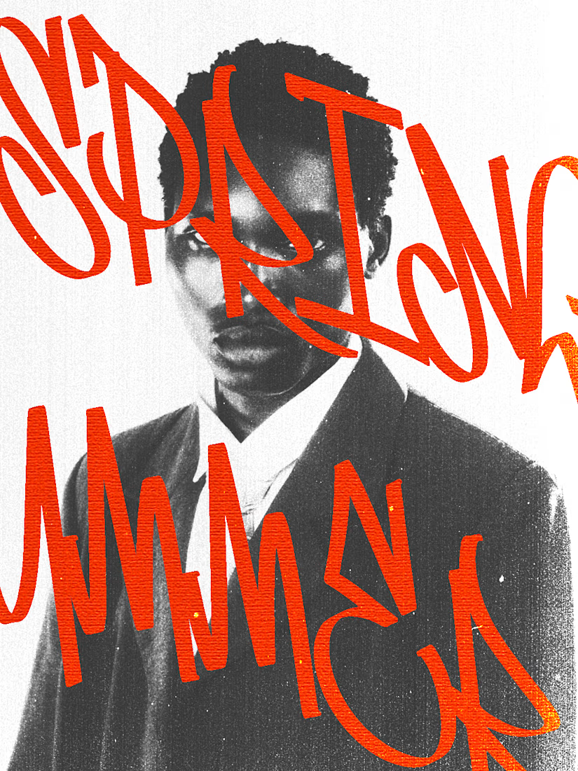
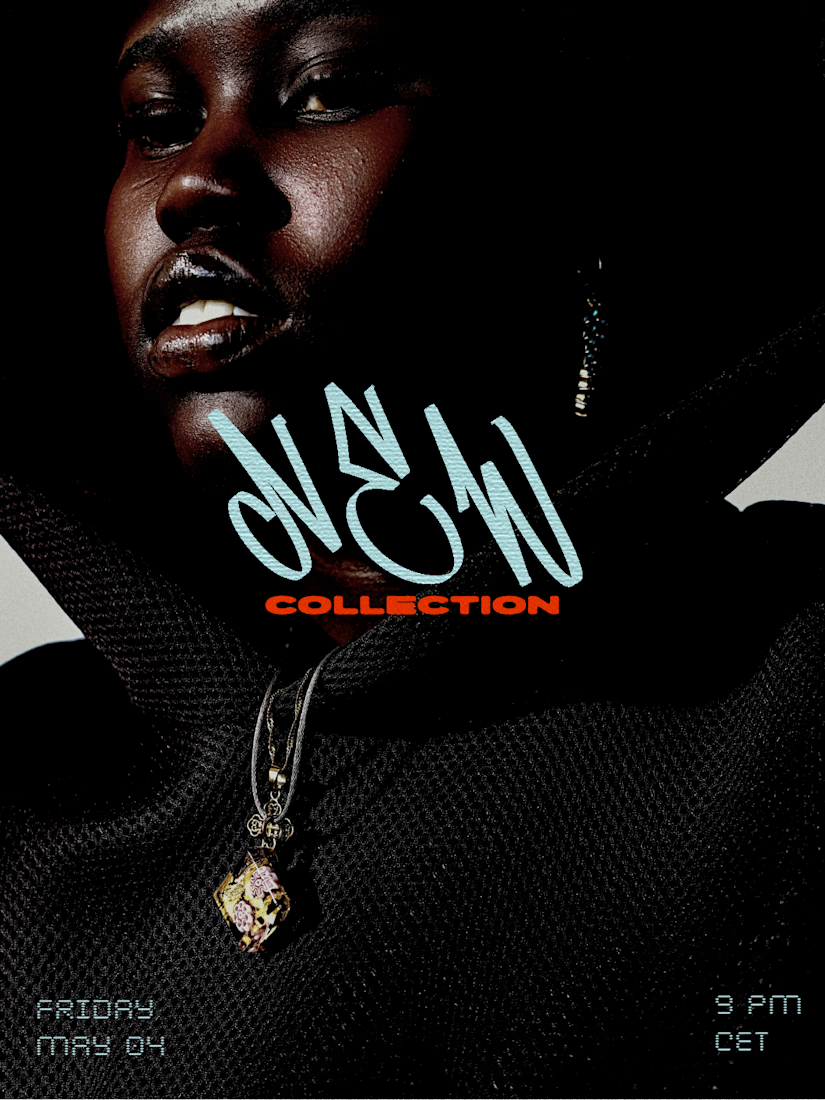
I recently worked on a branding concept for OUT OF ORDER (OOO), a streetwear brand inspired by hip-hop, urban culture and retro aesthetics.
The identity explores the contrast between expressive graffiti-inspired typography and a more refined, high-fashion visual direction.

Love this!

A brand built on the daily walk.
For Patta, a Brazilian pet-lifestyle brand, the wordmark leans like a pair walking side by side, and dog-tag shapes frame everything from packaging to Barkz, its collectible charms.
Pet brands: cute, or bold enough to wear?


I like it!🔥 Best one since morning.