The network for creativity
Join 1.25M professional creatives like you
Connect with clients, get discovered, and run your business 100% commission-free
Creatives on Contra have earned over $150M and we are just getting started
Back to feedPost
Obside is out. A luxury brand website in framer with Shopify store integration ready to go through frameship integration.
Try it today.
Get Obside here


NO SOFT EDGES is a killer headline for a luxury template, it sets the tone for the whole design before you even scroll. Framer plus Shopify through Frameship is exactly the combo luxury brands keep asking for, beautiful storefront with real commerce behind it. Was the Frameship...

Frameship was new to me but I wanted it in this template, so it was tricky but not a hard task really.
The sharp edges decision was easy to make because I haven't seen many luxury brands that use squircles or soft edges.
The network for creativity
Join 1.25M professional creatives like you
Connect with clients, get discovered, and run your business 100% commission-free
Creatives on Contra have earned over $150M and we are just getting started



Related posts

New here, so I'm slowly filling in my portfolio and getting to know the place. So far I like it.
Here's an extract from Software Intelligence, a Framer site I designed and built a few months ago for an enterprise data consulting startup.
The visual idea mirrors what they do with data: compact blocks that animate, break apart and recompose, like charts taking shape. Few effects, all consistent, everything managed through the CMS.
If you have a minute, take a look at the full case study.
I'd love to know what you think, especially whether the motion supports the content or ends up overpowering it.

You're very welcome, Francesco — glad the note landed. The motion in that extract really does the heavy lifting for the content, so keep sharing your work here. Looking forward to seeing what's next from you. ✌️


Meet the Mental Reps squad!
We got a chance to bring these seven characters to life, including building a fully custom Shopify store for Mental Reps Co., a performance-psychology brand that teaches kids the mental game.
Each one lives in mentalrepsco.com
Big feelings, tiny monsters.


Love the concept and illustration style here. Making complex emotions friendly and tangible for kids is tough, but this squad nails it effortlessly. The branding looks super playful and clean!


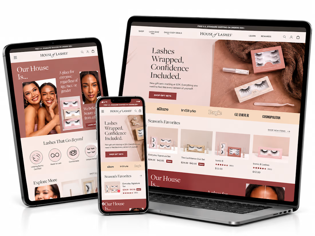
What if finding the perfect lash style was easier than ever? ✨
I’ve been exploring how a beauty eCommerce store can deliver a better shopping experience through thoughtful UI/UX design and conversion-focused strategies.
For this independent redesign concept, I explored a more engaging way to help beauty shoppers discover products, navigate collections, and make confident buying decisions.
A few things I focused on:
1. Clean, premium beauty storefront design.
2. Better product discovery and navigation.
3. Curated product collections.
4. A lash-finder quiz concept to guide shoppers.
5. Clear product presentation and shopping actions.
6. A responsive experience across devices.
My goal with this concept was simple: make the shopping journey feel effortless while keeping the brand visually engaging.
Because a beautiful store is great, but a store that makes shopping easier is even better.
Shopify founders and beauty brand owners: What's more important to you when designing a beauty store — visual experience or product discovery?
#Shopify #ShopifyDesign #ShopifyCRO #EcommerceDesign #UIDesign #UXDesign #ConversionOptimization


This is amazing. I would love to see more of your designs