The network for creativity
Join 1.25M professional creatives like you
Connect with clients, get discovered, and run your business 100% commission-free
Creatives on Contra have earned over $150M and we are just getting started
Back to feedPost

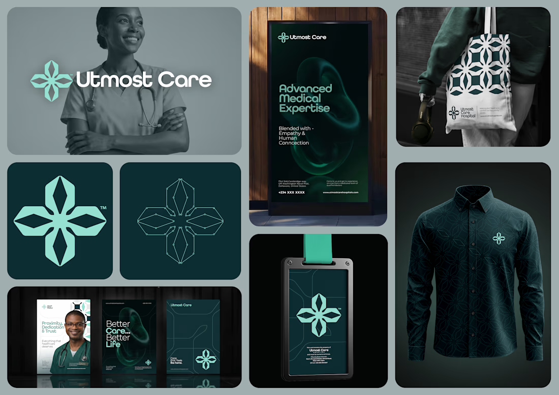
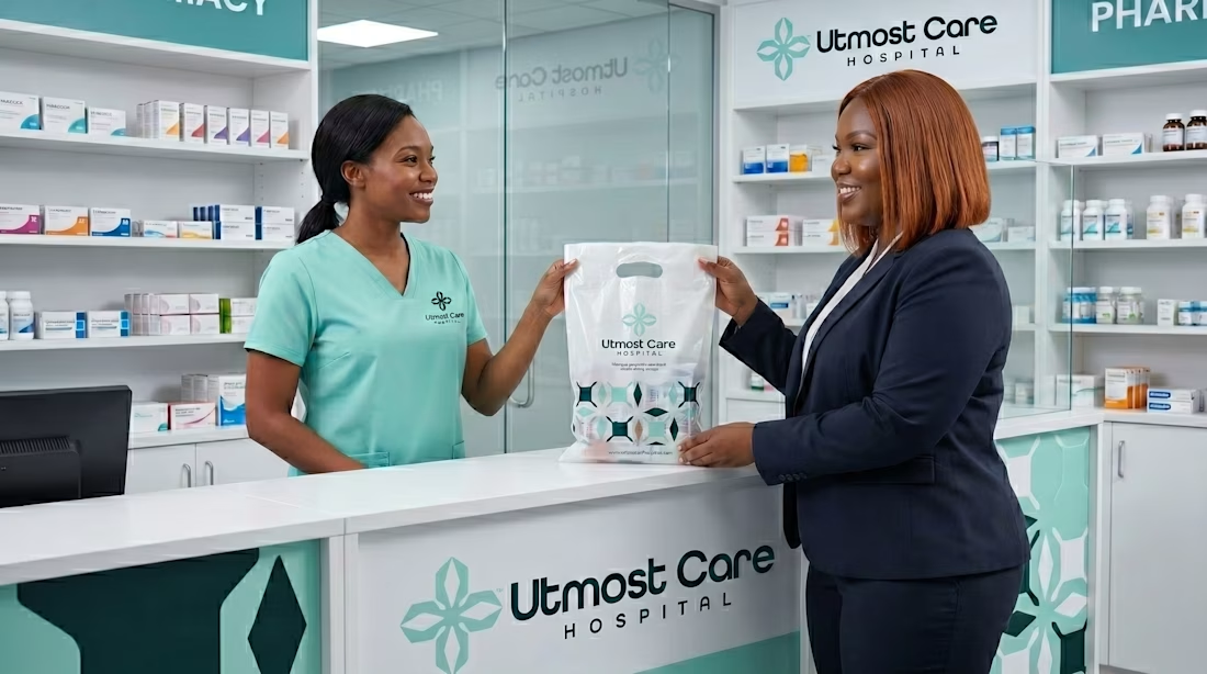
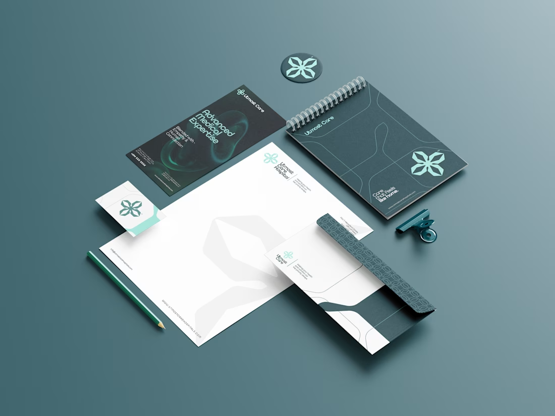
June Dump: Sorry it's coming late. Here's a rebrand i did for a health care service called Utmost Care. What do you guys think?

The network for creativity
Join 1.25M professional creatives like you
Connect with clients, get discovered, and run your business 100% commission-free
Creatives on Contra have earned over $150M and we are just getting started

Challenges
View all


Related posts

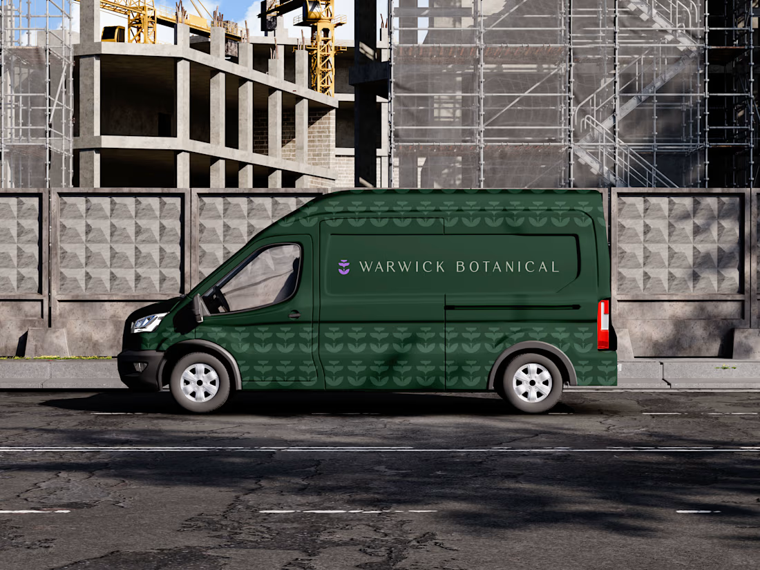
For brand identity, I like to show mockups to test of the identity system: the logo, pattern, and color palette all needed to work at a much larger scale without feeling overdesigned.
That’s where a flexible brand system really starts to prove itself.
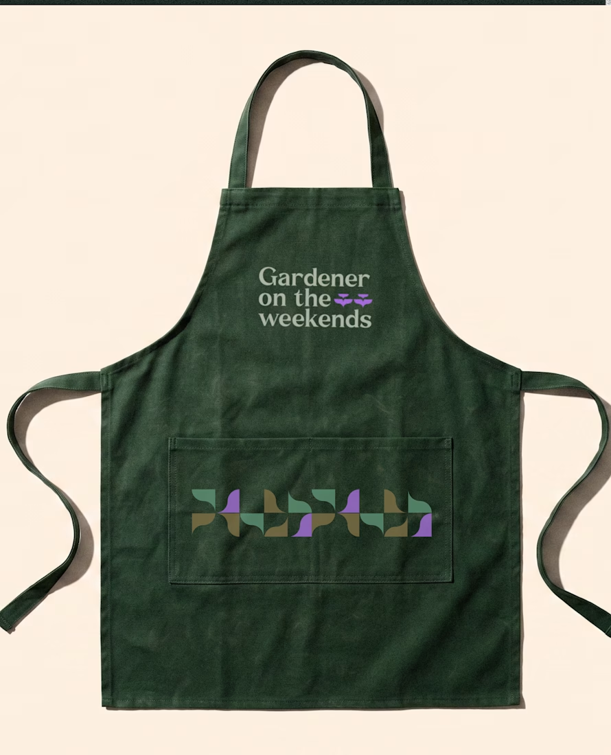
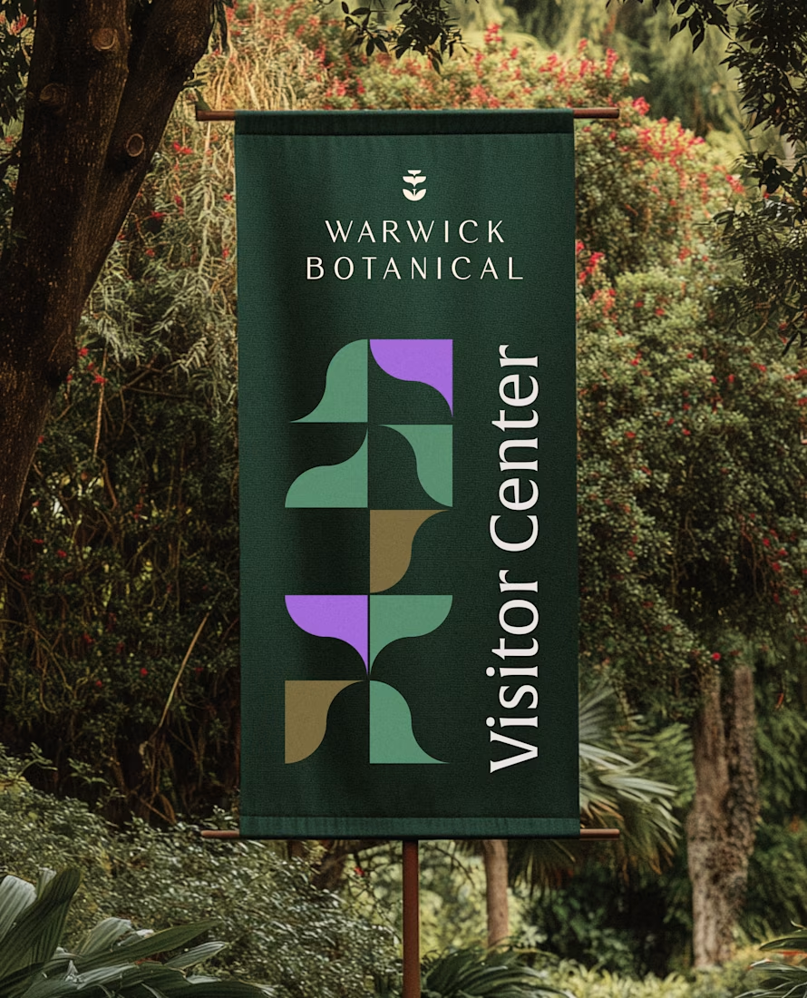

Powerful greenish look 👌
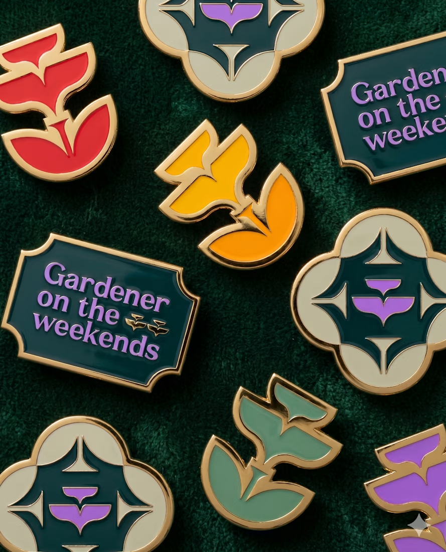
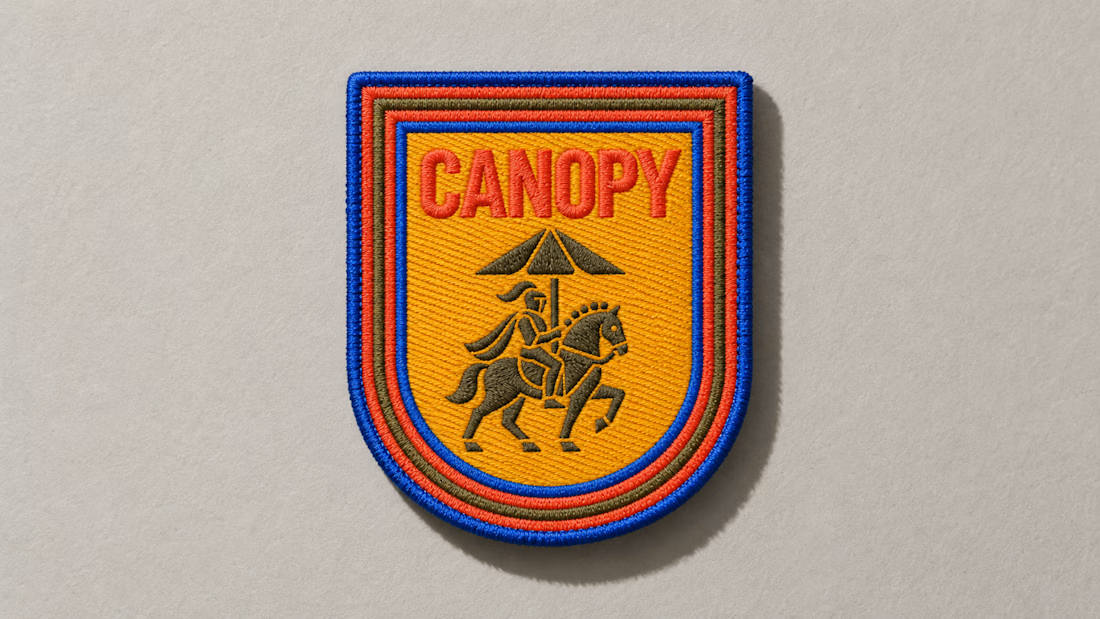
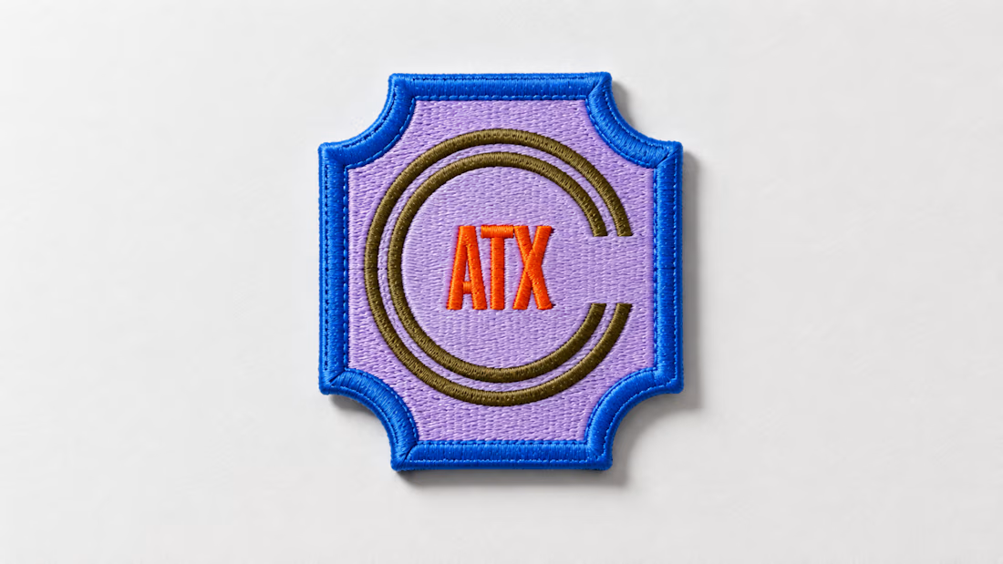
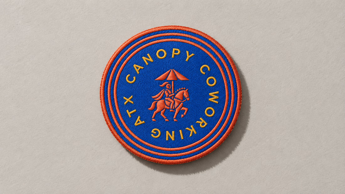
A little preview of something I’m working on.
These embroidered patches are a small part of a much larger brand system, but details like this matter. The challenge is making sure the identity still feels distinct and intentional when it moves from screen to something physical you can hold in your hand.
That’s where a strong brand system starts begins to prove itself. More soon :)

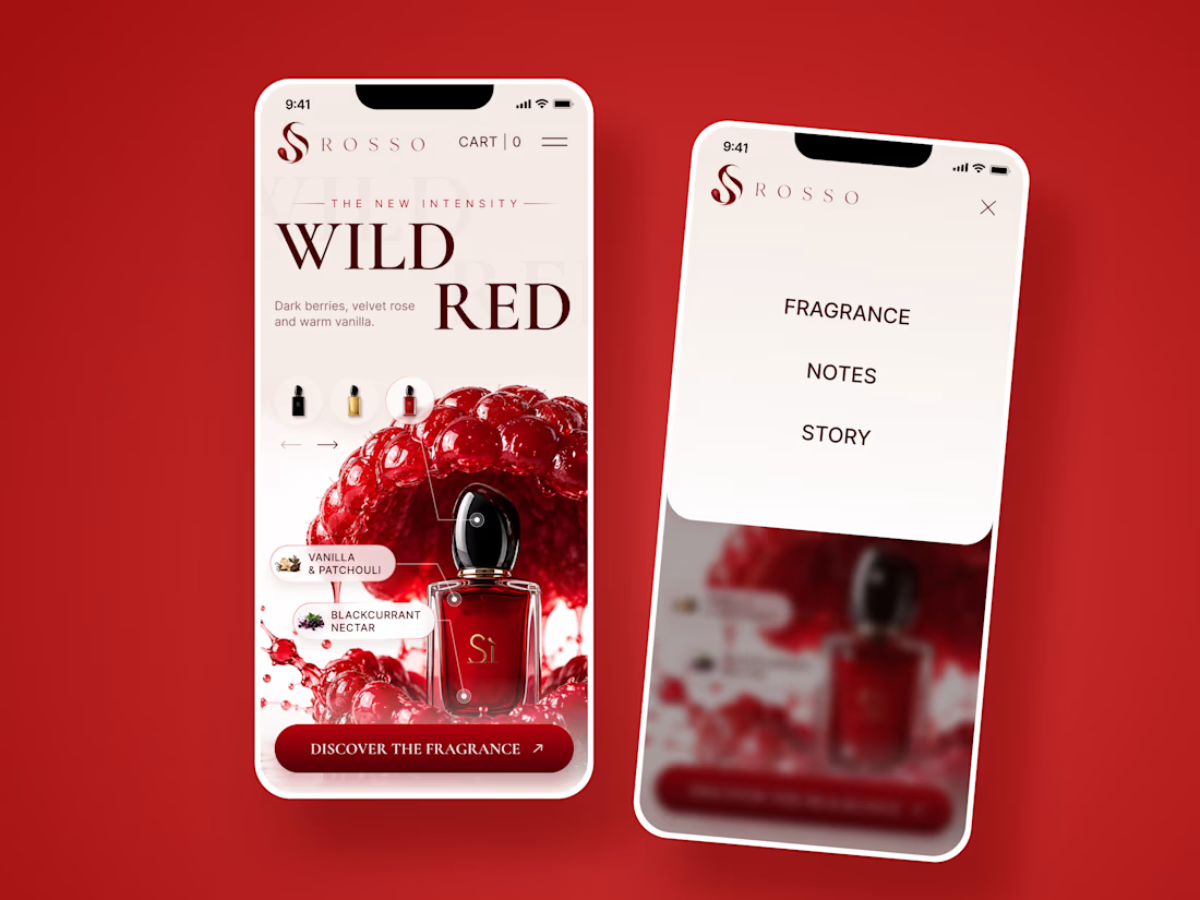
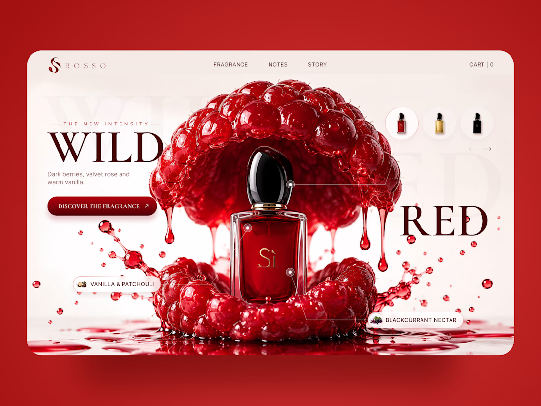
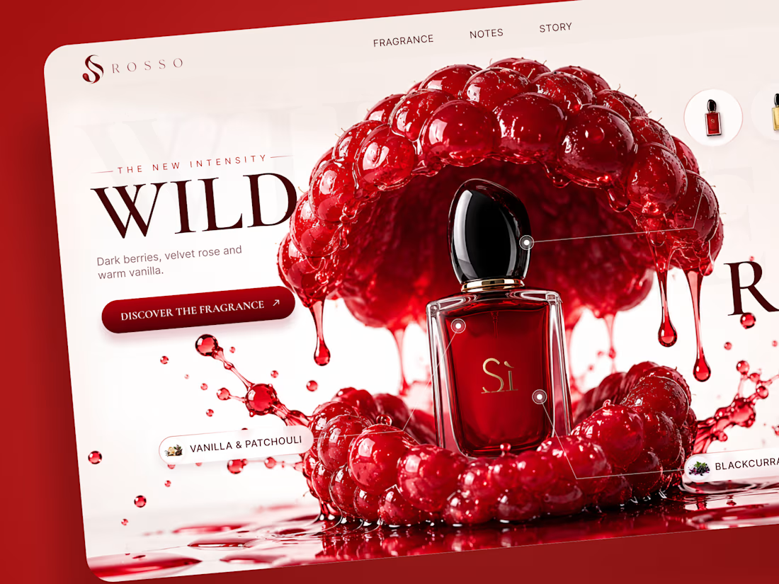
ROSSO — Wild Red Perfume Landing Page 🍒❤️
A bold fragrance landing page concept inspired by rich red berries, sensual notes, and luxury perfume aesthetics
The design combines deep red tones, oversized editorial typography, glossy fruit visuals, and elegant product presentation to create a rich and memorable experience
Special attention was given to:
• Bold product-first composition
• Rich red color palette
• Elegant editorial typography
• Fragrance notes and ingredient highlights
• Product variations and navigation
• Responsive mobile experience
The result is a vibrant, luxurious landing page that brings the fragrance to life through color, texture, and strong visual storytelling ✨
Looking to create a standout website for a beauty, fragrance, or luxury brand? Let’s connect