The network for creativity
Join 1.25M professional creatives like you
Connect with clients, get discovered, and run your business 100% commission-free
Creatives on Contra have earned over $150M and we are just getting started
Back to feedPost

Creates professional product and ugc ads

The network for creativity
Join 1.25M professional creatives like you
Connect with clients, get discovered, and run your business 100% commission-free
Creatives on Contra have earned over $150M and we are just getting started

Challenges
View all


Related posts

Made this Static ads for a payment platform
what do you think?
#motion #designer

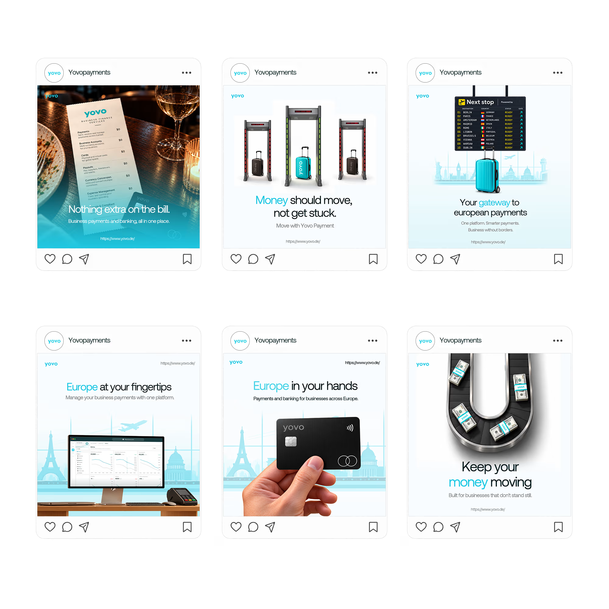

Pairing one physical object per tile (the menu, the security gate, the card) with a short headline keeps six ads feeling like a single system. Which of them ended up pulling the most attention, the literal card shot or one of the metaphor ones?

STONE: The Secret Ingredient to Culinary Masterpieces.
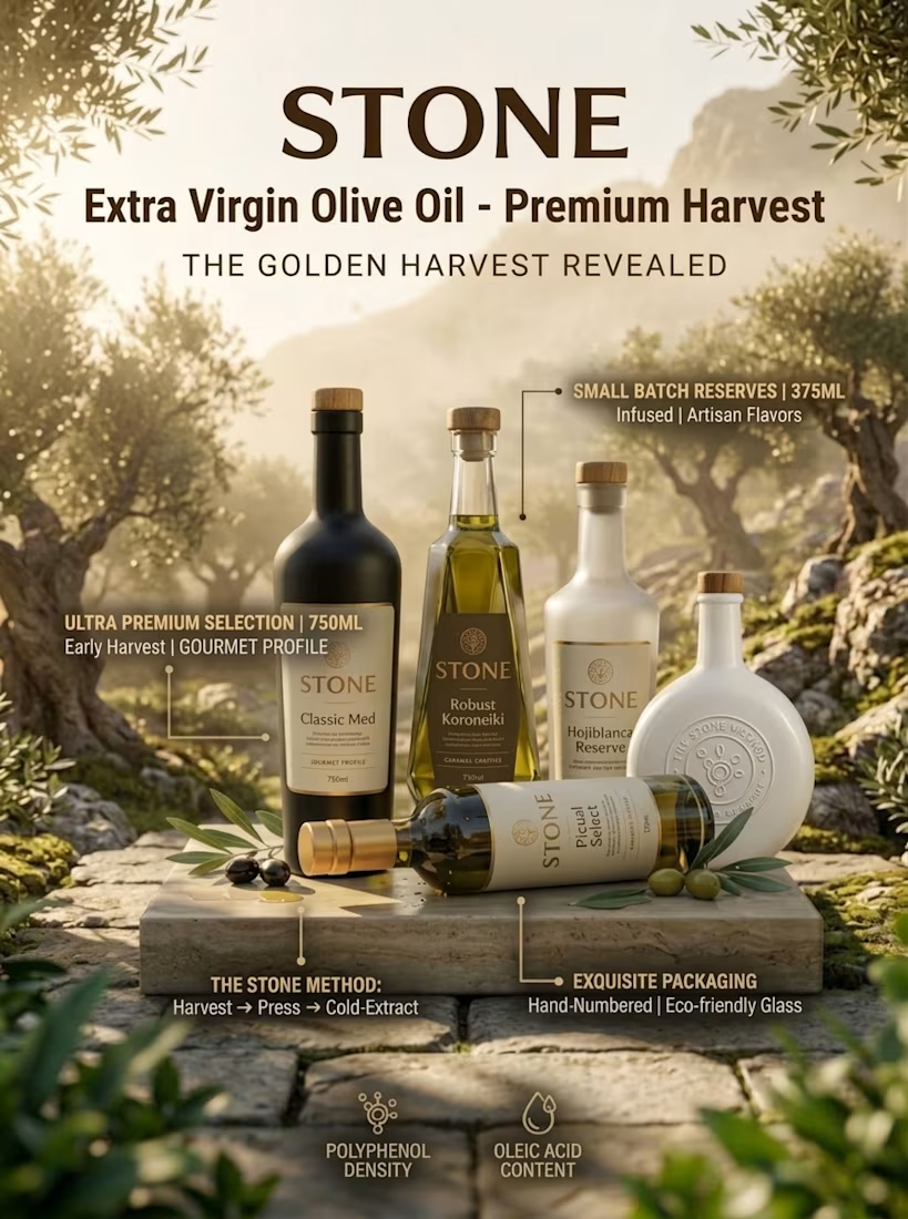
Naming each oil by its cultivar right on the label (Koroneiki, Picual) gives the line a built-in way to tell the bottles apart without touching the layout. Is the ceramic bottle meant as the premium tier or more of a gift format?

UGC ADS FOR BRAND BBA
1 voted
100%
0 voted
0%

1 vote
Closed